• Post Reply Bookmark Topic Watch Topic
  • New Topic
permaculture forums growies critters building homesteading energy monies kitchen purity ungarbage community wilderness fiber arts art permaculture artisans regional education skip experiences global resources cider press projects digital market permies.com pie forums private forums all forums
this forum made possible by our volunteer staff, including ...
master stewards:
  • Nancy Reading
  • Carla Burke
  • r ranson
  • John F Dean
  • paul wheaton
  • Pearl Sutton
stewards:
  • Jay Angler
  • Liv Smith
  • Leigh Tate
master gardeners:
  • Christopher Weeks
  • Timothy Norton
gardeners:
  • thomas rubino
  • Jeremy VanGelder
  • Maieshe Ljin

possible new look and feel

 
author and steward
Posts: 52456
Location: missoula, montana (zone 4)
hugelkultur trees chicken wofati bee woodworking
  • Mark post as helpful
  • send pies
    Number of slices to send:
    Optional 'thank-you' note:
  • Quote
  • Report post to moderator
The forum software used here on permies, is the same as the software used at coderanch. And the staff at coderanch are the only people that can make changes to the software. Alex Ojeda and I worked together to come up with a new look and feel for threads - so now it is up to the staff at coderanch to decide if they like it enough to do it. So if you like it, make sure to say something out at coderanch!

http://www.coderanch.com/t/600397

 
Posts: 180
Location: Boise, Idaho (a balmy 7a)
17
2
goat trees urban chicken wofati solar
  • Mark post as helpful
  • send pies
    Number of slices to send:
    Optional 'thank-you' note:
  • Quote
  • Report post to moderator
I care not for it. While what we are interested in is very organic, the medium we use to communicate with is not at all organic (except maybe the power sources)...let us not follow the path of the faux, rather think like the fox: nimble and crafty. An LED screen is pixelated light...wood and leather are dead things, finished by hand.
 
Posts: 11
Location: British Columbia, Canada
trees woodworking homestead
  • Likes 3
  • Mark post as helpful
  • send pies
    Number of slices to send:
    Optional 'thank-you' note:
  • Quote
  • Report post to moderator
Simple is better
- if it ain't broke don't fix it

Imho..
 
Posts: 183
Location: Vashon WA, near Seattle and Tacoma
1
  • Mark post as helpful
  • send pies
    Number of slices to send:
    Optional 'thank-you' note:
  • Quote
  • Report post to moderator
The most recent post displayed in each forum used to be a live link. Now it isn't. That hinders usability, and therefore I don't consider it a welcome change.
 
steward
Posts: 485
87
  • Mark post as helpful
  • send pies
    Number of slices to send:
    Optional 'thank-you' note:
  • Quote
  • Report post to moderator

Ivan Weiss wrote:The most recent post displayed in each forum used to be a live link. Now it isn't. That hinders usability, and therefore I don't consider it a welcome change.


Ivan, are you talking about the proposed look and feel or the existing forums? Can you point us to the page you are referring here, please?
 
Ivan Weiss
Posts: 183
Location: Vashon WA, near Seattle and Tacoma
1
  • Mark post as helpful
  • send pies
    Number of slices to send:
    Optional 'thank-you' note:
  • Quote
  • Report post to moderator
Jaikiran:

I was referring to the links to the specific threads. I see what the issue was now. You have to be logged in for the links to be live. No problem, now that I know that. Thanks.
 
steward
Posts: 2719
Location: Maine (zone 5)
593
2
hugelkultur goat dog forest garden trees rabbit chicken food preservation
  • Likes 1
  • Mark post as helpful
  • send pies
    Number of slices to send:
    Optional 'thank-you' note:
  • Quote
  • Report post to moderator
If the end goal is to bring as many folks to permaculture as possible, then the interface should be done in such a way to attract as many folks as possible AND retain them as members.

Sometimes I run into other forums that have an "off" feeling to them. Perhaps too crunchy,too panic/fear driven, too lazy, too apocalyptic or just plain disorganized. You get the point. Generally speaking, I avoid those types of things.

I like permies.com because it doesn't have that sort of tunnel vision feel to it. It's broad and welcoming.

Personally, the proposed new idea seems a little "cartoonish" to me. I'd like to see something light, clean, fresh. I'd want to feel like I'm walking (surfing) into a living place. A growing place. A vital place. More green, less brown. Brown comes off as dead or dry. Kinda like a desert.
IT would be nice if entering permies.com was like stepping foot onto Sepp's place (or Lawton's). Simple looking from a distance, complex up close and impossible to comprehend in full. Beautiful. A place you wouldn't want to leave.

That being said... Yay Permies.com!

 
Posts: 1273
Location: Central Wyoming -zone 4
46
hugelkultur monies dog chicken building sheep
  • Mark post as helpful
  • send pies
    Number of slices to send:
    Optional 'thank-you' note:
  • Quote
  • Report post to moderator
i had thought i had already replied...
i also have to say i dont like it, the previous or current format i think is just fine, the simplicity is good, it establishes a them but unlike this new format, it doesnt distract from the content of the forums
for a website whose purpose was selling something, or perhaps a blog, i could see this being a good format, but for forums i think that simplicity is the best path and that this new change simply does NOT improve the forums, but instead hinders them and makes them feel very un-forum like
forums are really for reading and learning and sharing knowledge and such, i feel like this new design takes away from that makes it harder to focus on what i assume most visit these forums for, and that is the content of the forums
not to mention if youre leaving the main forums page the same its going to look like your in another site, it just doesnt seem to match or fit together properly, feels mismatched and jumbled up
just no reason to change it in my opinion, especially if there is a lot of other stuff on your plate, this seems like an unnecessary change at the very least, it seems time would be better spent elsewhere than fixin something aint broke
 
Posts: 156
9
  • Mark post as helpful
  • send pies
    Number of slices to send:
    Optional 'thank-you' note:
  • Quote
  • Report post to moderator
me no like. it seems a bit zippidy do da. form over function.
I guess, if it ain't broke . . .
what's with the one eyed moose anyhow? and who sewed up his eyeball?
 
Tom Davis
Posts: 156
9
  • Mark post as helpful
  • send pies
    Number of slices to send:
    Optional 'thank-you' note:
  • Quote
  • Report post to moderator
big moose saloon? I don't get it, but I am dense.
I like the bare bones, craigslist type feel that currently exists, and that is one hell of a successful website.
 
pollinator
Posts: 3738
Location: Vermont, off grid for 24 years!
123
4
dog duck fungi trees books chicken bee solar
  • Mark post as helpful
  • send pies
    Number of slices to send:
    Optional 'thank-you' note:
  • Quote
  • Report post to moderator
Formatting is a little screwy in the one spot - multiple times:
Screen-Shot-2013-01-22-at-8.54.35-AM.png
[Thumbnail for Screen-Shot-2013-01-22-at-8.54.35-AM.png]
 
Jaikiran Pai
steward
Posts: 485
87
  • Mark post as helpful
  • send pies
    Number of slices to send:
    Optional 'thank-you' note:
  • Quote
  • Report post to moderator
Thanks for noticing that. We'll see what needs to be done.
 
Posts: 78
Location: Boston
9
2
  • Mark post as helpful
  • send pies
    Number of slices to send:
    Optional 'thank-you' note:
  • Quote
  • Report post to moderator
Let me start by saying I enjoy the evolution of the aesthetic of this site. I think the Image of Permaculture needs an overhaul for the general public and as Permies is such a grand empire, its only fitting that people get their first taste of Permaculture here. But for that same reason I'm a little concerned about the direction this design is taking. I speak from a designer's perspective so take my words however you like as User Interface/Experience design is my livelihood. ( My portfolio)

Think of this as a critique. Not an "I Hate it" or an "I love it".

A few initial reactions of the new design:
-Its dark and constricting. The content well is limiting and seems to be a little downplayed visually while the navigation on the left is given more weight. On the other hand The current Permies layout is very open and free. It extends to the edge of the window and the colors are subtle and not overpowering. The content is the focus. While I am all for giving the content more of a readable layout (think newspaper style) as it gets pretty "all over the place" I don't think this new approach is the way to do it. Trimming the width of the content well makes it much more readable but causes the uncomfortable mega-scroll effect. I would suggest making the navigation scroll with you when you get past the page-fold (sticky navs).

-The left hand nav is very hard to read and centering all the text in the links makes it even harder. The type is too tiny and illegible. My eye sees the buttons before I see anything else on the page but it takes a long while for me to read whats actually in the buttons. Not effective in increasing usability. I very much like though how you have links to other forums in the left hand nav. Having ways to navigate around the huge mountains of information that pile into Permies greatly increases the usability and "infection of more brains" rate.

-The buttons on the top and bottom of the posts that have to do with the post look exactly like the buttons in the left hand nav. What that causes is an immediate visual cognitive impact in the user's mind of "buttons that look one way do one thing and buttons that look another way do something else". I think the buttons that interact with the post (Post reply, bookmark, watch etc) should visually explicitly look tied to the post in some way and not like the buttons in the left column. They should say "Pressing me interacts with the post and won't lead you away from the post".

-Im sure you've noticed but the add at the bottom of the page breaks the layout.

Ok I'll spend some more time with the layout and continue to update this thread. I think its great that the design of permies is evolving and I hope I can be of some assistance as I myself would love for it to "infect more brains" and coming from where I do as a visual designer I think the BEST way to do that is through the image of something and the immediate impact it has on someone. But I guess I'm biased.
 
Posts: 644
3
  • Likes 1
  • Mark post as helpful
  • send pies
    Number of slices to send:
    Optional 'thank-you' note:
  • Quote
  • Report post to moderator

Tom Davis wrote:big moose saloon? I don't get it, but I am dense.
I like the bare bones, craigslist type feel that currently exists, and that is one hell of a successful website.


Same here. The new version looks like the website for a cheap bar that you would find out by the state game lands.
 
Jaikiran Pai
steward
Posts: 485
87
  • Mark post as helpful
  • send pies
    Number of slices to send:
    Optional 'thank-you' note:
  • Quote
  • Report post to moderator
Thank you for the feedback. Before I address the individual points, I would like to inform that the current beta view look is work in progress and changes are being made based on whatever feedback we have been receiving. So some of the changes being asked for, are already being implemented as we speak.

Elia Charalambides wrote:

A few initial reactions of the new design:
-Its dark and constricting.


Not surprisingly this has been among the top 2 feedbacks we have received (the other being the "narrowness" of the view). We do agree that this area needs some work and in fact we believe we have addressed it in our latest set of changes to the beta view which we plan to make available some time soon (no specific date though).

Elia Charalambides wrote:
The content well is limiting and seems to be a little downplayed visually while the navigation on the left is given more weight. On the other hand The current Permies layout is very open and free. It extends to the edge of the window and the colors are subtle and not overpowering. The content is the focus. While I am all for giving the content more of a readable layout (think newspaper style) as it gets pretty "all over the place" I don't think this new approach is the way to do it. Trimming the width of the content well makes it much more readable but causes the uncomfortable mega-scroll effect. I would suggest making the navigation scroll with you when you get past the page-fold (sticky navs).


Yes, this was the "narrowness" I was talking about. We are addressing this too.

Elia Charalambides wrote:
-The left hand nav is very hard to read and centering all the text in the links makes it even harder. The type is too tiny and illegible.


We have had some feedback on this but I don't remember noting the font size being too tiny. So thank you for reporting it, we'll see what can be done.

Elia Charalambides wrote:
-The buttons on the top and bottom of the posts that have to do with the post look exactly like the buttons in the left hand nav. What that causes is an immediate visual cognitive impact in the user's mind of "buttons that look one way do one thing and buttons that look another way do something else". I think the buttons that interact with the post (Post reply, bookmark, watch etc) should visually explicitly look tied to the post in some way and not like the buttons in the left column. They should say "Pressing me interacts with the post and won't lead you away from the post".


That's a good and unique feedback. So thank you. We'll check with others to see what they have to say about this.

Elia Charalambides wrote:
-Im sure you've noticed but the add at the bottom of the page breaks the layout.


Yes, that's a bug and will be fixed.

Elia Charalambides wrote:
Ok I'll spend some more time with the layout and continue to update this thread.


Thank you for doing that and if you have any more feedback, feel free to post them.
 
paul wheaton
author and steward
Posts: 52456
Location: missoula, montana (zone 4)
hugelkultur trees chicken wofati bee woodworking
  • Mark post as helpful
  • send pies
    Number of slices to send:
    Optional 'thank-you' note:
  • Quote
  • Report post to moderator
Elia,

I like your "gleaming with joy" stuff. I am a huge fan of watercolor.

The one view that has been shared is the thread view. It is the simplest change. The main forum page and the page for each forum will have a very similar border, but what goes inside will be quite different from what we see today.

Alexander and I spent a lot of time on the phone with Alexander sending me a new image every four minutes or so. I wanted something that looked like the interface was something created a hundred years ago but has stood the test of time until today. The dark wood and worn brass buttons are an attempt to reflect that. Alexander felt it was important that the border be as consistent as possible between the three different views. I think he makes a good point.

With the thread view, you have the thread, as it is now, embedded within this standard frame. Note that the stuff at the top of the frame is much more compact than before. That is something that bothered me with the old interface.

The overall mission is: how to go from an interface that is adequate for a site of pagerank of 4 to an interface that is adequate for a site of pagerank of 8. Combined with the idea of "we have 30,000 people stopping by here each day, but only a handful will write their first post. How do we get more people to say "this is a place where I want to hang out every day and be part of this community" ?"

Plus, this is not a site hellbent on advertising. Or with a commercial budget. It's just me and a bunch of volunteers. And the constant need to change the world.

Here is a forum view mockup:
http://www.coderanch.com/t/594921/a/3815/forum-view-permies.png

I have to say that right now I am extremely excited about the new look and feel. And I have never seen a website anywhere that I like better. I do feel like there is likely room to make it even better still. Or that there could be a look that I like even better still.

You are probably one of the only people that could push a few things around to help me understand.

I have made hundreds / thousands of things throughout my life where during the creation 100% of the voting public was of the position that it was backwards, wrong, terrible, etc. And when it was complete, then that same public said "oh - why didn't you say so before. of course, what you have now is excellent." So I'm kinda used to fishing for feedback to see if there might be something I have not seen, but used to throwing all (or most) of that feedback out.

So .... can you mock up an alternative?

 
Elia Charalambides
Posts: 78
Location: Boston
9
2
  • Mark post as helpful
  • send pies
    Number of slices to send:
    Optional 'thank-you' note:
  • Quote
  • Report post to moderator
Paul,

I have made hundreds / thousands of things throughout my life where during the creation 100% of the voting public was of the position that it was backwards, wrong, terrible, etc. And when it was complete, then that same public said "oh - why didn't you say so before. of course, what you have now is excellent."


You sir suffer from Egg of Columbus syndrome.

Alexander felt it was important that the border be as consistent as possible between the three different views. I think he makes a good point.


I also highly agree. Consistency keeps the "brand" (i know, terrible word, but nothing else fits) of Permies and makes the users feel like they are all in one experience no matter where they go in the empire.


I wanted something that looked like the interface was something created a hundred years ago but has stood the test of time until today. The dark wood and worn brass buttons are an attempt to reflect that.


I appreciate your concept of something standing the test of time as I think its valuable that is imparted onto first time users. The idea that these ideas(permaculture) are proven and stand up to scrutiny. As many hand crafted things are that are not mass produced. But at the same time I am wary of giving off this exact very valid feeling that Craig pointed out:

If the end goal is to bring as many folks to permaculture as possible, then the interface should be done in such a way to attract as many folks as possible AND retain them as members.

Sometimes I run into other forums that have an "off" feeling to them... too crunchy,too panic/fear driven, too lazy, too apocalyptic or just plain disorganized...Generally speaking, I avoid those types of things.

I like permies.com because it doesn't have that sort of tunnel vision feel to it. It's broad and welcoming.

...I'd like to see something light, clean, fresh. I'd want to feel like I'm walking (surfing) into a living place. A growing place. A vital place.


I like your "gleaming with joy" stuff. I am a huge fan of watercolor.


Thanks! Thats a very old design. A bit wonky of a flash site that I'm sure I'd make a few changes to now but I'm still proud of it. You can see the whole thing if you like here: Wedding Site

So .... can you mock up an alternative?


I wish I could quit my job and use my skills to focus on things like this. Excuses aside I will most certainly sketch up some ideas but I'd like to get some more thoughts and feedback from you first.


The overall mission is: how to go from an interface that is adequate for a site of pagerank of 4 to an interface that is adequate for a site of pagerank of 8.


What do you mean by this? Can you elaborate? Page rank in terms of google results? Pagerank in terms of # of users on permies and how many of them see one compared to the other ? Is 4 higher or lower than 8? Is this a scale of 10? I'm sorry but I don't follow.
 
paul wheaton
author and steward
Posts: 52456
Location: missoula, montana (zone 4)
hugelkultur trees chicken wofati bee woodworking
  • Mark post as helpful
  • send pies
    Number of slices to send:
    Optional 'thank-you' note:
  • Quote
  • Report post to moderator
PageRank is a google thing. Google ranks all web pages on a scale of "you and your mom have looked at it one time" (PageRank Zero) to "damn near everybody looks at it every day" (google home page, and a couple of others. PageRank 10). It is a logarithmic scale. Years ago I read that it is log base 6. By now I suspect it is log base 8. So an average pagerank 4 page gets about 8 times more traffic than a pagerank 3 page.

The richsoil.com home page has a PageRank of 4. My rocket mass heater page has a PageRank of 5. The permies.com forums page has a PageRank of 6. The pinterest and reddit home pages have a pagerank of 8.

The interface that I have at richsoil.com is great for a site with a pagerank of 3. The permies.com home page is great for 5 or 6. I think the current forum look and feel is good for pagerank 4.

I would like the forums at permies and coderanch to have a look and feel worthy of a pagerank of 8.


I wish I could quit my job and use my skills to focus on things like this. Excuses aside I will most certainly sketch up some ideas but I'd like to get some more thoughts and feedback from you first.


Well, I quit my job and now do nothing other than this. Sometimes I feel like a fool for not first amassing gobs of money - because that is the logically correct path. Smarter people than me are staying in the rat race to build their permaculture grubstake. Your path is wise. My path is foolish. And foolish .... is yummy.

What feedback can I give you?

Thanks! Thats a very old design. A bit wonky of a flash site that I'm sure I'd make a few changes to now but I'm still proud of it. You can see the whole thing if you like here: Wedding Site


Very pretty. Very cool. I like it a lot. Except I have no idea what the function is.

You sir suffer from Egg of Columbus syndrome.


Yes! that's it!

I feel that most of the things I say sound to others like crazy talk. I seem to be deluged with apologies "You told me this ten years ago and I told you you were nuts. And today I realize that not only is it obviously true, but I would have had a much happier ten years if you had done a better job of persuading me back then."

So, the key is: step 1 = crazy; step 2 = obvious; step 3 = still my fault for not being a better communicator

Video is a great thing because then people can really see it and believe it.

 
Elia Charalambides
Posts: 78
Location: Boston
9
2
  • Mark post as helpful
  • send pies
    Number of slices to send:
    Optional 'thank-you' note:
  • Quote
  • Report post to moderator
Ok i should be working right now but I can't tear myself away from this thread. The gears are churning...
This is a thought I had to increase usability and information findability in the forum threads.

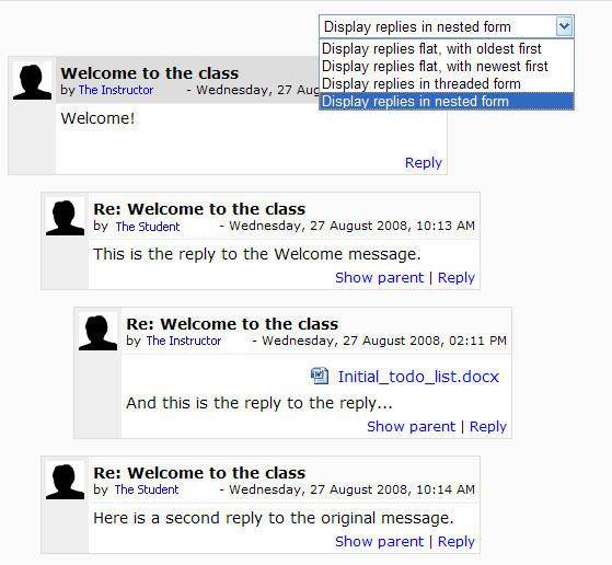
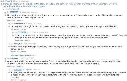
Have you thought of nested thread layouts?


reddit also does it but lets you close posts that are not interesting to you so you can more easily read the whole thread:


This way people can specifically reply to certain posts. And if you don't care for those replies as a reader you can close all of them with one click. The conversations become a bit clearer as well. Of course this only works if the functionality exists in the software to let you specifically reply to certain posts and I don't currently see that in Permies. Just the one button at the top that lets you post.
 
paul wheaton
author and steward
Posts: 52456
Location: missoula, montana (zone 4)
hugelkultur trees chicken wofati bee woodworking
  • Likes 1
  • Mark post as helpful
  • send pies
    Number of slices to send:
    Optional 'thank-you' note:
  • Quote
  • Report post to moderator
Nesting is a way. I do not care for nesting.


Elia Charalambides
Posts: 78
Location: Boston
9
2
  • Mark post as helpful
  • send pies
    Number of slices to send:
    Optional 'thank-you' note:
  • Quote
  • Report post to moderator

What feedback can I give you?


Well, thank you for feedback on my own work but I should have phrased that better. I meant more about what you are looking for in the new design. User retention, increase page rank, usability etc I understand. Though from your own perspective as you are the emperor can you elaborate more on conceptually what you'd like to achieve. More than just :

I wanted something that looked like the interface was something created a hundred years ago but has stood the test of time until today.


Considering that Permies has the rank it does on the world stage in presenting permaculture to the masses and being the first stop many may make on the voyage of permaculture, I believe it needs to be a very all encompassing and less niche aesthetic. Also people come here for the content. And the content needs to take center stage. As presentation of it should be first on the list, second should be the user's ability to find the content they want. Considering permaculture has a wide array of practitioners that may vary in their zeal and interests I think beholding the design to one taste may be alienating to the others.
I in no way argue for craigslist or reddit as I personally believe they are horrendously designed, but the functionality is there and the mass appeal is there(probably because of the functionality and the fact that they are free) and they do have gems of functionality hidden in the piles of crap. Though I do argue for simplicity, but clean simplicity. And clean simplicity can be themed. Sometimes I imagine what reddit or craigslist might look like if they existed in the real world. Probably a mass of people milling about in an increasingly chaotic giant hall, all blabbering at the same time trying to be heard. While Permies is not nearly as bad, I do get the feeling of having to dig, REALLY DIG to find the information I want... and making the aesthetic brown may just be pushing this feeling a bit more now. Also there is something to be said about coming across something I never would have looked for normally because I was spending lots of time on the forums. I think trying to get the average user to that point except removing the "lots of time" and "digging" would be ideal. I think the new forum view page is a step in the right direction.
So my question is can you paint a picture for me about how you would imagine permies if it existed in the real world? What type of place would it be? How would you feel when you went there? What would you see? What would be happening?

Also and on another note as I personally think it helps legibility in especially long threads:

Nesting is a way. I do not care for nesting.


What is it you think doesn't work? Can you elaborate more on why you care not for it?

Thanks,
Elia

Ok now really back to work
 
gardener
Posts: 697
Location: Mount Shasta, CA Zone 8a Mediterranean climate
152
hugelkultur duck forest garden trees books chicken woodworking greening the desert
  • Mark post as helpful
  • send pies
    Number of slices to send:
    Optional 'thank-you' note:
  • Quote
  • Report post to moderator
I took a look at the screenshot of your final goal and I do like the overall look and feel of it. I also agree that it seems a bit dark and wonder if it might be helped by having the background look more like light colored stripped sandstone or a well bleached wood? I have to admit that permaculture being so centered around growth and nature that I feel like a some green is missing, too - something like the center viewing area being a zoomed out view of your permaculture oasis, with the links zooming you in to look closer at individual knowledge "zones" contained within the oasis.

Not so much a look and feel thing as much as a function thing, but I do find myself wishing that the forums had the feature that when you hover over a specific thread link a small window pops up showing you a decent preview of the original post.
 
Cj Sloane
pollinator
Posts: 3738
Location: Vermont, off grid for 24 years!
123
4
dog duck fungi trees books chicken bee solar
  • Mark post as helpful
  • send pies
    Number of slices to send:
    Optional 'thank-you' note:
  • Quote
  • Report post to moderator

Michael Newby wrote:I also agree that it seems a bit dark and wonder if it might be helped by having the background look more like light colored stripped sandstone or a well bleached wood? I have to admit that permaculture being so centered around growth and nature that I feel like a some green is missing, too


I agree but there is a temptation to get too cute. If I have time I'll see if I can't make a mock up I like. Otherwise I'll be quiet.
 
paul wheaton
author and steward
Posts: 52456
Location: missoula, montana (zone 4)
hugelkultur trees chicken wofati bee woodworking
  • Mark post as helpful
  • send pies
    Number of slices to send:
    Optional 'thank-you' note:
  • Quote
  • Report post to moderator
I want more user engagement:

301: I want to triple the number of people per day that switch from lurkers to people that are an active part of our community.

302: I want to triple the number of people per day that look at one thread and leave, to looking at ten threads

I think that this can be done with the look and feel upgrade.

I think that 96% of the people that come to the site have never heard the word "permaculture" before. So this is their first exposure.

So my question is can you paint a picture for me about how you would imagine permies if it existed in the real world? What type of place would it be? How would you feel when you went there? What would you see? What would be happening?


And this is where my personal defects show. I have been managing online forums for ... over 25 years. And most of that time, I worked full time as an engineer. So the question strikes me a bit like "describe blue without anything that is blue." I feel it is beyond my ability to even try.

Nesting: i think that a thread has one topic throughout. The new posting at the bottom is a reflection of all of the conversation that has preceeded. if somebody wants a tangent, the best thing to do is to start a new thread. Nesting is one way. Threading is another. I have participated in both extensively and I prefer threading.


Cj Sloane
pollinator
Posts: 3738
Location: Vermont, off grid for 24 years!
123
4
dog duck fungi trees books chicken bee solar
  • Mark post as helpful
  • send pies
    Number of slices to send:
    Optional 'thank-you' note:
  • Quote
  • Report post to moderator
Screwy formatting issue seems to have moved locations!

Screen-Shot-2013-01-22-at-1.28.52-PM.png
[Thumbnail for Screen-Shot-2013-01-22-at-1.28.52-PM.png]
 
Posts: 8921
Location: Ozarks zone 7 alluvial, clay/loam with few rocks 50" yearly rain
2400
4
  • Mark post as helpful
  • send pies
    Number of slices to send:
    Optional 'thank-you' note:
  • Quote
  • Report post to moderator
I wonder if there will be a mobile version? I'm probably the only one participating on a 3.5 by 5 inch screen in black and white. I was able to switch to the new look but couldn't read the words on the buttons at all. I know you've already covered the darkness and type size issues, maybe when it changes i'll be able to see the words.
 
Posts: 519
Location: Wisconsin
12
  • Mark post as helpful
  • send pies
    Number of slices to send:
    Optional 'thank-you' note:
  • Quote
  • Report post to moderator
I miss the navigation tree at the top of each thread. When I am done reading a thread I hit the "rocket mass heaters" link above the thread to get back to the forum I use most. The links on the side do nothing for me, to get back to the rmh forum I would have to click twice, first on energy and then from the list (for every forum I view). Otherwise looks great!
 
Devon Olsen
Posts: 1273
Location: Central Wyoming -zone 4
46
hugelkultur monies dog chicken building sheep
  • Mark post as helpful
  • send pies
    Number of slices to send:
    Optional 'thank-you' note:
  • Quote
  • Report post to moderator
i feel like elia, in her first post described it in words i could not, at least on one or two points, i suppose i should maybe add some positive feedback or throw an idea in

i understand to an extent wanting to change things at least a little bit, as things stand now, there is the content, which is great, but the stuff that "brands" you as was used earlier in this thread is sorta like seperate elements on a design, placed on a blank background, i can see that this site could be improved by sorta binding these things together to create one solid look as opposed to seperated and (i dont want to say pieced together because it looks much more professional than that, but i cant think of a good word for it being as seperated from other elements as it currently is) not entirely connected
ive never seen a site with a high pagerank that has a complex, textured background, they always have simple, solid color backgrounds, headings may be a different story, but i think if your goal is higher pagerank, you should stay simple for the most part and if your going for weathered than leave the look in the heading for the site and possibly the heading of the individual forums/posts
so i should say that im all for it being improved but feel that this design has a bit to go before it is a leap forward instead of a step back as i feel it is now

i feel the way the new design stands, its kind of constricting and "narrow" is a good word for it
i feel that by getting rid of the side bar and simply keeping the top might rid it of this look, ill throw up a few links to forums that have a similar layout, now im not suggesting you copy them or do anything that is anything less than original or your own, simply trying to put an image to my words - nevermind, of all the forums i frequent, none really look so good aesthetically that i would recommend any sort of similar format


this one, albiet on a contriversial topic, is an international site and the home forums page has a pagerank of 4, it has a heading that is universal throughout the site, containing the users links to their control panel and profile, below they have their current discounts, i could imagine your current video or your newest article or something similar taking this parts place
they then have the forums, going on down the page, with white borders and the content is obviously the focus on this section of the page
at the bottom they have current activity, birthdays... blah blah blah, but all of this while maintaining an original, professional look that doesnt detract from the actual content of the forums
i can imagine your rustic, withstood the test of time design working fine for the header and footer, possibly even on the sides, but i think when youre using such an 'active' background that the current setup is too thick on the sides, if it was either thinned or filled in with the white or extremely light brown than perhaps thicker would work
http://forum.grasscity.com/


I honestly love this site and at times it is the site that i visit most, other times i stick to other sites, depending on what i feel like learning about but permies is definately one of my favorite sites so i do want to see it go in the right direction and help it along in its path to world domination


one more question that has been bugging me and itching the back of my mind, why are you calling it Big moose saloon? or is that simply where it is now to act as a delivery system for showing the new design?
 
paul wheaton
author and steward
Posts: 52456
Location: missoula, montana (zone 4)
hugelkultur trees chicken wofati bee woodworking
  • Mark post as helpful
  • send pies
    Number of slices to send:
    Optional 'thank-you' note:
  • Quote
  • Report post to moderator
we have taken the beta view down for now. We'll probably come back with it later when Jaikiran has more to show.

In the meantime, if folks want to persuade via mockups, now is a really good time.
 
Posts: 14
  • Mark post as helpful
  • send pies
    Number of slices to send:
    Optional 'thank-you' note:
  • Quote
  • Report post to moderator
I am really attached to the current simple layout of permies. It makes it easy to browse through, and its simplicity brings me comfort. Also, whatever happens, PLEASE DONT CHANGE THE HOME PAGE! witht he growies, critters, etc... it is flipping brilliant, and warms me up every time i see it
 
Elia Charalambides
Posts: 78
Location: Boston
9
2
  • Mark post as helpful
  • send pies
    Number of slices to send:
    Optional 'thank-you' note:
  • Quote
  • Report post to moderator

In the meantime, if folks want to persuade via mockups, now is a really good time


Now!? You are demanding sir ! As I really want to offer my skills and thoughts I'll try my hardest to have some ideas visualized by the end of this week.

So the question strikes me a bit like "describe blue without anything that is blue." I feel it is beyond my ability to even try.


Well, I have listened to many of your podcasts and read many threads on this site and I think you are quite good at describing things you may envision. You don't give yourself enough credit.

In terms of nesting I can totally understand your desire to cleanly categorize threads and topics but human nature is human nature and people tend to spill off on tangents within threads. I believe having a toggle for nesting replies within a thread could greatly increase legibility, especially of very long threads, for those users that find use in it(another percentage whose brains can be infected). You could have the default set to what it is now and people could then choose to look at it in nested format. Again if the goal is user retention and engagement as many strategies as possible should be in your arsenal. One thing I've learned over and over again is that users basically fall into a few categories. The lazy 30% and the very lazy 70% (i totally made those numbers up based upon my own experiences) and as a designer I must cater to that laziness to be effective. Sometimes people call it intuitive design to glorify it but at its core its just a way to pull in a broader audience by tapping that innate laziness.

What do you mean by this:

Note that the stuff at the top of the frame is much more compact than before. That is something that bothered me with the old interface


Are you talking about the cookie crumbs that you removed in the new design? I think keeping cookie crumbs should be included perhaps not as visually prominent as before but many users are very familiar and feel "safe" seeing their trail through the site.

Other thoughts coming. In the meantime could you pm me the mockups for the thread,forum, and front pages(and anything else)? If you don't mind I'd like to take a look at the full direction you are thinking of as I believe it will help inform my own mockups in ways that your feedback may not.

Thanks,
Elia

p.s.

elia, in her first post


elia is a he
 
Elia Charalambides
Posts: 78
Location: Boston
9
2
  • Mark post as helpful
  • send pies
    Number of slices to send:
    Optional 'thank-you' note:
  • Quote
  • Report post to moderator
I'm going to think out loud. You can throw it away or not but it will help me keep my thoughts in one place and perhaps get some feedback on them from others.

Permies-wide inconsistencies:

1)Main navigation:
-what is the main navigation? Depending on what part of permies you visit there is a different structure to it(richsoil as compared to the forums). While I understand the purpose of having seperation between Richsoil and Permies if the point is to increase user discoverability then a homogenized main navigation will help towards this purpose. After all there are many internal ads(mini banners that lead to richsoil while in the forums) that guide users from one site to the next. Creating an overarcing main navigation further promotes the permies "brand" and creates an overall consistent vision of the empire as one place instead of a disjointed user flow experience.

2)Main page illustrative aesthetic doesn't carry strongly into the forums. Again this is a comment focusing on keeping the experience consistent.

Promotion of visual material:
1) Paul, to your point on how you've seen people react generally more positive to your videos, visuals and presentations than those people that just hear you talk about something. I think you pushing your videos really helps get messages across further. Though the new design you showed doesn't really highlight or feature them. other than dumping them at the top of the page. I think there may be great value in brainstorming a way that videos can be more featured in the experience overall and creating a way in which by clicking on a video thumbnail doesn't initially drive you to the forum but just expands/pops up/slides over the video so you can watch it immediately and then there is functionality to bring you to the forum where it lives. My thought is to remove as much clicking and scrolling as possible (down to 0) from when someone clicks that video thumb to when it starts playing.

Header:
1) The permies logo + the video thumbs + an ad + "permies" nav ( Search | Permies Wiki | Recent Topics | Hot Topics etc etc) causes the actual content of the page to get pretty much past the page fold on small screens and fills half the page on larger screens.
 
Elia Charalambides
Posts: 78
Location: Boston
9
2
  • Likes 3
  • Mark post as helpful
  • send pies
    Number of slices to send:
    Optional 'thank-you' note:
  • Quote
  • Report post to moderator
I should note that one of the wonderously fantastic things about your site(from a designer's perspective) is that you have virtually no ads! And the few ads you do have are very much controlled by you in terms of their look and feel. Except for maybe the adchoice ads at the bottom of threads , which in themselves are incredibly unobtrusive, having basically no ads on a site that delivers as much content as a newspaper is pretty incredible.

From a user experience perspective there isn't anything blaring and fighting for the user's attention that you don't have control over. While I'm sure you are abundantly aware of this, I think its worth noting again and pushing the fact that it needs to be taken advantage of.
 
paul wheaton
author and steward
Posts: 52456
Location: missoula, montana (zone 4)
hugelkultur trees chicken wofati bee woodworking
  • Mark post as helpful
  • send pies
    Number of slices to send:
    Optional 'thank-you' note:
  • Quote
  • Report post to moderator

What do you mean by this:

Note that the stuff at the top of the frame is much more compact than before. That is something that bothered me with the old interface


The stuff at the top would sometimes get too tall. The beginning of the thread/forums would sometimes be below the fold.


mockups for the thread,forum, and front pages


The thread view mockup:

http://www.coderanch.com/t/594921/a/3798/thread-view-permies.png

forum view mockup:

http://www.coderanch.com/t/594921/a/3815/forum-view-permies.png

forums view mockup (for coderanch):

http://www.coderanch.com/t/594921/a/3812/forums-view-coderanch.png
 
paul wheaton
author and steward
Posts: 52456
Location: missoula, montana (zone 4)
hugelkultur trees chicken wofati bee woodworking
  • Mark post as helpful
  • send pies
    Number of slices to send:
    Optional 'thank-you' note:
  • Quote
  • Report post to moderator
main nav: the new look and feel goes with a very different focus of primary navigation.

main page matching forums: yes, and alexander is working on that.

promoting videos: yes, the new look and feel does a much better job in that space (IMO)

ads: i like keeping the ads simple, small and on topic. I like the fact that our users do tend to actually visit our advertisers, and I like the idea that our advertisers get a good response rate. Therefore, keeping it simple works out best for everybody.


Elia Charalambides
Posts: 78
Location: Boston
9
2
  • Mark post as helpful
  • send pies
    Number of slices to send:
    Optional 'thank-you' note:
  • Quote
  • Report post to moderator


Okay, I've attached some thoughts to increase usability and discoverability of content.

Notes:
Dont know if its clear but the Post Reply button sketches are not to scale with the drawing above them. They would basically float attached to the left hand of the left column(thread column).

Please forgive the gridded background, I hope you can see past it. The scanner is not so great when scanning my sketchbook.
I think bringing the main nav to the top would open up the dead space created underneath a left hand nav, which is vital on a forum as its all about scrolling. Pulling the forum thread to the left and minimizing it say 760-800 or so pixels would give room for a content well on the right that could be 160-200pixels wide. This would make the threads more readable as they wouldnt stretch so far across the screens and bring more discoverability of content to Permies by using the right column for featured or highlighted content(really anything your heart desires:videos, podcasts, quotes, images, links to other threads, ads etc etc). Also taking it out of the top of the layout would bring the entire page content up above the page-fold more.
PermiesThreadConcept.jpg
[Thumbnail for PermiesThreadConcept.jpg]
Permies Thread View Concept
 
Elia Charalambides
Posts: 78
Location: Boston
9
2
  • Mark post as helpful
  • send pies
    Number of slices to send:
    Optional 'thank-you' note:
  • Quote
  • Report post to moderator
Consider grouping all the "My Account" links and functionality together and in the upper right of the page. As this is very common practice and users would be familiar with it being there.They would know where to look for it and find it where they look. Less confusion.

Also consider making the main navigation structure be a collection of main forum trunks and other main sites. Perhaps something like:
Articles | Videos| Podcasts | Growies | Critters | Building | Homesteading | Energy | Living | Community | Wilderness | Regional | Global | permies.com

If this is the case then Videos shouldn't lead out to youtube. They should stay within the permies experience and all be embeded in one page or set of pages.
If this is too many links to be part of the main nav then all the forums could just be grouped under "Forums" so it would be :

Articles | Videos | Podcasts | Forums

and Forums would have a drop down of then each of the main trunks.

-Elia
 
paul wheaton
author and steward
Posts: 52456
Location: missoula, montana (zone 4)
hugelkultur trees chicken wofati bee woodworking
  • Mark post as helpful
  • send pies
    Number of slices to send:
    Optional 'thank-you' note:
  • Quote
  • Report post to moderator
So first i want to say that I still like the look and feel direction that we are already moving in. The stuff you listed does give me some additional ideas for future stuff to add to that, after we get the current beta out of beta.

The ideas that you presented that I like are:

stuff in the side column. Only with our current approach, it would be on the left and only if there is room.

The idea of a fixed reply button sounds intriguing. Again, something to explore when we get much further along with the beta.

Thanks!

 
Elia Charalambides
Posts: 78
Location: Boston
9
2
  • Mark post as helpful
  • send pies
    Number of slices to send:
    Optional 'thank-you' note:
  • Quote
  • Report post to moderator
Consider keeping the wrapper the same throughout all aspects of permies (and richsoil?). i.e. the Header, Footer and even the right column highlighted items content well. While the left column would change based upon where the user is and what they visit. Also consider that the highlighted items column can be tailored to respond to what the user is doing. Perhaps throw the "similar threads" links in there or show vids and pics of more swales , hugelkultur, raised beds if the user has made a search or is currently viewing such content in the left column.
-Elia
 
It's never done THAT before. Explain it to me tiny ad:
the permaculture bootcamp in winter (plus half-assed holidays)
https://permies.com/t/149839/permaculture-projects/permaculture-bootcamp-winter-assed-holidays
reply
    Bookmark Topic Watch Topic
  • New Topic