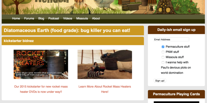
So I have implemented some "ads" on the top of each of the new richsoil article webpages for our kickstarter but it doesn't seem like they are doing too well. You can see them
here,
here, and
here. Or here is a screen shot to make things easier:

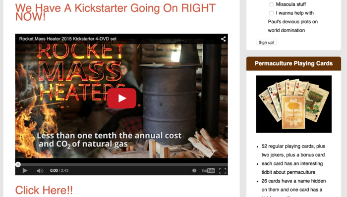
Then, on the rocket stove article, we have the video embedded, and you can see that
here.
Screen shot of this one:

Basically what I am asking is, what are ways we can make these sections look prettier or more enticing so that we can convert all the tons of traffic to those pages, into supporters of our kickstarter!!
Would there be a better image? Better font? Better sizes? I will welcome ANY feedback.


