• Post Reply Bookmark Topic Watch Topic
  • New Topic
permaculture forums growies critters building homesteading energy monies kitchen purity ungarbage community wilderness fiber arts art permaculture artisans regional education skip experiences global resources cider press projects digital market permies.com pie forums private forums all forums
this forum made possible by our volunteer staff, including ...
master stewards:
  • Nancy Reading
  • Carla Burke
  • r ranson
  • John F Dean
  • paul wheaton
  • Pearl Sutton
stewards:
  • Jay Angler
  • Liv Smith
  • Leigh Tate
master gardeners:
  • Christopher Weeks
  • Timothy Norton
gardeners:
  • thomas rubino
  • Jeremy VanGelder
  • Maieshe Ljin

look and feel improvements for september 2016

 
author and steward
Posts: 52410
Location: missoula, montana (zone 4)
hugelkultur trees chicken wofati bee woodworking
  • Likes 1
  • Mark post as helpful
  • send pies
    Number of slices to send:
    Optional 'thank-you' note:
  • Quote
  • Report post to moderator
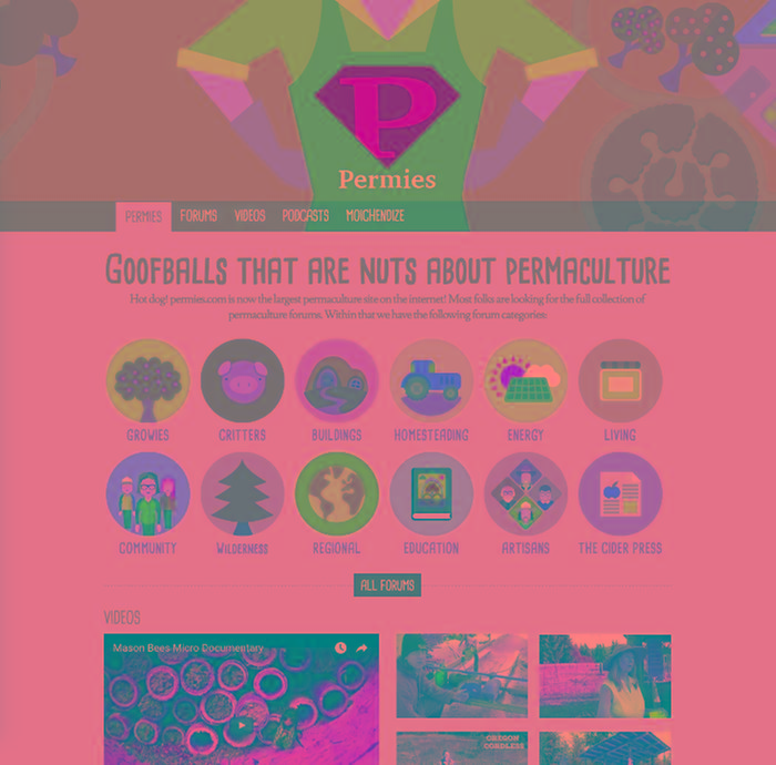
We have a new home page at https://permies.com that looks a bit like this:


And we get our forum software from my other website, coderanch, which used to be javaranch.  Both https://javaranch.com and https://coderanch.com got home page overhauls:


Olof did all three designs.

Olof also made a suggestion for changes to the forums look and feel:
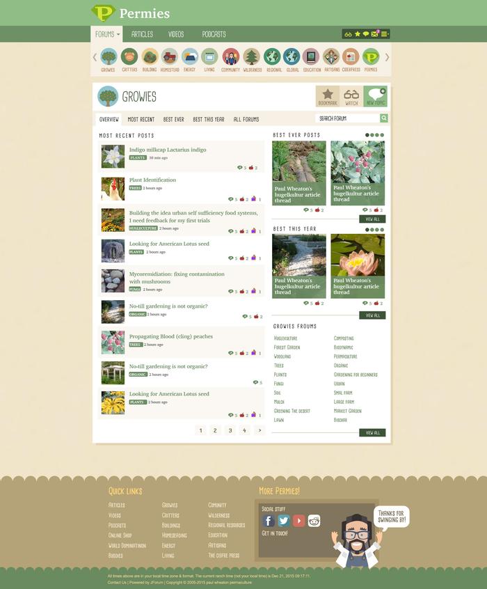


Right now is a really good time to figure out where we might want to go from here for the forums.  I think we need to follow two big steps:

step 1:  figure out where we want to end up.

step 2:  make a list of about a dozen changes to we get there.


Anybody wanna take a stab at an alternative look for the forums that would work for both permies and coderanch?


steward & author
Posts: 38382
Location: Left Coast Canada
13632
8
books chicken cooking fiber arts sheep writing
  • Mark post as helpful
  • send pies
    Number of slices to send:
    Optional 'thank-you' note:
  • Quote
  • Report post to moderator
I know I'm usually the one to dig her heals in and say "No CHANGE!", but this time, I like the new look.

I like that it's bright.  Off-white background with dark letters is a must for people with language disabilities.  From what I can see, it looks clean and intuitive to use.


One thing that strikes me is that there isn't much space on the page for the forums.  It would be difficult to navigate on a tablet - but there is a mobile view which gets around this problem.  Would this be a gateway to the forums or the actual main forum?  I still like the clean table style for my main browsing, but I think this would be a great introduction for people new to the site.

ps, also is it fast to load for people with limited internet?
 
pollinator
Posts: 320
Location: Quebec, Canada
48
hugelkultur forest garden trees urban
  • Mark post as helpful
  • send pies
    Number of slices to send:
    Optional 'thank-you' note:
  • Quote
  • Report post to moderator
What would be very practical when doing a search on the Search page is to have the "forums" selection box given more height as it is difficult to find the right forum.
 
a fool thinks himself to be wise, but a wise man knows himself to be a fool - shakespeare. foolish tiny ad:
12 DVDs bundle
https://permies.com/wiki/269050/DVDs-bundle
reply
    Bookmark Topic Watch Topic
  • New Topic