Its looking very good!
You can look at the whole page, semi-closing your eyes, to see if anything stands off when it shouldnt.
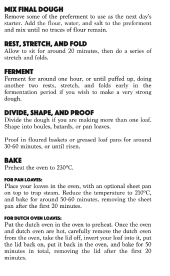
Are you using more then two fonts? You can pick a font that has many variations in weight, condensed and so on.
I'd use less the bold weight. The numbers don't need to be bold.
In the screen, serif fonts look funny. Experiment printing a page or two - a sample at the scale you want the final product to be - and see if you like it. You can experiment printing various types if you're not sure. Picking a type can be the hardest part. Go for the first that "clicks", don't overthink.
In terms of spacing, it should be, "ascendently" like so:
space between leters < space between words < space between lines < space between paragraphs < space between columns < margins to the border of the page
this rule is when "objects" need to be together. If they don't, say, a table and a text, one allows them to breath. Like how you did.
I'd pick a diferent heading font, that looks very bulky. But its a matter of taste

For a book teaching how to cook good food - as in gourmet level - one can pick a refined classy font, that will make the page beautiful. Should be easy to find a serif that'll do the trick. Maybe the one youre using on the body, bigger.
About the introduction paragraph, try this on for size: instead of italic, loose the italic, make it a bit bigger then the body text. If you have a non serif version of your body's font, try it too.
Enjoy the process!