I don't think it's a good idea at all to have different covers for p/b and h/b editions (option #3). Lots of reasons, but the main one is that you'll confuse the audience (and the purchasers).
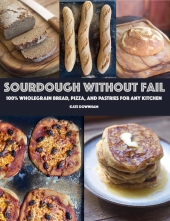
I voted for the multiple images (#2) because they illustrate the book title. But I actually prefer #1 from a design perspective because it's clear and attractive.
I agree with all the comments about visual clutter in option #2, and the baguettes do seem to fight with everything else.
I like the suggestion that you could put some of the detail (#2) on the back cover, and use #1 as the front cover.
I also like the suggestion that a fresh shoot, with several creations visible in the one image, may work.
I'm craving some sourdough RIGHT NOW! - must be something about those pictures!!!
Good luck with the project.


