• Post Reply Bookmark Topic Watch Topic
  • New Topic
permaculture forums growies critters building homesteading energy monies kitchen purity ungarbage community wilderness fiber arts art permaculture artisans regional education skip experiences global resources cider press projects digital market permies.com pie forums private forums all forums
this forum made possible by our volunteer staff, including ...
master stewards:
  • Carla Burke
  • John F Dean
  • Timothy Norton
  • Nancy Reading
  • r ranson
  • Jay Angler
  • Pearl Sutton
stewards:
  • paul wheaton
  • Tereza Okava
  • Andrés Bernal
master gardeners:
  • Christopher Weeks
gardeners:
  • Jeremy VanGelder
  • M Ljin
  • Matt McSpadden

Kama pigments. Canadian made oil paint (review)

 
steward & author
Posts: 42080
Location: Left Coast Canada
15398
9
art trees books chicken cooking fiber arts
  • Likes 6
  • Mark post as helpful
  • send pies
    Number of slices to send:
    Optional 'thank-you' note:
  • Quote
  • Report post to moderator
I stumbled on 
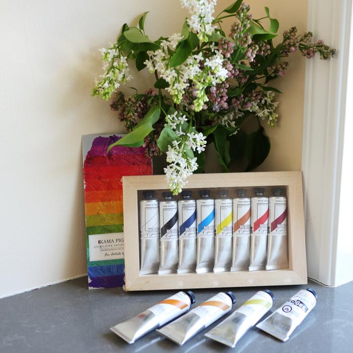
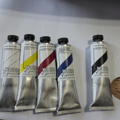
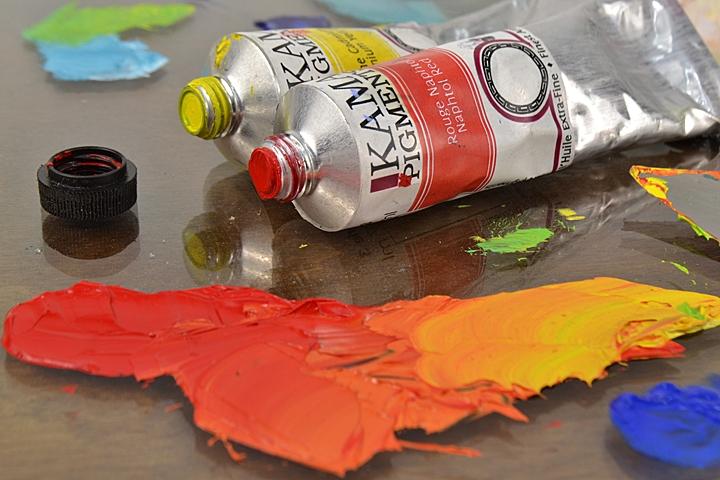
kama pigments oil paint and it looks like they are made in Quebec, canada.


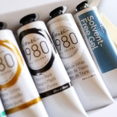
The price is amazing compared to other paint brands we can get here.  On par with the student line 1980, but from what I can tell, it's a professional quality brand, probably mid level professional which would put it somewhere near US-made M Graham (my current favourite) but more creamy and less runny.  Like M Graham, Kama uses walnut oil, so I am hopeful they also have a slow drying time.

That's all I know so far. But I want to know more, so a thread for gathering information about the brand with a view to making an order the next time I run out of yellow ochre.  I'm forever running out of yellow ochre, and a variation of the zorn palette seems to be a good way to judge a brand as the care they put into a cheap earth colour (or fail to put care into it) like yellow ochre, is a good mark of how the brand as a whole will behave.

Anyone paint with Kama before?  Or used some of their other art supplies?

 
r ranson
steward & author
Posts: 42080
Location: Left Coast Canada
15398
9
art trees books chicken cooking fiber arts
  • Likes 4
  • Mark post as helpful
  • send pies
    Number of slices to send:
    Optional 'thank-you' note:
  • Quote
  • Report post to moderator
Here are some beautiful images of their paint making process.


Having that much french in one go is bringing back trauma from my school days.  We are woefully terrible at being bilingual on the west coast.  I speak better Japanese than French.  Although reading French is easier.  This might be why I'm having so much trouble finding reviews on this paint.  Google is only returning English language results.

It looks like this video is too old for youtube to auto populate CC, but maybe if a few more people watch it, we can get some captions and I can read what he is saying.

Anyone up for the challenge?   Not sure if we can watch here or have to on youtube for it to work, but it usually takes only four or five people watching it to awaken the cc generator.
 
r ranson
steward & author
Posts: 42080
Location: Left Coast Canada
15398
9
art trees books chicken cooking fiber arts
  • Likes 2
  • Mark post as helpful
  • send pies
    Number of slices to send:
    Optional 'thank-you' note:
  • Quote
  • Report post to moderator
I wonder where the lightfastness for these paints is listed, or do we have to judge by pigment reputation?
 
r ranson
steward & author
Posts: 42080
Location: Left Coast Canada
15398
9
art trees books chicken cooking fiber arts
  • Likes 2
  • Mark post as helpful
  • send pies
    Number of slices to send:
    Optional 'thank-you' note:
  • Quote
  • Report post to moderator
I'm still firmly on my art supply no-buy so this is more a dream-list than what I plan to buy.  

The idea is to find paints that would give a representative sample of what the company is like while working with how I normally paint.  

yellow ochre of course.  Natural & synthetic iron oxide - Py 43, Py 42 are both well established as light fast pigments.

titanium white because it's a good indication of how the paint makers make their paint.  Also, I think a zorn-like palette would be a good place to start.  Titanium dioxide - Pw 6

Ivory black for the same reason as the white.  Tri-calcium phosphate - Pbk 9

naphthol red to complete the zorn palette.  pigment(s): Naphthol AS - Pr 170 (don't know the lightfastness of this yet).  

(They do have a vermillon version of naphthol, but it has a lot of pigments including zinc white.  I don't enjoy white being pre-mixed into my paints, so maybe not this one)

red ochre is one I've always wanted to try.  Synthetic iron oxide - Pr 101 is another well established lightfast pigment  

And I would get their two naples yellow because I'm curious what it's like.  

naples yellow light  Nickel Titanate, Synthetic hydrated iron oxide - Py 53, Py 42 (I don't know the lightfastness on these pigments)

naples yellow deep which interests me the most as it contains only  Chrome Titanate - PBr 24  (don't yet know the lightfastness on this pigment)


7 colours would get me to about $90CAD.  I think that qualifies for free shipping, but with tax, a hundred and something easy.  

The problem is, that's actually a very good price for professional grade paints.  Although, I wonder if I really need the black and white as I have a lot of that with other brands and am unlikely to run out.  

And thankfully, I'm on my no-buy so it's going to be a while before I can invest in something like this.  
 
r ranson
steward & author
Posts: 42080
Location: Left Coast Canada
15398
9
art trees books chicken cooking fiber arts
  • Likes 2
  • Mark post as helpful
  • send pies
    Number of slices to send:
    Optional 'thank-you' note:
  • Quote
  • Report post to moderator
The world is cruel.  Every time I've saved enough money up to place my order (and meet minimum for free shipping), something steels that money.

First, I suddenly needed a bunch of new socks as they were weirdly wearing out a hole in the ball of the foot.  Every socks for like two weeks ended the day with a hole in it.  

Then I needed new shoes because apparently they had a hole in the bottoms of the 15-year old shoes that were otherwise perfectly serviceable.  (and yes, it took two weeks to figure this out).

That sort of thing keeps getting in the way.  And to be open about it, I have enough paints for now.  The appeal comes wanting to test these paints BEFORE I need them.  That way I can know if they are a viable backup if I can't get my favourite.  

But it has given me time to change my mind on what colours I would get.  I've been looking at historical palettes and notice that red ochre is quite common.  And for some reason I keep using up ultramarine even though it's not my favourite.  But I figure so long as I get a yellow, blue, and red for the review, the rest can focus on colours I want to try or frequently run out.  So here's my current wish list.

red ochre

French ultramarine blue

spanish gold ochre - semi transparent yellow ochre!  Exciting!

naples yellow light and naples yellow deep

pyrrol red - because I want a deep red for the review and it's a pretty lightfast pigment.  

And asphaltum of course.  Because I've always wanted to try it.  Although, that is a lot of different pigments.  not sure how it's going to behave - but that's also part of the fun.

and I don't know if that gets me to the minimum for free shipping or not.  But I've got another month or so to save up - unless something else decides to fall apart.  
Content minimized. Click to view
 
r ranson
steward & author
Posts: 42080
Location: Left Coast Canada
15398
9
art trees books chicken cooking fiber arts
  • Likes 2
  • Mark post as helpful
  • send pies
    Number of slices to send:
    Optional 'thank-you' note:
  • Quote
  • Report post to moderator
I give these oil paints 9 out of 10 acorns.

Well, I say 9 and the Kama oil paints are very clearly awesome as you will find out in a moment.  The expierence buying the paints less so.  Let's start there.


SHOPPING AND SHIPPING

I'm not knocking any acorns off for this, but it's worth mentioning.  The website didn't make it as easy to select and buy the items as I'm used to.  There was no pay pal option and I had to enter my credit card details - something I'm always nervous about with a new site.  After I entered those details, it asked me to agree to the terms and conditions of the site.  These are pretty standards, but it's really really odd to have this after the credit card screen.  I wasn't able to ship to my (indoor, climate controlled, locked) PO box (even when there wasn't an issue with Canada Post) and in the end it was shipped UPS.  UPS has a terrible reputation on the West Coast and had several delays like the first warm day of spring we had a delivery delay due to Weather Emergency.  The weather was too nice to deliver parcels, alas.  

I was also confused as to what I was buying with the pre selected paint box.


The colour name in the listing didn't match, and I had to find the listing for each paint colour to find out the pigment information.  I still haven't figured out what kind of gesso is used on the panel.

What can I say?  I'm a lazy shopper and I don't like to have to hunt around for the information I want nor am I likely to contact the shop for a little detail like this.  I was happy with either colour, so I took a chance.

The whole shopping expierence was a let down and when the paints finally arrived, I had lost a lot of enthusiasm for them.  

When I got around to painting with them, WOW!  What a wonderful surprise.  


PRETTY!

Just look at this!


I ordered The 8-colour kit with primed panel and some other paints.  I probably didn't need the yellow ochre after all as the indian yellow fills that gap nicely - if transparently.  It's still nice to have yellow ochre for a zorn palette.  

The box was excessively well wrapped and everything arrived safely.  Even a cute drawing when I opened the box to show that extra bit of care.


These oil paints are made in Canada, using walnut oil as the binder.  I'm a big fan of walnut oil paints as they tend to dry a bit slower than linseed, have reduced yellowing, and are just generally smoother to work with.  The back of the tubes are clearly labeled and no magnifying glass required.  I love that they have the empty and full square to indicate transparency, as well as words.  This is something I struggle with, especially in student grade paints where they don't imagine a painter would care about such trivial qualities - spoiler, the more I paint, the more I care about transparency and opaqueness of the paints.  

Given how expensive imported big-brand paints are in Canada, Kama paints work out to be cheaper than any of the big brands in the local shops.  The price is on par with student grade paint, but from my experiments so far, these are not anything like student paints I've met.  Professional grade paints for a student grade price - made in Canada!  This is why I had to try them.  

However, the label is missing one very important piece of information - lightfastness.  I also couldn't find lightfastness ratings on the kama website either.  For this, the paint looses one acorn.  

I can, of course, look up the pigment lightfastness but there is also a lot of range one pigment can have.  What is ASTM II in one brand is ASTM I in another (py74, why you gotta do this to me?).  There is something science happening here to do with particle or binder to pigment ratio that I never quite got the hang of.  ASTM is the normal testing for lightfastness in paint (the other international standards is Blue Wool but that's more for dye based colours).  ASTM I through ASTM III are considered good enough lightfastness to sell it and it probably won't fade under gallery lighting conditions (indirect light, climate controlled, etc).    I understand that ASTM is pretty expensive, especially when a brand has so many colours (Kama has a lot of colours).  I've seen some of the newer paint makers, especially out of china, do their own in house tests and set up their own star rating.  

Basically, for everyday painting and learning how to paint, lightfastness isn't much of an issue.  But for paintings that are wall worthy or if someone is selling the painting, lightfastness is one of the most important things to think about when choosing a paint.  

I think I might set up a window test where I put some paint on a paper, tear it in half, then put half in a sunny window and keep half in the dark.  This, contrary to popular believe on the internet, will NOT give me lightfastness results.  Lightfastness requires climate control and only light being the changing variable - windows change temperature and humidity dramatically throughout the day.   The window test gives me something better - it's a permanence test by exposing the paint to conditions unlike they would ever expierence in a hundred years of neglect (unless they were put in a window) we can find out how the colours hold up to both light and abuse.  

This deficit is a shame because without  it, this could easily replace all other paints in my paint kit.


BUT CAN IT PAINT A CHICKEN?!?

I begin by choosing a limited palette to play with.  Let's see how far it can go.  A mixture of transparent and opaque colours.


This review is done painting directly from the tube, no medium or solvents added so I can get a fair comparison with other brands I've reviewed so far.  

There was no sign of binder separation which is a nice change from other brands.  Maybe the paint is fresher?  

When I squeezed the paint out of the tube, I was worried I had gotten dried up tubes.  It was tough for my arthritis.  But once I start working with the paint on the palette - oh wow!  

Do you like chocolate?  Not just chocolate bars from the grocery store, but really good chocolate.

I'm rather fond of chocolate myself.  

I thought I understood chocolate until one day I bought a six dollar, handmade champagne truffle from a local shop.  It was a life altering expierence.  That moment forever divided my world into stuff that calls itself chocolate and this ultimate expierence!  

Once I start moving the paint on the palette and mixing colours with the knife, the Kama paint took on a texture that was so pleasant, it felt like it was mixing itself.  I've never expierence anything like it.  There is a word out there that starts with a T that means "stiff when still, fluid when mixing" and I never understood what that meant until now.  This paint is that word.  And that's perfect for oil painting because sometimes we want the paint to glide and other times we want the brush stokes to stay where we put them.

Mixing a variety of reds with the Hansa and Alizarin Crimson was quick.  Beautiful and just the right amount of transparent.  After testing it on the chicken (her name is Cathy), I felt compelled to try it as a glazing layer as this might be the final perfect colour I need to improve Little Chicken's portrait.  


Wow!  Powerful and perfect for glazing.  No medium added.

This is one of the few paints I've tried that takes the idea of "transparent" seriously.  After a few moments, I am feeling a strong amount of pigment, and yet, it's letting the light through when it says it would (I'm looking at you M Graham, Winton, and 1980 - transparent means the light can pass through the paint without adding an excess of oil or medium!).  It's like stained glass in one of those really old churches in Europe that didn't get bombed and the glass broken.  So pretty!  Light and colour and... I can go on and on about the glory of transparent oil paints.

At first stroke, I am happy with this paint.

Let's see what happens when I add some white


The white is predictable.  It behaves exactly as it should.  Quite strong pigment like most professional Titanium white oil paints, so it needs the normal amount of caution.  But not as blue as a lot of T-white which I really appreciate.  

I mixed a pile of white with the yellow to make a cream that was maybe 8 on the greyscale.  When I put it on the chicken, it looked bright.  Love it.  


So I start playing with blue and black to see how they interact with the other colours.  This mars black is a bit less 'warm' than I'm used to.  I like it.  It was very friendly when mixing with other colours.  

I am, however, having trouble with the excessive vibrancy of the paint.  It's taking all my skill to "knock back" (desaturate) the colour.  I didn't know I needed more practice in this area, but I've also been working with a lot of earth colours lately.  

Ah, the eye! It's always the tricky part.  


I was able to get the shadows smooth without brush marks, but leave the brush marks in the spots that matter.  Blending easy, and not blending even easier.  

Drying time was on par with most linseed oil paints I've tried.  The mars black didn't skin over as quickly as say Old Holland's mars black (4 hours or less).  For walnut oil based paints, I was expecting more open time as the tiny piles of paint I had on my palette were only workable for about 24 hours.  However, the paints responded well to a clove box and stayed workable several days.  The painting dried in a reasonable amount of time - a few days.  

And here is my hen.  Not bad for just under two hours.


But wait!

There's more!

The next morning, I discover the sunlight has found my painting and it glows so pretty!  The way this paint interacts with light is unlike anything I've ever seen before.  I don't really know how to describe it.  There is a lot more to learn about this paint!  I can't wait to get to know it better.


CONCLUSIONS

So who is Kama paint for?

If it wasn't for the lack of lightfastness testing, I would say it's a lovely, mid to high end professional paint.  Not as stiff or pigmented as Old Holland, but more so than W&N and Opus.  Very close to M Graham in texture and vibrancy, maybe a touch brighter.  

It's also a wonderful paint to use solvent and medium free.  Small batch, hand made, high quality, makes this very acceptable for permaculture art.

For the quality of paint, and the price of oil paint in Canada, this is an excellent value as it's cheaper than any of the professional brands we can buy locally.  

That said, the website outsmarted me several times, making it difficult to order.  The lack of lightfastness rating worries me.
 
r ranson
steward & author
Posts: 42080
Location: Left Coast Canada
15398
9
art trees books chicken cooking fiber arts
  • Likes 3
  • Mark post as helpful
  • send pies
    Number of slices to send:
    Optional 'thank-you' note:
  • Quote
  • Report post to moderator
One of the reasons why I choose this cheap black panel for reviews is it's not good.  It's just the wrong quality of absorbency that the paint will often feel oily while painting and dry uneven (sinking in) so that patches look matt and dull, while other parts of the painting look almost wet they are so oily.

With this paint, none of these problems happened as the paint dried.  It dried with a unified gloss, even with no medium added.
 
Hustle until your haters ask if you’re hiring --tiny ad
Learn Permaculture through a little hard work
https://wheaton-labs.com/bootcamp
reply
    Bookmark Topic Watch Topic
  • New Topic