Potter's pink is possibly the most beautiful watercolour paint ever. It's heavily granulating, earthy pink. Used for natures, urban sketching, portraiture, and so many things. Potter's pink checks all the boxes.
There are only two things wrong with it.
1. It's often not very strongly pigmented
2. It's one of the most expencive non-specialty colour.
I wonder,
can I make Potter's pink (hue) at home but better and cheaper?
Well, one can buy pigment and mull their own paint at home. But Potter's pink pigment looks even more expensive than the pre made watercolour
So, what if I mixed some paint together?
Other than the hue (colourness - saturation and value can be managed through water control in watercolours), the most important element is the granulation. Since this is a hue (same word, but means substitute for the original colour in this context), I don't mind multiple pigments if it gives the desired look and behaviour. One pigment would be good to have heavy, earthy pigment that settles unevenly into the texture of the paper (the granulation part) and another pigment could be more staining and evenly floating in the water like a solution. Think i want a mixture of lentils and sugar in water - one sinks to the bottom, the other blends with the water.
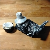
Then I discovered professional grade raw umber, in this case,
by jackson's , and this is a delightful. It's a desaturated brown, leaning towards a warm black. It's extremely granulated. And it plays well with others.
Student grade raw umber was none of these things.
This changes everything!
I play around with mixing this and various colours on my palette. Van gogh has dusk pink which is granulating, but nope, not quite the colours i seek when mixed with raw umber. Cotman rose? Too pink still. Eventually I settle on Rembrandt Alizarin crimson and raw umber as being closest. Still needs a bit more something.
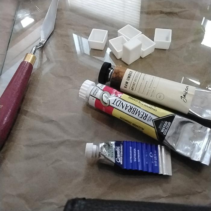
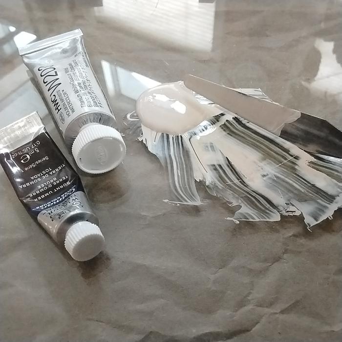
Glass slab from an old shelf, empty watercolour pans to put the finished paint in, palette knife to mix things up, and some tubes of watercolour paints. Is that everything? Oh, paper towels, water, brush, and paper for sampling.
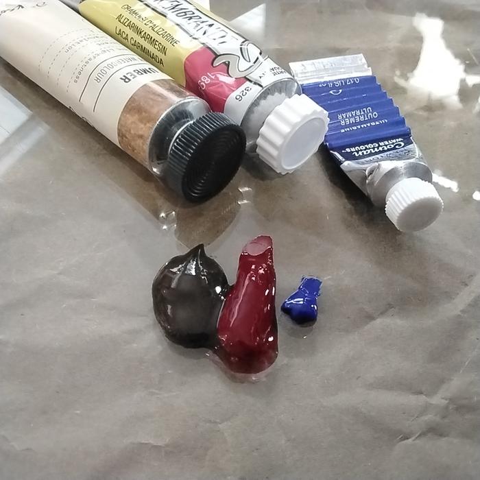
This is just a starting place from earlier mixing experiments. Spoilers, it needed a lot more raw umber.
I mixed them together with a palette knife, and then tested. Added more raw umber, tested again.
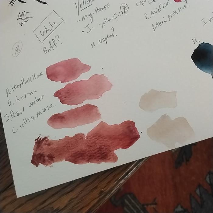
Until I was happy.
The thing I struggled with most was the paints losing moisture quickly and drying on the glass and palette knife. I wish i had a spray bottle with clean water. I had to work quickly and had no time to photograph stuff.
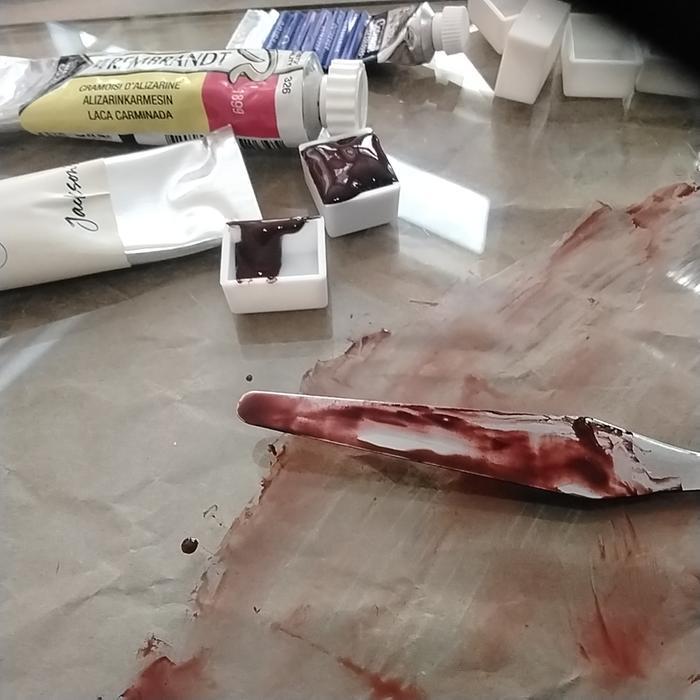
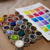
I managed to get a bit more paint into the pans after this. But pretty happy with the results.
I got a pink that is heavily granulating, earthy coloured. It's a bit more pigmented (saturated) than potter's pink I've seen in person, but that's what I wanted.
Most importantly, these are all series one colours, aka, the most affordable.
Best document the recipe in my swatch book.
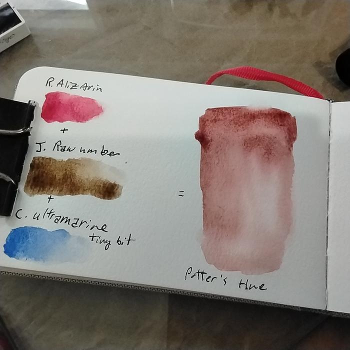
I don't think these pictures show the colour well enough, but maybe you get the idea? In person, it's exactly what I had hoped it would be.
And why not just mix this from the individual paints on the fly? Normally, I would. But today, I'm building a limited palette and neither Alizarin nor ultramarine will likely find a place there. But I do want potter's pink (hue) and I'm excited what I can do with this colour. I might even mix up a few more convenient colours for this little limited set,
Note, hue meas it's not made with the pigment most often associated with the paint name.











 3
3