Permies' kickstarter is live!
click here
  • Post Reply Bookmark Topic Watch Topic
  • New Topic
permaculture forums growies critters building homesteading energy monies kitchen purity ungarbage community wilderness fiber arts art permaculture artisans regional education skip experiences global resources cider press projects digital market permies.com pie forums private forums all forums
this forum made possible by our volunteer staff, including ...
master stewards:
  • Carla Burke
  • Nancy Reading
  • r ranson
  • John F Dean
  • Timothy Norton
  • paul wheaton
  • Jay Angler
stewards:
  • Pearl Sutton
  • Anne Miller
  • Tereza Okava
master gardeners:
  • Christopher Weeks
gardeners:
  • M Ljin
  • Matt McSpadden
  • Megan Palmer
  • Likes 2
  • Mark post as helpful
  • send pies
    Number of slices to send:
    Optional 'thank-you' note:
  • Quote
  • Report post to moderator
https://gamblincolors.com/oil-painting/color/1980-oil-colors/


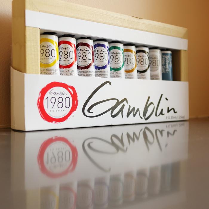
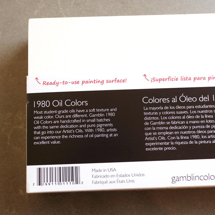
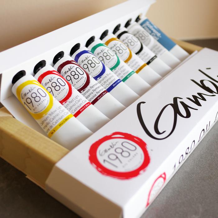
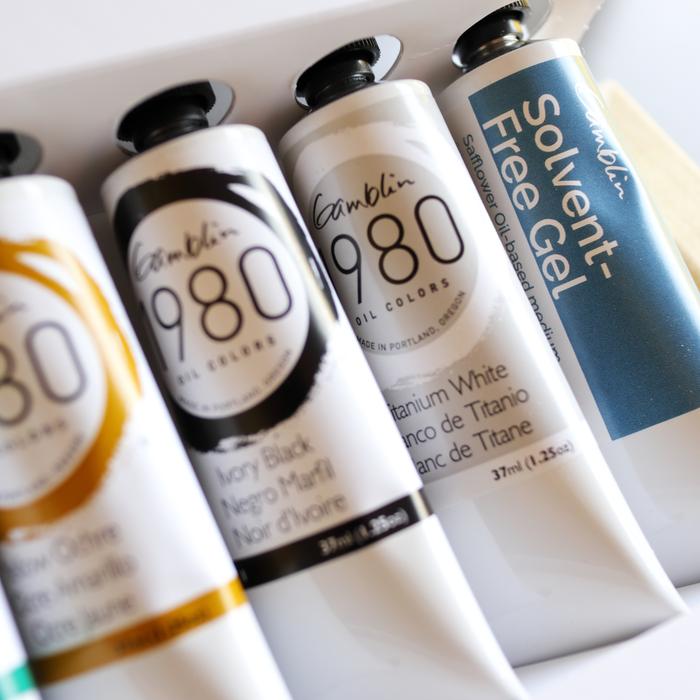
Gamblin 1980 Oil Colors are made with the same dedication and pure pigments that go into our Artist’s Oils. In addition, we use the same process of mixing, milling, filling, and hand labeling.

In order to reduce the cost of oil colors, some manufacturers use gels and waxes to stiffen colors and replace traditional pigments with less expensive ones.

Our approach is different. 1980 colors are formulated with pure pigments, the finest refined linseed oil and marble dust (calcium carbonate). More affordable colors have been made with these three ingredients since oil painting began.

With 1980 colors, artists experience colors that are true, without homogenized texture or muddy color mixtures. Our approach of using both traditional raw materials and processes ensures that artists experience the luscious working properties that they expect from their oil colors.


COMMENTS:
 
steward & author
Posts: 42972
Location: Left Coast Canada
16012
9
art trees books chicken cooking fiber arts
  • Likes 2
  • Mark post as helpful
  • send pies
    Number of slices to send:
    Optional 'thank-you' note:
  • Quote
  • Report post to moderator
I give this paint 8 out of 10 acorns.  

The 1980 line of oil colours by Gamblin is my favourite student grade oil paint.  It's a good starting paint and has some special qualities that make it better than other student lines.  Made in small batches on the Left Coast of the USA, it's a fairly local paint company to me.  

Although I've used other colours of this paint for a while now, this review is primarily for the starter kit of 8 colours and solvent free medium packaged in a wood box.  


The box it comes in is also a wood panel for painting on.  Primed and ready to go, but I'm going to put that to one side today and save it for a wall worthy painting.  This set is nice as it basically just needs something flat for a palette and some brushes and we are ready to paint.

Let's start with a quick swatch!


The colours are vibrant.   Like 1980s crayons.  Very modern choices and excellent for mixing just about anything.

And that's also the thing I like least about this set.  The colours are TOO vibrant.  This could simply be a personal thing, but for me, I don't like starting with vibrant colours as it takes one heck of a lot more bother to dull them down to look like nature (where I live the colours are very muted).  I always feel like I'm wasting paint and time starting with the brightest colours possible then calming them down.  But this is the style that is taught most often these days and it's a solid set of colours to start with.  

hmm, not ready to jump in and paint yet, so I'm going to play with some  colour mixing and see how long it takes me to get a transparent black (compared to the regular Ivory black included in the set).  


Not bad.  

Cad red plus phthalo green make an interesting brown.  Although it doesn't get very dark, this might prove useful.

Alizarin permanent and phthalo green can make a very deep purple leaning black.  

Looking closer at these eight paints, there are plenty of limited palettes within this collection. Monochrome plus white.  Zorn with yellow ochre, cad red, white, and black.  Or the Bright yellow, crimson, ultramarine, an earth brown (not included in this set, but good to have on hand), and a white (like the colours drawmixpaint recomend). This would be fun to explore.

Okay, I'm ready to find out the most important question of all.  

Can it paint a chicken?

Cad yellow and Alizarin make a lovely bright red, perfect for wattles.  I'll mix up a lot of this and use it as my base colour for wattles and comb.  Although I am already feeling that the cads are both bullies when it comes to mixing.  Having such an opaque yellow and orange (because this cad red behaves like an orange), well, it's going to take some getting used to.

The paint is fairly stiff and although we can paint from the tube, fine details are a bit tricky.  I was going to try some of thjs solvent free medium, but the lamp black had a lot of binder separation so I will use that oil to start with as a medium to help the paints flow better.  As annoying as binder separation is, it's also like a free gift of lightly tinted oil that can be useful.  

These feel like paint that is designed to be used with a medium.  Although would be good for impasto painting right from the tube.

A lot of people like this thick paint as they feel they are getting more for their dollar.   That's not quite true with student paint like this as the stiffness comes from the filler.  That said, this is the only company I've found so far that is honest with their filler.  They say on their website they use calcite or chalk filler which is great.  It's the same stuff many of the great masters of the Renaissance through baroque periods used to adjust the texture of their paints.  It also means this company can use the same pigment for their student line as their professional.  So, if, for example, I run out of Indian yellow in the middle of the painting, and the store has run out of this colour in the 1980 line, I can buy a tube of the professional line, gamblin artist oil colours, and know it will be identical, albeit quite a bit more pigmented and expencive.   Winsor and Newton don't do this and it causes no end of frustration to have even a cheap pigment like an umber or sienna use different pigments between student line and professional.

The 1980 paint dries a bit faster than the Gamblin professional line, but slower than Winton.  This makes it good for early layers in the painting.


I don't think it's a problem with the paint.  I've used other colours by this 1980 line before and didn't have the same challenges.   The problem seems to be a mismatch of painter to colour choice.  I'm really struggling to dull these colours without making them muddy.  If anything, this colour selection is too good.  I do better with a much more limited colour gamut.  

And a lack of being used to cadmium colours.  I avoid them as we live on a farm and need to be careful of how we dispose of, well, everything.    And I really feel the cad yellow acted a bully while mixing on the palette, when adjusting colours on the canvas, it a coward.  It seems to reduce transparency without influencing hue.  Lack of expierence or too much filler?

I feel strongly that a Hansa yellow and a Pyrol red would be a much better choice for a set designed for someone new to oil painting.


I'm going back to playing with green and red to get the shadows of the wattles and comb a bit better.  

And as this is the first time I've played with green right from the tube, I might have gone a bit far.


For these reviews, I usually budget an hour for these little chickens.  That includes putting the paint on the palette, playing around a bit, then mixing and painting.  The idea is to keep everything loose and the brands on equal footing.  

We are now well past the one hour mark.  

I'm just struggling with calming down the colours.  The texture of the paints are not a problem and I keep having to remind myself how much I love some of the other colours in the 1980 student line.  For example:


By the two hour mark, I got to good enough.  Mostly by tossing in splotches of blue to calm down the wattles.


As much as it was a pain to paint, I kind of love this painting.  It's 'looser' (less precise) than my normal painting style which I suspect was a result of the frustration.  There wasn't much in the way of milky or muddy colours (except perhaps in the greens of the background).  


These 1980 oil paints are wonderful for some of the more affordable colours like earth colours, transparent oxides, and a lot of the basics.  It's very easy to mix them with professional paints.

This specific set, I don't know how much I would recommend it.  

There is a lot of good here.  The colour choices are very standard for taking a class in North America or online.  You have massive range of colours that can be mixed.  But some of the colours are bullies.  And it lacks the advantage of having a transparent yellow which would make this set way more versatile.  


These are very permaculture friendly paints.  They say clearly what the filler is so we can use the paint with confidence.  And they behave right for a calcite filler.  They can be used right from the tube, no need for medium.  Although they do come with solvent free gel (which appears to be oil and fumed silica).  The only issue is avoiding some of the more heavy metal colours (cadmiums for example) , especially if you don't have a hazmat facility to take the artist waste to.  

And the brushes cleaned up well with handsoap and water.  
 
Give a man a gun and he'll rob a bank. Give a man a bank and he'll rob everyone. Even tiny ads:
The new permaculture playing cards kickstarter is now live!
https://www.kickstarter.com/projects/paulwheaton/garden-cards
reply
    Bookmark Topic Watch Topic
  • New Topic