|

|
|
|
|

|

|

|

|

|
 2
2


Skill verified by gir bot")

Skill verified by Nicole Alderman")

Skill verified by Mike Haasl")

Skill verified by Ash Jackson")
 1
1
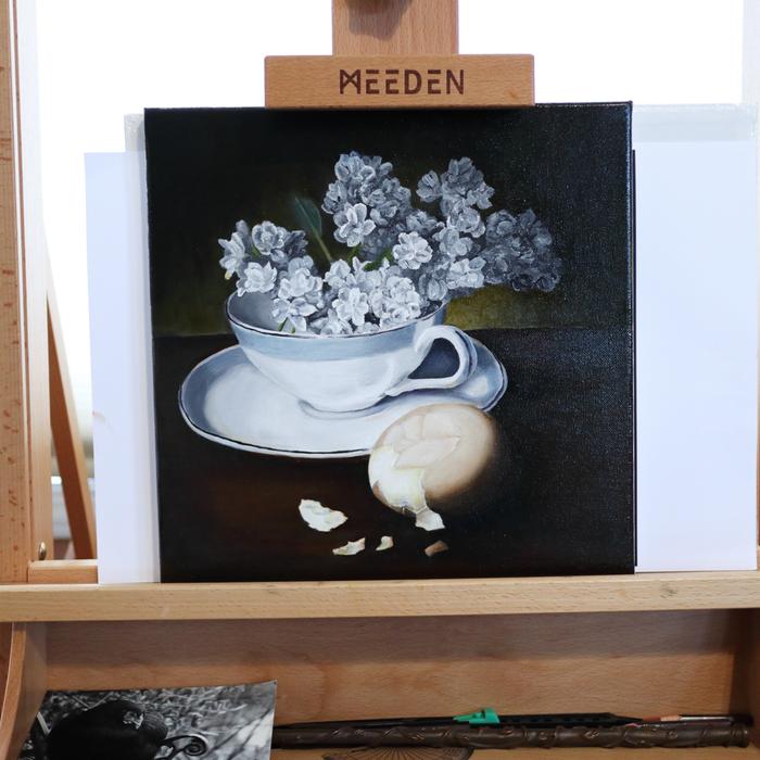
Feedback from teacher
More time is the key ingredient to realism
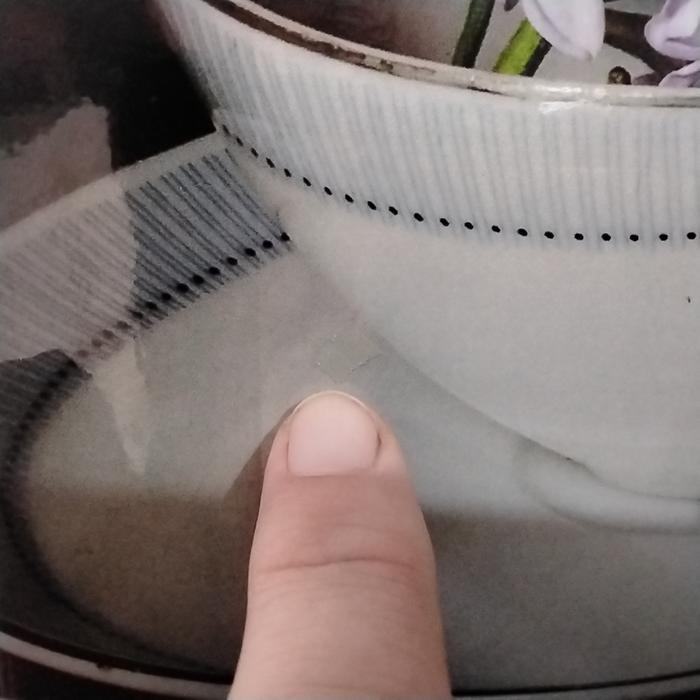
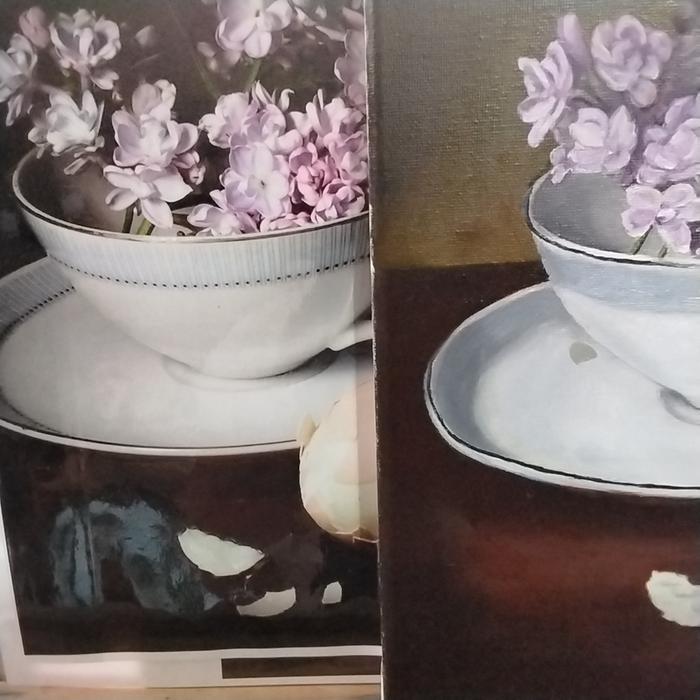
Accurate values. Example cup edge at right next to shadow. Shadow looks darker because cup is too light. White objects deceive more than most.
Egg, value change is really fast near the line. Sometimes changing a whole 1 point (11 point muncel scale) in a a couple of mm.
My brush strokes went with the egg. Like drawing, looks better to have the lines/brush marks perpendicular to the shadow edge. He had words like "against the form".
Cup. The paint layer is too inconsistent and detracts from the realism.
Use medium to slower drying pigment.
A. Because upper layer of painting
B. To give more time to focus on getting values right
...
My thoughts
Egg has too few colours. I want to bring in some of the colours from elsewhere. Egg was done first and fewer colours so it looks less connected to the remaining picture.
It might be good to do a few practice eggs before starting.
Maybe start with the cup?
2
 1
1
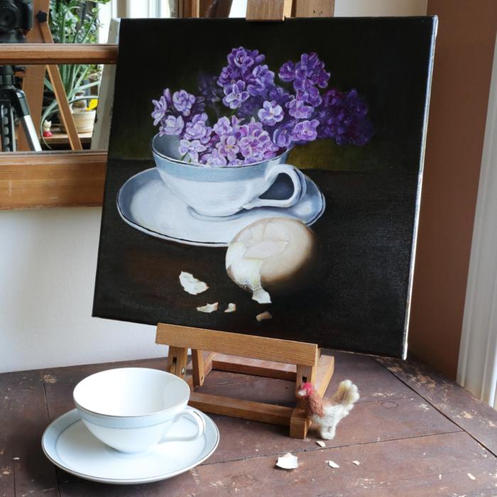
Why chose these items?
It wasn't just about the night watch, there was so many more things I could choose to represent the story better and look forward to next year's painting
The items I choose were also related to my painting deficiencies.
The cup is a smooth white object with strong value changes. It's something all artist struggle with and I wanted to test myself against it. I had thought it would be easy, but it still tricks me.
The egg is both 3 dimensional shape which is difficult to show. This is why so many paint apples and pears for practice.
A brown egg is also very close to skin colour. Depending on the egg and the hen, they can represent many varieties of skin colour around the world. Eggs are amazing! I choose one that was closest to my own skin colour, because I kind of failed miserably when painting my first self portrait.
I suspect painting eggs would be the best practice for portrait painting.
And last, the cluster of flowers is a challenge I'm extremely unconfident with. How to show a cluster without painting each individual petals?
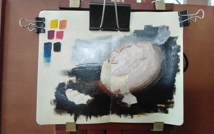
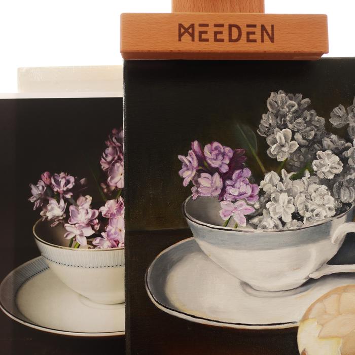
Observation colour study (better pics on camera)
Hansa yellow and pyrol red prob not needed. Remember to put out far less pthalo blue rs.
What was to be a 1 hour study, was 1 hour mixing paint and 1 h painting.
Goal zero blending. Put paint and leave it.
Colour mixing still needs work especially saturation near back of egg.
Line of shadow in wrong place still and wrong width
Aklyd medium limits total painting time to 3 hours before gets too gummy
Would naples yellow help? Trans iron ox?
More egg study needed
2
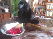
Redd Hudson wrote:
Long live the Clack.


 3
3
Tradition is not the worship of ashes, but the preservation of fire.
1

| I agree. Here's the link: http://stoves2.com |