M Pearson wrote:
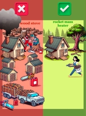
On a cultural note; independent of the content or arguments for/against any heating method, think of this: imagine you show a gruff logger dude a graphic showing him with a chainsaw and a big pickup truck hacking down tons of trees, vs a barefoot vegan looking hippie girl running a RMH and lacking both a chainsaw and a pickup.
Which method do you think he's gonna pick?
And now think: what is the distribution of your "potential customers" between these groups? I.e. who is in need of heating in a relatively cold climate where building a RMH is pretty easy and they don't just live in an apartment with central/gas/electric heat?
If I had to take a guess, I'd say it's 80% gruff logger dudes.
Seems fair enough.
Burra Maluca wrote:
To me, that image is inspiring because it means I can do the work that previously my man had to do because it was too much for me but now we have a way to keep warm on a smaller amount of sticks, then I can contribute a bit more fairly to the work load.
Also seems fair enough.
I remember what impressed me, personally, about rocket mass heaters. It was a podcast, I think, a story about Africa. How the fancy metal solar heaters immediately became jewelry and rocket mass heaters were very much adopted by the very women who were doing the cooking and wood collecting - and, thus, exerting a lot of behind-the-scenes influence. That's what impressed me, personally, about RMH - "it is easier to provide enough firewood for household and it can be done with coppicing". Add to it the Eastern European storybook "warm pechka you sleep on" or Scandinavian or Japanese heating mythology... Yep, sign me up.
The new page kinda explains the point of a RMH, ins and outs, a bit better? But it appeals to logic too much. And I'm pretty sure my "seems reasonable" is based on that African story I remember and the fairytales I've read, i.e., on
feeling. I don't know if a random person off the street would be quite so impressed.
~~~
For feeling, the logger/girl were better. Except for the "kinda polarising in maybe a bad way?" bit and "possibly creating the wrong feeling", as mentioned in quotes above. When watching "Despicable Me", I root for Gru's machinery - yes, it's smokey and theoretically
bad, but I so
hate the sleek Apple-like blue-lit tech of Vector! So, I definitely feel the "Grizzled woodcutters will side with the left just out of solidarity" theory.
Polarisation seems to be a basic concept in "aiming at feelings", but it'd probably be better if it was polarisation between "lots of work, smoke and cut forest" and "easy and fast to collect enough wood, clean air, warm room, green woods outside". Oh, and "easily build out of anything".
Except, of course, for the folks who consider "hard work" a badge of honour? But they're a very different kind of customer, to be lured by other traditional values (like, maybe, having more time to devote to other worthy pursuits?). And if we assume we need to cater to the proverbial "average guy/gal off the street", then it might be said that
both pages are too wordy and smart. But I kinda hate the sensational and in-your-face-pushy three-word sales, even if they are considered better for short-term marketing. After all, permaculture is meant to be about long-term...
~~~
My problem with both pages is "They look like sales". I see so many "Buy this!" pages of this kind all over the internet, I filter them all out on par with ads. A huge page that, until scrolled, is just a picture that explains nothing + a sentence that finishes a bit off-screen (expecting a bigger screen than mine), promises the world and is probably lying, hoping I won't bother with a refund? Yep, ignore.
Btw, gotta confess, I have absolutely no idea how it looks on a phone (and half the world is interneting on a phone, or so I've heard). I just see than my laptop screen, that could fit quite a lot of graphic plans/explanation/a cute story about those African ladies/Scandinavian cat on a warmed bed in a three-panel comic, shows an abstract barrel sculpture and tries to pique my interest with empty promises. And I'm kinda out of interest to pique, because clickbait fatigue forces me to ignore such general-looking phrases.
https://richsoil.com/hugelkultur/ page feels more like "story" and doesn't take up the width of the page too much (it's a delicate balance. having a narrow column of text that gets narrower if I try to make my window smaller is maddening. having text run all across a good 40 cm of a screen is also not fun - reading it is like a cartoon character watching a table tennis match, left-right-left. hugelkultur page resizes well. this forum uses extra real estate on the left for a nice and stable menu. both make me happier than any version of the "Free heat" pages).
Pictures at
https://richsoil.com/rocket-stove-mass-heater.jsp are pretty good. If I saw
that page first, I'd read it just for the ambiance.
The rotating 3D model of the free heat pages makes little sense. It gives no real info - one richsoil picture shows the dream of a warm seat, another shows the flow of air that gives off more and more heat... the 3D model has no labels, no reality, it combines the abstractedness of non-functional art with the "I'm-no-builder-that's-too-scary" vibes of a CAD drawing. Too technical for a "normie", not technical enough for an "engineer", and I know for a fact it's just one model of a RMH, but looks to be the "one and only". And it rotates too quickly, making me dizzy (and some people have motion sensitivity so bad, they'd close the page right then).
Not to mention the darned smoothness.
~~~
It might be an unpopular opinion (many modern designers certainly think so), but I want texture and complexity. A palette of a few colours is all well and good for pulling a look together, but pure colours and strict lines with rounded corners are overused.
RMH is "warmth that stays" and "place to settle"? "Warm and cozy"? Then it is rough stone, polished or chopped-and-a-different-sort-of-polished-that-comes-from-a-split wood, not-quite-smooth plaster, Fair Isle knits. And large, friendly letters.
RMH is "ease of use"? Then it's colourful, airy, light. Ladies who can get firewood without getting their lace gloves dirty (OK, joking, mostly, though it's a fun mental picture, but probably a bit out of style with a homesteader). But self-sufficient women, men who can dispense with hours of woodchopping, kids getting firewood with ease? Yep. All of them solid, not line-art-vector-simplified.
RMH is "clean and green"? Show that with colour. Clean smoke, rich-green open woods, sunlit paths and sun streaming through the window.
A good artist can combine the lot. "Sun streaming through a window, making the Fair-Isle blanket on the slightly-rough heated bench more vivid in colour and the cat a deeper black", "kids with twigs, dressed in textured clothes, on brilliant white snow with blue sky that is barely tainted by smoke, combining chores and fun". Give it
feeling. Currently it feels "corporate". Both of them

That was my two cen... dollars? As for static pages - yay! Static, save-able, cache-able and unbreakable? Of course!