• Post Reply Bookmark Topic Watch Topic
  • New Topic
permaculture forums growies critters building homesteading energy monies kitchen purity ungarbage community wilderness fiber arts art permaculture artisans regional education skip experiences global resources cider press projects digital market permies.com pie forums private forums all forums
this forum made possible by our volunteer staff, including ...
master stewards:
  • Carla Burke
  • John F Dean
  • Timothy Norton
  • Nancy Reading
  • r ranson
  • Jay Angler
  • Pearl Sutton
stewards:
  • paul wheaton
  • Tereza Okava
  • Andrés Bernal
master gardeners:
  • Christopher Weeks
gardeners:
  • Jeremy VanGelder
  • M Ljin
  • Matt McSpadden

White does not exist! | Solving chalky paint colours

 
steward & author
Posts: 42030
Location: Left Coast Canada
15372
9
art trees books chicken cooking fiber arts
  • Likes 6
  • Mark post as helpful
  • send pies
    Number of slices to send:
    Optional 'thank-you' note:
  • Quote
  • Report post to moderator
So you want to get better at colour mixing and painting lovely things?  

Welcome! (slightly evil laughter)

What if there was an exercise you only had to do once to completely revolutionize your approach to colour mixing?  Get your shoes on, maybe a hat (people don't wear enough hats these days), and we're off on an adventure that will change you as a painter.  

Before we head out, although what I write here is applicable to any medium where we mix or blend colours, I'm focusing on oil paint.  For watercolourists and others that use the white of the paper and saturation as value control, there are some good stuff in here too, but probably only for people willing to break out of the modern restrictions to use "transparent pigments only".  For the rest of you watercolourists, the TLDR is to pick the paper colour to match the painting.  

For everyone else, let's solve that chalky and milky colour problem once and for all.


You ready?

Head to any DIY, hardware, or other shop that sells house paint, for like, painting walls.  

No, seriously, once you are finished here.  Do it.

Anyone can say anything on the internet - even me (evil grin) - give it a try for yourself.

So we head into the paint (for houses) shop and it stinks of chemicals, but never mind.  There are swatches of fashionable colours on the wall to the left.  The lighting is flickering florescent daylight bulbs.  The shoes squeak on the floor, especially if we went to one of those high-end shops.  Let's pretend we did.  The paint professional is in the back, ignoring us through a cutout in the wall, with the effort of a cat who needs you to know you are being ignored.  And we walk up to the paint swatches with White on our mind.

There's lots of cream.  Blue cream.  Peach cream.  Tiny patches of this among the sea of colour.  Although, not much white.  Maybe these two at the bottom corner of this section?  Are they white?  Sort of grey when compared to all the other swatches.

A sigh of frustration is the key to get the paint expert to greet you.  We must go through these rituals.  

Small talk ends and we pop the question "Do you have any white paint?"

The pause hangs in the air like a physical thing we could reach out and pop with a pin.  If we look carefully, we can see them spinning through the thoughts.  Do these guys actually know what white paint is?  How much explaining do they want or should I just choose one and say it's white?  Where did they get those snazzy hats?  I want to start wearing more hats... This lasts, oh, maybe half a second.  Sometimes up to three seconds (and yes, I've done this a few times just for fun - you do know I'm evil, right?).

You might have to push them a bit (with words), but eventually we get to a place where they admit, "we don't actually have white paint.  No one does.  We have over 200 colours called white, but none of them are actually white white.  They are all slightly one colour or another."

The last place I asked was super-posh and sold actually non-toxic milk paint for walls.  They had over 600 whites and could order from a catalogue that had double that again.  All flavours of white.  None of them actually white white.

(Flavours of paint is metaphorical.  Don't eat paint)


Well, there you go.  You don't need to read any more.  That tells you everything.  White qua white does not exist in this world.  (what's qua?)


I would love to blame the digital revolution for this next problem.  But alas, computers may have made it worse, but it actually starts about two hundred years ago.  White becomes Y-ified.

Actually, it's about the same time Y looses it's full vowel status.  It becomes "sometimes Y".  Same too with white.  It looses colour status.  It's no longer a colour, it is now a value-modifier.  White suddenly means not just the paint colour, but the quality of whiteness perfected (qua means something like that.  It's a pretentious way to say the most qualified quality that makes a thing a thing or something) .  A whiteness that is so neutral, it cannot exist on earth - although sunlight comes close.  

Real white is suddenly a value adjuster.  It has no other function or personality in painting.  It exists to make things lighter.

And this, my friends, is where art - and art education - goes horribly wrong.  


Vocabulary time

Colour - Hue would be the most technical word for how I'm using this here.  Although I am also mixing the word colour to also mean the name on the paint packaging.  Aka, paint colour

Value - sometimes called tone.  It's how much lightness or darkness something has.  We can see this really well in a black and white photo.  It's also an easy cheat for those who hate colour theory.  Get the values right and you don't need to care about colour.

Saturation - This one is a bit tricky.  It's the Much-ness of a colour.  How intense or strong a specific colour is.  

It's  easier to see when compared to desaturated.  Desaturated colour is a kind of a not-strong-at-all colour, like how the mud on my boots aren't really brown, but are a desaturated red-orange.  Greys and browns and chalky pastels are all desaturated versions of other colours.  Whereas firetrucks are usually highly saturated colours of red or yellow or... I don't know what other colours fire trucks are.  Purple?


Where we used to lighten a colour, we whiten it.  We add white because white is light.  And light is white.  Or so we are taught now.

Same with darkening a colour, we see this the same as blackening it.  

And over time, this idea gets contorted.  We are taught that colour is separate from value.  We learn these rules and stop looking.  This rule of adding white to lighten a colour stops us looking at what is actually happening.  

I think that's a shame.  

I feel strongly that people would have a much easier time learning colour theory and colour mixing if white (and black) could be a colour again.  


If you have one of those phone gadgets (or a friend with one), the Pantone app is great for learning about colour.  They make a huge science of it and every little shift in colour is categorized.  Like colour theory taken to the most foolish extremes.  Maybe don't use this when you are painting.

However, after poking about the house, looking at a few different objects and observing how the colour changes in different lighting, gather a pile of things that look the most white ever.  A bit of paper.  Maybe a flower.  How about the ribbon on your new hat?  See what the app has to say?  It's very good at finding out if an object really is white.  

And they won't be white.  I bet you my new hat that every one of them is blue-leaning.  They are a very pale (value), desaturated (saturation), blue (hue).  That's because our eyes are weird.  

No, not how we see stuff.  The physical makeup of the two gooey little orbs in our head.  The goo and other stuff that fills them isn't crystal clear.  This changes the light as we see it.  Eyes have biology.  And as a result of biology, what looks white to us... the most white that could ever exist or not in the world.  This is blue.  Because science (aka, about 9 volumes of two inch thick books).  

This is also why bleach (chemicals that make things white) makes cloth look yellow.  It's making them closer to white.  White looks yellow to us.  To make the crisp linen shirt look white, we add bluing to the laundry. It's a bright blue dye to make clothes a very pale (value), desaturated (saturation), blue.  Now it looks white.

We see very light, desaturated, blue as if it is white.  Like A COLOUR!  And it is a colour.  In the world where we have paint on our palettes, white is a c o l o u r!  

Remembering that dramatically changes how we use it in painting and mixing colours.  Because white is a colour.

As pink is a kind of pale, desaturated red, white is usually a pale, desaturated blue (although it can also be a yellow... more on that much later).

In oil painting, we see Titanium White as the most white of them all.  

It isn't really.  But it is because our eyes see it is.  And art is more about what our eyes see than what science badgers us with.  (although science is useful for fixing problems like chalky paint mixing).


Okay, so how does all this stop me getting chalky and milky colours when I'm painting?

What is chalky oil painting?  What is a chalky colour?  

The problem is, chalky is a subjective work in art.  But in general, we can assume when someone says a colour looks chalky or milky, they have gone too far in a general direction.  

When I was a kid, the chalk board at the front of the school room was black and the chalk was white.  When the chalk was erased, the board was no longer black, but sort of a milky, light grey colour.  It was chalky.

Chalky means the colour is lighter (value) and bluer (hue) than the desired colour.  

Another way to put it is: chalky colour is cooler and paler than the colour we want.

The opposite of chalky would be muddy colour, which is redder (warmer) and less saturated than the desired colour.  

(another thing people can mean when they talk about chalky oil painting, especially the painting becoming chalky as it dries, is a problem called "sinking in" but that's for another day - tldr, it's made worse by using solvents)


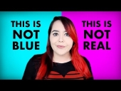
Here's a video for those who want to geek out more about why thinking of white as a colour helps take your painting to a whole better level:


Basically, if the colour is too chalky, and you want to fix it, have a look and ask, does it need more yellow or more red?  And if there is doubt, put it into three piles.  Leave the first pile alone, the second gets red, the third gets yellow.  See what happens.  It's your paint.  You are allowed to experiment with it.


That's a simple way to fix chalky colours.  But I'm more interested in preventing them.  Hang on to your hat, I've got some tricks for that.


r ranson
steward & author
Posts: 42030
Location: Left Coast Canada
15372
9
art trees books chicken cooking fiber arts
  • Likes 7
  • Mark post as helpful
  • send pies
    Number of slices to send:
    Optional 'thank-you' note:
  • Quote
  • Report post to moderator
Welcome back.  Nice Hat!

We want to prevent chalky colours in our oil painting.  Sure there are loads of ways to do this.  I'm going to share a way that is one of the best methods I've stumbled on.  And then I'll share my favourite, much easier way.   Followed by an even easier way.

If you have a trick for preventing chalky colour mixing, please share.  There are about thirty six thousand ways to do anything when it comes to oil painting.  try some and see which one works best for you (then pop over here and let us know).


The right colour in the right place.

It's a mantra that seems to comfort painters.  If we can perfect this art of putting the right colour in the right place, everything else will fall into place.  It's a big fat lie, but it's a lovely lie that helps us feel better.  (edges, values, and relationships are probably more important than colour, but that's another essay)

One of the easiest ways to learn about colour mixing, is to do colour matching.  DrawMixPaint's style is especially focused on this idea of just (as if it's that simple) putting the right colour in the right place and poof!  Painting happens perfectly.   And even if that isn't the style you are going for in your own art, if you have ever struggled with milky or muddy colours, do a painting or two in his style and it will solve most if not all your colour problems.  


Once you've tried his style, go back to your usual style and see how the colours suddenly behave kindly towards you instead of fighting against you at every stroke of the brush.  


The mind-blowing crazy thing I found out from watching this guy mix colours is that, on a modern palette, there are two, not just one, but two different ways to lighten a colour.  We can use Titanium white which is blue-leaning, or - and this is the mind-blowing bit - we can add YELLOW.   (no hats were hurt in the blowing of this mind).  Yellow can't get very dark in value and the yellow paint most of us use when oil painting today, is very, very light in value.  Cad Yellow Lemon, Hansa, Azo... all of these are 7-8.5 on the value scale.  Much lighter than we think they are.  

I'm measuring these values Munsell style where 10 is the ultimate white - aka, the one that doesn't exist - and 0 is the ultimate black which again, is a colour that doesn't really exist.  In comparison, Titanium white is probably about 9.5ish.  

Next time  you reach for white to lighten a colour.  Stop.  Ask yourself, does it need to be warmer or cooler?  Would yellow do the trick?

And that's all well and good, but kind of hard.  Isn't there an easier way?


Mixing Dark to Light

I admit it, I'm a mixer.  I like to mix a few colours before embarking on a painting.  That way I have a starting point that I can adjust as I go along.

When I'm mixing the colours, I start at the darkest colour I can see on my reference.  I slowly get lighter, going as far as I can without adding white.  I don't even put white on my palette yet.

Then I paint these areas in as smoothly as possible, because we are working with darks and darker midtones smooth texture helps them hide.  When I get those more-or-less blocked in, then I'll put the white on my palette and start mixing the lighter colours.  Titanium white is one of the more opaque colours and in oil painting, having opaque colours in the lights helps draw attention to the subject.  

In watercolours, it used to be quite common to use opaque colours, especially white, to direct focus away from an area.  See Turner and Constable's watercolours for some gorgeous examples of how white can make a watercolour painting sing!

This little trick of working without white for as long as I can manage helps keep the shadows pure and stops them from becoming chalky.

But there is an even easier way.


Change your white

Before, we talked about what we see as white being a very light blue.  This causes milky chalky looking colours.  What if we got rid of that problem altogether?  What if we removed the box-standard Titanium white from our palette and replaced it with something kinder?

It's what people did for most of history.  

Titanium white (PW6)  is a very new pigment.  It's very popular.  Titanium white is a cheap pigment to produce.  Benign to the human painter and most environmental issues as the lead used in the making is very very small and has tiny traces (but enough to get a warning label in California with the dead fish picture on it).  It's a long lasting, happy little white.  And it looks like a clean, pure white (aka, it's blue) and the opaque quality of this paint makes it even stronger in the mix..  

These days we generally learn to paint with Titanium white and since we learned to paint with it, we keep going with it.  It's a powerful colour paint and can lighten the value of a colour very quickly.  And makes it more blue/cool at the same time.

But it's not the only white available.

Lead white (PW1 - toxic, yellow-leaning, semi-opaque) and Chalk white (PW18 - non-toxic, grey-blue-leaning, so transparent, it's often used as a filler or transparent mediums) are out of fashion these days.  Zinc White (PW4 - non-toxic, blue-leaning, semi-transparent) too is out of fashion because it causes issues with the longevity of the painting.  It's a fairly new pigment in the paint world too, and is proving unkind to the paintings.  

That leaves us with variations of Titanium white.  It doesn't have to be the overwhelmingly blue-leaning opaque hog of a pigment.  It takes extra science to make that happen.  

Different brands have different names, but some of the ones I've tried and been impressed with are Portrait White, Buff Titanium (unbleached titanium), transparent white, and flake white hue (the hue is important here as it means it's not the toxic lead stuff that we need to be extra careful when handling).  And these whites make sense.  They are all less blue than Titanium white and several are yellow or orange-leaning.  Kind of like how our eyes see the world - slightly yellow or orange leaning...I might have to swap out my hat for a thinking cap.

Unless one is working from a poor quality photograph that has the highlights blown, bright blue-whites are unusual in our daily lives.  It's often recommended that we first mix our Titanium white with a touch of yellow ochre before painting so we don't get tempted to use it out of the Titanium White tube.  

Most of the world just isn't that white.  

They give us this powerful paint and then tell us how to make it calmer.  Why not skip that step and start with a warm white?


Or we could go a step further and take white off our palette entirely.

In this painting he doesn't use white at all.  Just yellow.


My favourte for this kind of thing is Naples yellow as it's a very calm yellow and most modern versions have quite a bit of white added to it already (although the expensive ones might not).


r ranson
steward & author
Posts: 42030
Location: Left Coast Canada
15372
9
art trees books chicken cooking fiber arts
  • Likes 5
  • Mark post as helpful
  • send pies
    Number of slices to send:
    Optional 'thank-you' note:
  • Quote
  • Report post to moderator
Hmmm... hat reference?  Oh, I know.  


A halfway finished hat painting.  We can use it as a metaphor for just scratching the surface of what treating white as a colour can do for us.  


And for more fun, here he is Our Painted Lives replacing white with other colours to explore the different effects.


r ranson
steward & author
Posts: 42030
Location: Left Coast Canada
15372
9
art trees books chicken cooking fiber arts
  • Likes 4
  • Mark post as helpful
  • send pies
    Number of slices to send:
    Optional 'thank-you' note:
  • Quote
  • Report post to moderator
I want to clarify that all this is majorly oversimplified.   Especially the part about the laundry.

And hats.

And cats.

The cat bit extra oversimplified.  
 
out to pasture
Posts: 12783
Location: Portugal
3780
goat dog duck forest garden books wofati bee solar rocket stoves greening the desert
  • Likes 5
  • Mark post as helpful
  • send pies
    Number of slices to send:
    Optional 'thank-you' note:
  • Quote
  • Report post to moderator
As I see it, white is like pink - it exists only in your mind.
 
r ranson
steward & author
Posts: 42030
Location: Left Coast Canada
15372
9
art trees books chicken cooking fiber arts
  • Likes 4
  • Mark post as helpful
  • send pies
    Number of slices to send:
    Optional 'thank-you' note:
  • Quote
  • Report post to moderator
A perfect way of putting it.
 
Burra Maluca
out to pasture
Posts: 12783
Location: Portugal
3780
goat dog duck forest garden books wofati bee solar rocket stoves greening the desert
  • Likes 4
  • Mark post as helpful
  • send pies
    Number of slices to send:
    Optional 'thank-you' note:
  • Quote
  • Report post to moderator
Here are a couple of my favourite videos about the science of colour and perception.


I might feel up to sharing the story of how my colour-obsessed plushy dragons explored colours and and colour theory and powers of 10 and the existentiality of the essence of pinkness whilst learning to play Towers of Hanoi.
 
r ranson
steward & author
Posts: 42030
Location: Left Coast Canada
15372
9
art trees books chicken cooking fiber arts
  • Likes 4
  • Mark post as helpful
  • send pies
    Number of slices to send:
    Optional 'thank-you' note:
  • Quote
  • Report post to moderator


The cc and auto dubbed are in English.

There are some useful tips for working with white.  Like adding yellow when lightening red to avoid it transforming into pink.

 
Posts: 762
Location: Morocco
109
cat forest garden trees solar wood heat woodworking
  • Likes 6
  • Mark post as helpful
  • send pies
    Number of slices to send:
    Optional 'thank-you' note:
  • Quote
  • Report post to moderator
When I mixed oil paints (because I wanted to try if I can make them myself), I used titanium oxide and white clay. The white clay isn't totally white, more of a very light, warm, gray.
However I used linseed oil as the binder and that introduced a little yellow also. I suspect you know about more suitable binders that don't introduce their own tint.
 
r ranson
steward & author
Posts: 42030
Location: Left Coast Canada
15372
9
art trees books chicken cooking fiber arts
  • Likes 4
  • Mark post as helpful
  • send pies
    Number of slices to send:
    Optional 'thank-you' note:
  • Quote
  • Report post to moderator

Sebastian Köln wrote:When I mixed oil paints (because I wanted to try if I can make them myself), I used titanium oxide and white clay. The white clay isn't totally white, more of a very light, warm, gray.
However I used linseed oil as the binder and that introduced a little yellow also. I suspect you know about more suitable binders that don't introduce their own tint.


That's a great point.

Something I have been trying to figure out.

Memory of visiting art galleries in london and seeing recently cleaned works. The ones over 300 years old had beautiful bright whites once the old varnish is removed.  And yet, modern painting from the 1970s, recently cleaned had whites that yellowed terribly.  There was some words on the wall saying the conservation techniques and the mystery of why modern linseed oil yellows so badly.

It was known early on in European oil painting that linseed oil yellows without pigment, but nothing like we see starting in the 19th. Century.

What changed?  
 
Sebastian Köln
Posts: 762
Location: Morocco
109
cat forest garden trees solar wood heat woodworking
  • Likes 5
  • Mark post as helpful
  • send pies
    Number of slices to send:
    Optional 'thank-you' note:
  • Quote
  • Report post to moderator
Curiosity got me.

On the Yellowing of Oils
summary: A simple TiO2 and linseed oil is the worst case

Yellowing of Oils – Update and New Testing at the 5 Year Mark
summary: Yellowing is strongest without UV radiation

Long-Term Behavior of Oil-Based Varnishes and Paints
summary: UV radiation attacks the complexes that cause yellowing
 
r ranson
steward & author
Posts: 42030
Location: Left Coast Canada
15372
9
art trees books chicken cooking fiber arts
  • Likes 4
  • Mark post as helpful
  • send pies
    Number of slices to send:
    Optional 'thank-you' note:
  • Quote
  • Report post to moderator
Those are epic experiments.  Thanks for finding them.

Rublev (natural pigments) also suggests that some of the modern (aka, post 1800) mediums used today also accelerate yellowing.  A lot of them have varnish and resins in them that aren't really needed, but make painters feel good.  Their suggestion is to paint right from the tube to reduce intensity of yellowing.

Wet Canvas and MITRA forums also suggest that there is a difference in how lead white and titanium white yellows.  But have conflicting information about what is the cause.  
 
r ranson
steward & author
Posts: 42030
Location: Left Coast Canada
15372
9
art trees books chicken cooking fiber arts
  • Likes 2
  • Mark post as helpful
  • send pies
    Number of slices to send:
    Optional 'thank-you' note:
  • Quote
  • Report post to moderator
Here is another take on white paint.


I think he would be considered a colourist in that matching the right colour (hue, value, and saturation) is his approach.   He's also painting alla prima so it influences which white works best for him and which qualities of white are unimportant to his approach.
 
r ranson
steward & author
Posts: 42030
Location: Left Coast Canada
15372
9
art trees books chicken cooking fiber arts
  • Likes 2
  • Mark post as helpful
  • send pies
    Number of slices to send:
    Optional 'thank-you' note:
  • Quote
  • Report post to moderator
 https://www.youtube.com/live/NUXvUK_xnA0?si=y1YSqNH6KoHywYau  

Rublev video on the difference between the white pigments they sell, their differnt colours of white, and how it relates to longevity of oil painting

Starts at about 7:50 min.  Everything before that is intro and housekeeping.
 
r ranson
steward & author
Posts: 42030
Location: Left Coast Canada
15372
9
art trees books chicken cooking fiber arts
  • Likes 2
  • Mark post as helpful
  • send pies
    Number of slices to send:
    Optional 'thank-you' note:
  • Quote
  • Report post to moderator


At about 13:25, he talks about the advantages of the different colours of white paint.
 
r ranson
steward & author
Posts: 42030
Location: Left Coast Canada
15372
9
art trees books chicken cooking fiber arts
  • Likes 2
  • Mark post as helpful
  • send pies
    Number of slices to send:
    Optional 'thank-you' note:
  • Quote
  • Report post to moderator


Some very useful tricks for using white in watercolours.
 
Do you pee on your compost? Does this tiny ad?
Learn Permaculture through a little hard work
https://wheaton-labs.com/bootcamp
reply
    Bookmark Topic Watch Topic
  • New Topic