|

|
|
|
|

|

|
.png)
|

|

|
 3
3


...In order to reduce the cost of oil colors, some manufacturers use gels and waxes to stiffen colors and replace traditional pigments with less expensive ones.
Our approach is different. 1980 colors are formulated with pure pigments, the finest refined linseed oil and marble dust (calcium carbonate). More affordable colors have been made with these three ingredients since oil painting began...

Skill verified by gir bot")

Skill verified by Nicole Alderman")

Skill verified by Mike Haasl")

Skill verified by Ash Jackson") 2
2
3
2
2
2
2
3
2
2
Extender Medium, previously called Impasto Medium, is essentially colorless paint made with inert pigments in linseed oil. It is intended to be used as the name implies, to extend paint. It is made from marble dust (calcium carbonate) and barium sulfate which are typically used as modifiers for oil paint to improve feel and dry time. When used in larger amounts, these pigments are categorized as fillers, as in the case of student-grade oil paints.
Extender Medium is a translucent, pale grey paste that has a similar consistency to most of our oil paints. It has a very low tinting strength and only slightly lightens and changes the sheen of most colors when mixed in. An ideal use for the extender Medium is when you want to mix a larger quantity of straight paint and don’t mind a slightly less saturated color or a muted sheen. Using mixtures made with Extender Medium can be a very cost effective way to cover a lot of surface area. Underpaintings are a great opportunity to use the Extender. It can also help mix certain tints and colors that would otherwise not be available simply with the addition of white or other tube colors. A normal brushed out layer dries in about 3-4 days.
2
2
2
4
Teach me of your sacred plants, spaces, places. Share me your songs that I may share the stories to those not yet born.
2
2
Teach me of your sacred plants, spaces, places. Share me your songs that I may share the stories to those not yet born.
3


 2
2

 2
2
Also known as Meudon white, marble powder, or Spanish white, this product is precipitated chalk powder. This grade (the most popular) is primarily used in the manufacture of gesso and other coatings for painting.
Chemical Formula: CaCO3.
Colour Index: Pw 18
Average Particle Size: 3 µm (microns)
2
2
 2
2
2
2
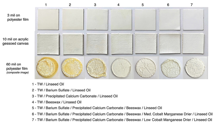
The next two variations, which include the addition of barium sulfate or precipitated calcium carbonate, become increasingly less yellow while also showing a corresponding drop in oil exuding to the surface or out the sides.
 2
4
2
4
 2
3
2
3
Best luck: satisfaction
Greatest curse, greed
3
2
Best luck: satisfaction
Greatest curse, greed
2
4
 1
1
 2
2
There are alternatives to solvent that still allow you to apply thin layers at the begining of a painting, the two I use are marble dust and lavender spike oil. To use marble dust I mix 4 parts paint with 1 part marble dust and add half as much linseed oil as marble dust. This creates a paint that you can spread thinly and makes the paint more transparent and it will dry in a day or two. Lavender spike oil, though it is a solvent, will not cause any of the health concerns associated with mineral spirits. The one big downside is that it takes longer to dry than traditional solvents, but it does make oil paint leaner as well as physically thinner. If you just want to make your paint dry faster without thinning it much than you can add a TINY amount of a whole beaten egg to your paint. Be careful, a little goes along way. I hope this information will help you in your solvent free journey. I would also recommend you get the book “the new oil painting” by Kimberly Brooks.
Happy painting!
2

|
Wait for it ... wait .... wait .... NOW! Pafiffle! A perfect tiny ad!
Quit your workee-job and live, year round, for free-ish in Montana
https://wheaton-labs.com/bootcamp
|