
 2
2



.png)
My farm and garden: https://trello.com/b/GqBLwdNh
My tacky designs on merch: https://www.redbubble.com/people/oldmobie/shop?asc=u&ref=account-nav-dropdown
 1
1


 2
2


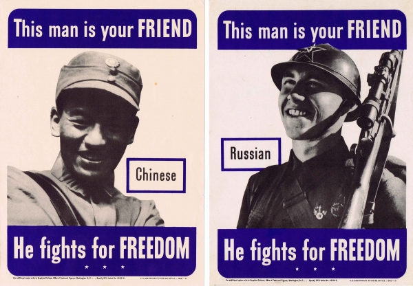
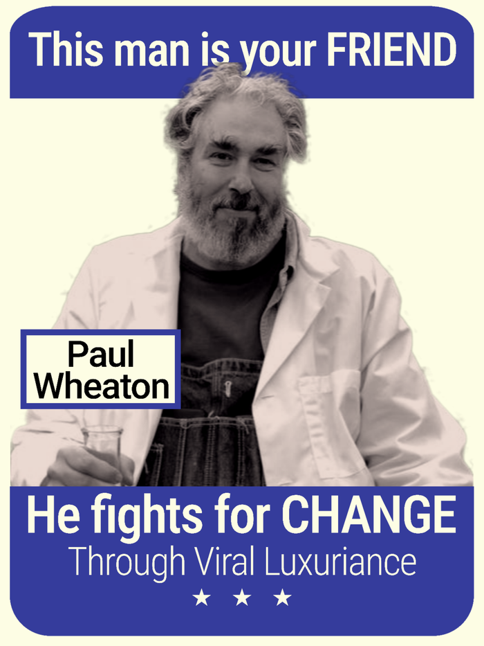
Len Whittaker wrote:Anyway, I will give you my personal opinion, I think if you want to make it look like a war poster, you should make his photo take up more of the white/empty space on the poster. You see how the other posters have that "classic look"? It's because the viewer's eye is either drawn right or left, and then to the words and the photo is supposed to set the tone of the words. You should position his photo in a way that the words and his image get the same amount of attention from the eye and compliment eachother.
I find the best way to get a good result is to position it, leave it, and then look at it 20 minutes later. Keep working and tweaking it until you get the dynamic result you want; something you would want to look at. It takes awhile, but it's worth it.
My farm and garden: https://trello.com/b/GqBLwdNh
My tacky designs on merch: https://www.redbubble.com/people/oldmobie/shop?asc=u&ref=account-nav-dropdown
 3
3


Weeds are just plants with enough surplus will to live to withstand normal levels of gardening!--Alexandra Petri
 2
2


Mk Neal wrote:Can you find a different picture to use? IN the WW2 soldier pictures, the men are in a relaxed pose just smiling, like a friendly greeting so it fits with the "This man is your friend" tagline. But the picture of Paul he looks like he is speaking (lecturing?) to the viewer, and he seems to be positioned above the viewer. It is a "leader" picture, like you would see in many "great leader" propaganda posters, not a "friend" picture.
My farm and garden: https://trello.com/b/GqBLwdNh
My tacky designs on merch: https://www.redbubble.com/people/oldmobie/shop?asc=u&ref=account-nav-dropdown
 2
2


My farm and garden: https://trello.com/b/GqBLwdNh
My tacky designs on merch: https://www.redbubble.com/people/oldmobie/shop?asc=u&ref=account-nav-dropdown
 1
1


T Melville wrote: I think I get part of what you're saying, but probably not all of it. Regarding the white space, I think I positioned him so his whole body fit the width of the space, similarly to the others, but his arms are out to the sides. That made his body take up the space, but left his face taking less horizontal space than theirs. Looking at the "rule of thirds", their heads (including hat brim) take about ⅓ of the horizontal space. I would say I have Paul at a little over half of that. Therefore, I could zoom in on him accordingly. Am I on the track of what you're telling me? What else am I missing?
 2
2


My farm and garden: https://trello.com/b/GqBLwdNh
My tacky designs on merch: https://www.redbubble.com/people/oldmobie/shop?asc=u&ref=account-nav-dropdown
 2
2


My farm and garden: https://trello.com/b/GqBLwdNh
My tacky designs on merch: https://www.redbubble.com/people/oldmobie/shop?asc=u&ref=account-nav-dropdown
 2
2


Hugelculture image with Nasa style font. *Inspired by graphics found in Paul Wheaton's article "hugelkultur: the ultimate raised garden beds" at https://richsoil.com/hugelkultur/ .
My farm and garden: https://trello.com/b/GqBLwdNh
My tacky designs on merch: https://www.redbubble.com/people/oldmobie/shop?asc=u&ref=account-nav-dropdown
 2
2


T Melville wrote:
I guess I have a moral question now. I made that design, but it's very much based on graphics Paul Wheaton used here. What is the right thing for me to do here?
 2
2


T Simpson wrote:The big thing I would worry about would be using the term Hugelkultur is it a trademarked or coined term that requires any royalties or permission to use.
My farm and garden: https://trello.com/b/GqBLwdNh
My tacky designs on merch: https://www.redbubble.com/people/oldmobie/shop?asc=u&ref=account-nav-dropdown
 3
3


 2
2


My farm and garden: https://trello.com/b/GqBLwdNh
My tacky designs on merch: https://www.redbubble.com/people/oldmobie/shop?asc=u&ref=account-nav-dropdown
|
Inside every old person is a young person wondering what happened. And waving this tiny ad:
Learn Permaculture through a little hard work
https://wheaton-labs.com/bootcamp
|


