|

|
|
|
|

|

|

|
.png)
|

|
 4
4


Skill verified by gir bot")

Skill verified by Nicole Alderman")

Skill verified by Mike Haasl")

Skill verified by Ash Jackson") 6
6
"The only thing...more expensive than education is ignorance."~Ben Franklin. "We can easily forgive a child who is afraid of the dark; the real tragedy of life is when men are afraid of the light." ~ Plato
4
3

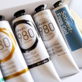
| Pros to Buying Cobalt | Cons to Buying Cobalt |
|---|---|
| Authentic color: easier to paint historical paintings | Expensive |
| Authentic color: great for learning about history | Toxic |
| Fun and unique Christmas present to self | Might support sad working conditions for people |
| You only need a little bit of cobalt paint to have a good time | Might be more destructive to the environment than other hues |
| You can mix a similar hue | It's hard to mix paints the same each time! |
~Permies FAQ ~ Dragons, Fairies and even a Mini-Paul! ~ You Know You're a Permie When...~ All About Permies, including tutorials ~Herbal Hugel Spiral of Randomness!~Tricks to Keep the Dirt from Sliding off a Hugel~List of Cascadia Bloggers and Facebook Pages!~

Skill verified by gir bot")

Skill verified by Mike Haasl")

Skill verified by paul wheaton")

Skill verified by Mike Haasl")

Skill verified by Mike Haasl")

Skill verified by Mike Haasl")

Skill verified by Mike Haasl") 2
2
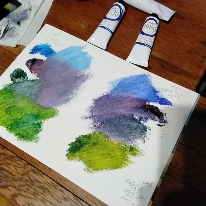
r ransom wrote:I think you're right. Having lived with the swatch for a day, I don't see many places to use colbalt blue in my painting.
Maybe one day, if it's on sale, but not this time.
Now, smalt, on the other hand...
The cobalt ore was roasted and the cobalt oxide obtained was melted together with quartz and potash or added to molten glass. When poured into cold water, the blue melt disintegrated into particles, and there were ground in water mills and elutriated. Several grades of smalt were made according to cobalt content and grain size. In the complex ores in Saxony, as they were first roasted, much of the arsenic was volatilized. The oxides of cobalt, nickel and iron were then melted together with siliceous sand, and the resulting product called Zaffre or Zaffera were, in part, sold to potters and glassmakers.
Another modern recipe is heating of quartz, potassium carbonate and small amount of cobalt(II)-chloride to 1150°C and inserting the still hot product into cold water. The disintegrated glass is then homogenized in a mortar.
The principal source of cobalt used in the preparation of smalt in Europe during the Middle Ages appearing to be the mineral smaltite, one of the skutterudite mineral series. In the seventeenth and eighteenth centuries other associated cobalt minerals were probably used as well (erythrite and cobaltite).
~Permies FAQ ~ Dragons, Fairies and even a Mini-Paul! ~ You Know You're a Permie When...~ All About Permies, including tutorials ~Herbal Hugel Spiral of Randomness!~Tricks to Keep the Dirt from Sliding off a Hugel~List of Cascadia Bloggers and Facebook Pages!~
2
2
2
2

|
straws are for suckers. tiny ads are for attractive people.
3D Plans - Solar Food Dehydrator with Rocket Boost - Pre-Order
https://permies.com/wiki/193722/Plans-Solar-Food-Dehydrator-Rocket
|