|

|

|

|

|

|
|
|
|
|
|
|
|

|

|

|

|
|


"Instead of Pay It Forward I prefer Plant It Forward" ~Howard Story / "God has cared for these trees, saved them from drought, disease, avalanches, and a thousand tempests and floods. But he cannot save them from fools." ~John Muir
My Project Page


 1
1
Success has a Thousand Fathers , Failure is an Orphan
LOOK AT THE " SIMILAR THREADS " BELOW !
France Zone 7a 1025mm rain, 1900 sunshine hours.
Michael Newby wrote: What happened to being able to see a list of all the forums with the most recent topic for that forum showing, I really liked that feature?
Rus Williams wrote: Also the thread layout, being the same as the old one, makes it hard to follow the conversation. I would have thought this would be a thing to improve in the upgrade. Maybe using something like geeklists on the boardgamegeek site. One header with conversations under that header, a new header for a different but related to the OP's topic.
https://boardgamegeek.com/geeklist/178180/what-are-best-gateway-games-and-what-category
Edit: For instance Evans ant village thread would have benefited from this type of layout, with the ability to be able to just subscribe to his updates.
Rus Williams wrote: I don't like knocking other people's work, but we all want feedback, right?
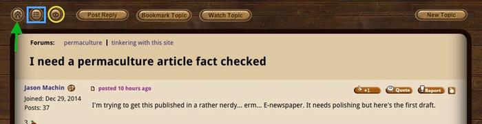
![[Thumbnail for Posting-Board-Options.jpg]](/t/49484/a/31602/Posting-Board-Options.jpg "Filename: Posting-Board-Options.jpg
Description: This is the Posting Board. The Red Rectangle shows the WATCH FORUM BUTTON.")
![[Thumbnail for Posting-Board-More-Options.jpg]](/t/49484/a/31603/Posting-Board-More-Options.jpg "Filename: Posting-Board-More-Options.jpg
Description: The Green Oval shows the WATCH TOPIC BUTTON.")
Dave's SKIP BB's / Welcome to Permies! / Permaculture Resources / Dave's Boot Adventures & Longview Projects

Skill verified by gir bot")

Skill verified by Mike Haasl")

Skill verified by Mike Haasl")

Skill verified by Nicole Alderman")

Skill verified by Nicole Alderman")