
• Post Reply Bookmark Topic Watch Topic
  • New Topic
permaculture forums growies critters building homesteading energy monies kitchen purity ungarbage community wilderness fiber arts art permaculture artisans regional education skip experiences global resources cider press projects digital market permies.com pie forums private forums all forums
this forum made possible by our volunteer staff, including ...
master stewards:
  • paul wheaton
  • Anne Miller
  • Carla Burke
  • Nancy Reading
  • John F Dean
  • Timothy Norton
  • Jay Angler
stewards:
  • r ransom
  • Pearl Sutton
  • Tereza Okava
master gardeners:
  • Christopher Weeks
gardeners:
  • M Ljin
  • Megan Palmer
  • Kate Downham

a new overhaul of the freeheat page - need feedbacks for world domination

 
paul wheaton
author and steward
Posts: 108108
Location: missoula, montana (zone 4)
∞
hugelkultur trees chicken wofati bee woodworking
  • Likes 10
  • Mark post as helpful
  • send pies
    Number of slices to send:
    Optional 'thank-you' note:
  • Quote
  • Report post to moderator
The current page is at https://freeheat.info

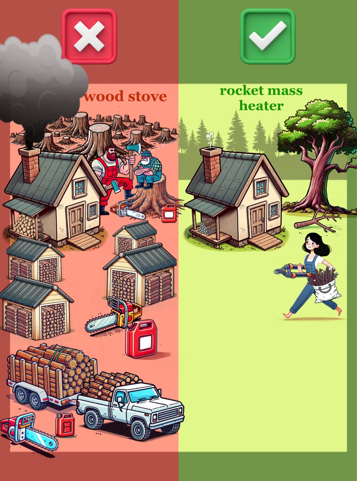
I spent a huge amount of time working on that page with andres.  And after all these years, i deeply appreciate the images near the top of the red X vs. the green checkmark.  The burly logger dudes vs. the dainty barefoot gal.

But this page isn't about convincing me.  Or about a message that I enjoy.  This is about world domination.  

Andres and experts made a new page.  The idea is that this new page is better.  Better for our world domination goals.  We will try it out and see.  It does look really nice.  If it is better, I guess I will miss the logger dudes and the barefoot gal.


Also ...  from a geeky/technical angle ...   I have never liked wordpress.  And I have never liked aws.  Our current freeheat stuff is on wordpress at aws.  I think static pages are the best for security, bandwidth, reliability, etc.  We went with wordpress stuff because it was a bit more WYSIWIG during changes.  But modern tools seem to offer better tools and you can have static pages again!

We can point https://freeheat.info to any of these three options.  

Here is the new static page https://richsoil.com/free-heat

here is the old page as a static page https://richsoil.com/free-heat-original

Please use the thumbs below to vote on the stuff.  Maybe add some vote stuff or just give your opinion using the mighty power of the english language!

 
paul wheaton
author and steward
Posts: 108108
Location: missoula, montana (zone 4)
∞
hugelkultur trees chicken wofati bee woodworking
  • Likes 68
  • Mark post as helpful
  • send pies
    Number of slices to send:
    Optional 'thank-you' note:
  • Quote
  • Report post to moderator
click on the thumbs up for this post if you like the new page best
 
paul wheaton
author and steward
Posts: 108108
Location: missoula, montana (zone 4)
∞
hugelkultur trees chicken wofati bee woodworking
  • Likes 18
  • Mark post as helpful
  • send pies
    Number of slices to send:
    Optional 'thank-you' note:
  • Quote
  • Report post to moderator
click on the thumbs up for this post if you like the old page best
 
paul wheaton
author and steward
Posts: 108108
Location: missoula, montana (zone 4)
∞
hugelkultur trees chicken wofati bee woodworking
  • Likes 24
  • Mark post as helpful
  • send pies
    Number of slices to send:
    Optional 'thank-you' note:
  • Quote
  • Report post to moderator
click on the thumbs up for this post if you know a thing or two about webby tech and you agree that static pages are better than wordpress+aws
 
paul wheaton
author and steward
Posts: 108108
Location: missoula, montana (zone 4)
∞
hugelkultur trees chicken wofati bee woodworking
  • Likes 2
  • Mark post as helpful
  • send pies
    Number of slices to send:
    Optional 'thank-you' note:
  • Quote
  • Report post to moderator
click on the thumbs up for this post if you know a thing or two about webby tech and you think that static pages are not as good as wordpress+aws
 
Ash Jackson
gardener
Posts: 1439
Location: Miami, 11a, Am, apartment dweller
975
10
hugelkultur kids forest garden trees books wofati cooking bike rocket stoves
  • Likes 7
  • Mark post as helpful
  • send pies
    Number of slices to send:
    Optional 'thank-you' note:
  • Quote
  • Report post to moderator
I'm no help, I like both pages, they're just different styles, to me.

I think I accidentally clicked that I know webby things. In the grand scheme of things, I don't.
 
paul wheaton
author and steward
Posts: 108108
Location: missoula, montana (zone 4)
∞
hugelkultur trees chicken wofati bee woodworking
  • Likes 27
  • Mark post as helpful
  • send pies
    Number of slices to send:
    Optional 'thank-you' note:
  • Quote
  • Report post to moderator
thumb if you likey this image

 
M Pearson
Posts: 39
9
  • Likes 10
  • Mark post as helpful
  • send pies
    Number of slices to send:
    Optional 'thank-you' note:
  • Quote
  • Report post to moderator
I voted for the new page. Not that I don't like the old one, but just a case of "when in doubt, try new things." I'd say it's a bit more modern/normal style and less "quirky."

Overall I'd say it probably really depends on whom you're targeting with your "world domination." For one, much of the world doesn't speak English, right? So in practice you probably mean "cold climates in Western, English-speaking countries"-domination.

On a cultural note; independent of the content or arguments for/against any heating method, think of this: imagine you show a gruff logger dude a graphic showing him with a chainsaw and a big pickup truck hacking down tons of trees, vs a barefoot vegan looking hippie girl running a RMH and lacking both a chainsaw and a pickup.

Which method do you think he's gonna pick?

And now think: what is the distribution of your "potential customers" between these groups? I.e. who is in need of heating in a relatively cold climate where building a RMH is pretty easy and they don't just live in an apartment with central/gas/electric heat?

If I had to take a guess, I'd say it's 80% gruff logger dudes. Skinny barefoot vegan chicks tend to live in apartments on University Ave in Berkeley.

So maybe you want to not frame it as "big tough chainsaw pickup logger dudes vs skinny barefoot vegan girls" but "big tough chainsaw pickup logger dudes being cool & creative vs. wasteful and bad stewards of their land" or something.

Just thinking out loud tbh, no "shoulds" as I frankly am merely speculating.
 
M Pearson
Posts: 39
9
  • Likes 3
  • Mark post as helpful
  • send pies
    Number of slices to send:
    Optional 'thank-you' note:
  • Quote
  • Report post to moderator
Another shower thought in terms of economic analysis. Not meant to disparage RMHs as I love the idea, but let's just be realistic.

What % of people's annual spend is heating? I don't even know what my heating bill is because my electricity is very cheap. I'm sure it's higher than if I used a RMH, but it's not enough for me to pay attention or wear a sweater. Now I don't live in Montana, maybe it's more there.

But most people's biggest cost by far is housing. Then what, car payments? Food? Medical? I'd expect heating costs to be number 10-15 or so. So it's not irrelevant, but it's also just not top of mind for most people, I'd expect.

So it's just going to be a harder sell vs. "save 2/3 on housing" or "save 2/3 on car payments" or "save 2/3 on food while eating beyond organic."
 
Richard Gorny
gardener
Posts: 545
Location: Poland, zone 6, CfB
317
14
forest garden fish trees books writing homestead
  • Likes 7
  • Mark post as helpful
  • send pies
    Number of slices to send:
    Optional 'thank-you' note:
  • Quote
  • Report post to moderator
The new page is not only more modern, but also it is dramatically better at selling (but this is not what you are asking about).

Old one was good, but started to look as old fashioned sales page.

The new one looks like a modern landing page.
Great job in my opinion (not an expert though).

The image above... apologies, but no. It does not fit the new design at all, if that is what you are asking about.

For the new site, you need something between an architectural illustration, a modern magazine illustration and a beautifully simplified technical drawing, not something that is too playful for the subject and looks like children's-book illustration.

It is also not a professional advice, just my personal opinion based on being on the Internet almost since it exists.
 
Victor Johanson
Posts: 436
Location: Fairbanks, Alaska
67
  • Likes 10
  • Mark post as helpful
  • send pies
    Number of slices to send:
    Optional 'thank-you' note:
  • Quote
  • Report post to moderator
I don't like the negativity the first panel associates with masculinity.

paul wheaton wrote:thumb if you likey this image

 
Lif Strand
pollinator
Posts: 403
Location: New Mexico USA zone 6
107
3
  • Likes 7
  • Mark post as helpful
  • send pies
    Number of slices to send:
    Optional 'thank-you' note:
  • Quote
  • Report post to moderator
I think the page https://richsoil.com/free-heat is a HUGE improvement.  Too much space on the old page is used up with images that don't provide any actual information.

I do have an issue with the phrase "Free Heat", particularly as used with the things you're offering. The Free Heat Movie is not free!  The Free Heat 3D plans are not free!  Better to put Free Heat in italics to show that it's a title phrase, not a description of the movie or plans., as you did in the 02 / SEE IT IN ACTION section.


David Huang
gardener
Posts: 1339
773
10
hugelkultur monies foraging trees composting toilet cooking bike solar wood heat rocket stoves ungarbage
  • Likes 12
  • Mark post as helpful
  • send pies
    Number of slices to send:
    Optional 'thank-you' note:
  • Quote
  • Report post to moderator
The old version with the red x and green check mark has more of fun, light hearted feel to it.  Though as Victor noted in these current days of identity politics as a super sensitive issue for some it also associates the masculine and white males in particular in a negative light.  I have zero reason to believe there was any hidden agenda to do that, but some will read it this way and be turned off by it.

Even without regard to that whole cultural mess we are looking at the old version with a light hearted feel to it compared to the new version that reads as a much more serious and professional presentation.  The new version conveys through its presentation that this is a serious solution to a serious problem.  I believe the new version will be more successful for promoting the rocket mass heater.

That's my opinion as a professional studio artist who has spent his career striving to learn how to communicate ideas, concepts, and emotions though primarily visual, non-verbal means.
 
Casey Allen
Posts: 1
Location: Coast-side Pacific Northwest
2
forest garden urban
  • Likes 5
  • Mark post as helpful
  • send pies
    Number of slices to send:
    Optional 'thank-you' note:
  • Quote
  • Report post to moderator
Folks are making good points about image association and target audiences, though it's a bit rude to consider some audiences as less "worth" catering to. "Barefoot hippie chicks" have as much to bring to permaculture as big tough lumberjack types.

From a purely site-design standpoint, I associate the old site's style more with independent creators who do things (like making webpages) themselves. I think that this style would appeal to people who are interested in also doing things themselves and are looking for a community to help with that. The new site feels more professional, yes, but also less approachable or personable.
 
Kate Downham
gardener & author
Posts: 3727
Location: Tasmania
2375
9
homeschooling goat forest garden fungi foraging trees cooking food preservation pig wood heat homestead
  • Likes 8
  • Mark post as helpful
  • send pies
    Number of slices to send:
    Optional 'thank-you' note:
  • Quote
  • Report post to moderator
I think both have their good points - The cartoons in the original make me smile, but I think the new one looks smoother and maybe more normie-friendly. The sales bit of the new one is more clear - the old one it's a bit busy for some people - they have to make that extra decision of which option to get, in the new one the $35 combo is more obvious.
 
Jarret Hynd
pollinator
Posts: 234
Location: Sask, Canada - Zone 3b
77
  • Likes 7
  • Mark post as helpful
  • send pies
    Number of slices to send:
    Optional 'thank-you' note:
  • Quote
  • Report post to moderator
The new page is a great improvement over the original in regards to world domination. Good work to everyone who put it together.

Mass AI use the last few years has made images, similar to the original cartoon, one that many will just glance over because everyone and their dog are spamming AI images everywhere. People want real life images - I've seen this trend in various industries the last year. (reference the research article "Customer reactions to generative AI vs. real images in high-involvement and hedonic services")

Ideally, you'd want a video playing in the hero section instead of just the image of the RMH bench: say a 15 second loop of 4-5 clips. Example: A clip of it mid-build, a quick showcasing of a nice house with a RMH in action, a shot of someone stoking it, a scene of a cold winter with a focus on the house from the outside, then finally a shot inside and the thermometer shows room temp (maybe even family gathered around it having fun), etc - story telling in action, tapping into people's emotions. You likely have most of the footage to build something like that already.

Not saying it has to be done exactly that way, but that's the common marketing strategy that grabs people's attention - gotta capture people's interest within a few seconds of landing on the page and give them a compelling reason to keep scrolling.

---

I never liked Wordpress either, always felt clunky and high maintenance. For reference, I barely know any html, but Astro + Gitlabs has been easy enough to pick up. All static pages, but they are robust in features, no crazy SaaS price increases or daily news about vulnerable plugins. It's great.
 
Glen Thomson
Posts: 20
Location: Hamilton, Canada
3
6
food preservation building writing
  • Mark post as helpful
  • send pies
    Number of slices to send:
    Optional 'thank-you' note:
  • Quote
  • Report post to moderator

paul wheaton wrote:click on the thumbs up for this post if you like the new page best

 
May Gardner
pollinator
Posts: 70
Location: Semi-arid USDA hardiness zone 7b, AHS heat zone 11
54
purity personal care fiber arts seed greening the desert homestead
  • Likes 4
  • Mark post as helpful
  • send pies
    Number of slices to send:
    Optional 'thank-you' note:
  • Quote
  • Report post to moderator
I like a lot of the new one BUT.... it seems just too dry given its origins, and could use a bit of lightening up. I think people would be missing out on part of the charm. Perhaps make that image you're attached to smaller and include it partway down the page, or to address concerns people have expressed here include some kind of currently acceptable humor. I really appreciate the humor here and there on this site, the elist emails, etc. and find it sorely lacking on the new page. That said, the new page has a cleaner crisper look and flow, so I'd start with that as the base.
 
Sara Hartwin
pollinator
Posts: 283
Location: SE USA, southern Piedmont Uplands, zone 8b
246
home care personal care tiny house books cooking fiber arts seed writing composting
  • Likes 3
  • Mark post as helpful
  • send pies
    Number of slices to send:
    Optional 'thank-you' note:
  • Quote
  • Report post to moderator
I don't know webby things, or staticky things.
Or even "what will appeal to the masses" things.
Also, my impressions are from someone who is overstimulated already, at the end of an extremely exhausting day.

I tried to look at each page as if I had only just, or had never been introduced to the RMH concept before. (impossible, but I tried)
I used my laptop.
I visited the old page first for one scroll-through, then the new page for one scroll-through. Then back to the first.
And when I wrote this reply, I considered the hours and hours of tweaking and discussion and effort to get every component and proportion and presentation on both pages juuuuuuust right.

I love the minimalism and flow of information that starts below the logger/hippie graphics. It just.... flows. When scrolling, I mean. My eyes are lead to each new info-bit, naturally. Once I scroll past the older graphics, the old page gets my "just facts, please, I'm too tired to think" first impression vote. It's comfortable, easy to consume.
In fact, it was such a difference in comfort and stimulus level that I found the new page almost overwhelming. Even after going back and forth between them a couple times.
So I pushed the thumbs-up once for the old page. Because I thought I was done.
But I wasn't.

As I explore (i.e., spend more time on) the new page, I realize there's a lot of info here. Good info, different from the old page. The marketing is subtle, but not hidden. There's a delicate balance: I know you're selling something, and you know I know. The tone of the new page kind of acknowledges that. We (the seller and the potential buyer) have an understanding.
On the new page, it seems to me that comfort and ease (of a rocket mass heater) are emphasized, not environmental responsibility. The stakes of my decision (to buy or not buy) don't seem as high or as stark as presented by the old page's graphics and info. It's definitely a different flavor of influence.

Old page gets a + for how the info-bits flow (presentation).
New page gets a + for product info (details of what you're getting), a + for approach (luxurious comfort emphasis), a + for concept-info.
New page wins.

And as far as stimulus level or information overload - in the end there's only going to be one page. There won't be any going back and forth between them.

So the new page got my (final) vote. (I pushed the thumbs up twice to "correct" my first-impression old page vote.)
(I hope I didn't mess up the voting.)

Edited to say I just checked both pages out on my phone. New page still gets my vote. The flow is smoother than on my laptop screen.
 
Rebekah Harmon
Apprentice Rocket Scientist
Posts: 1348
Location: 4a, high mountain dessert
672
5
kids foraging rabbit fiber arts medical herbs bee
  • Likes 1
  • Mark post as helpful
  • send pies
    Number of slices to send:
    Optional 'thank-you' note:
  • Quote
  • Report post to moderator
The new page is sleek. When it loads on my phone, I see three buttons with prices. Thats a little overwhelming.

Maybe I am a little old fashioned? Is there a way to show me what I am buying first, like to see a RMH Pic or diagram before I see that it's $35 in three places?
 
T. Woolf
Posts: 57
Location: Montana
35
goat cat dog foraging hunting chicken food preservation cooking solar writing wood heat
  • Likes 1
  • Mark post as helpful
  • send pies
    Number of slices to send:
    Optional 'thank-you' note:
  • Quote
  • Report post to moderator
The old page is too busy In My Not So Humble Opinion. The newer page is cleaner, and less "sales-y". It feels more professional and less like you're desperate for money. (The sharks smell blood...🦈)

Anyway, just my opinion. Your mileage may vary. 👍
 
Wojtek Bazant
Posts: 1
1
  • Likes 10
  • Mark post as helpful
  • send pies
    Number of slices to send:
    Optional 'thank-you' note:
  • Quote
  • Report post to moderator
Software engineer here, I think you're on to a much better page with the new design but it also lost much of the personality of the old one. I guess from headers like '03 | the idea' that some of the new page is AI writing. From the world domination perspective, using this very effective technology is great, but it comes with a pitfall, more and more of Internet is starting to look like that, and people will discount AI writing more and more as they get more and more exposed to it. Ironically you can still use AI to get the indie quirk back in, prompt like 'give me 5 ideas to make the content on the new page 5% less AI' after showing the agent both pages.

Great if you can maintain a static page, faster loading and cheaper hosting.
 
Elizabetta Patti
Posts: 2
1
  • Likes 3
  • Mark post as helpful
  • send pies
    Number of slices to send:
    Optional 'thank-you' note:
  • Quote
  • Report post to moderator
OLD PAGE !!!
 
Anne Miller
master steward
Posts: 19740
Location: USDA Zone 8a
4954
dog hunting food preservation cooking bee greening the desert
  • Mark post as helpful
  • send pies
    Number of slices to send:
    Optional 'thank-you' note:
  • Quote
  • Report post to moderator

Victor Johanson wrote:I don't like the negativity the first panel associates with masculinity.


I don't see any masculinity when I look at that page, maybe it is a feminine prospective?

All I see is that it takes tons and tons of wood to fire up a wood stove and only twigs to fire up a RMH.

 
M Wilcox
pollinator
Posts: 161
Location: Upstate New York
59
chicken solar rocket stoves
  • Mark post as helpful
  • send pies
    Number of slices to send:
    Optional 'thank-you' note:
  • Quote
  • Report post to moderator

paul wheaton wrote:
Andres and experts made a new page.  The idea is that this new page is better.  Better for our world domination goals.  We will try it out and see.  It does look really nice.  If it is better, I guess I will miss the logger dudes and the barefoot gal.


The new page is better
 
David Nightingale
pollinator
Posts: 80
Location: Pierce County WA, Northwest and Sound
34
cattle forest garden fungi trees chicken cooking pig medical herbs bee sheep wood heat
  • Likes 2
  • Mark post as helpful
  • send pies
    Number of slices to send:
    Optional 'thank-you' note:
  • Quote
  • Report post to moderator

Jarret Hynd wrote:The new page is a great improvement over the original in regards to world domination. Good work to everyone who put it together.

Mass AI use the last few years has made images, similar to the original cartoon, one that many will just glance over because everyone and their dog are spamming AI images everywhere. People want real life images - I've seen this trend in various industries the last year. (reference the research article "Customer reactions to generative AI vs. real images in high-involvement and hedonic services")

Ideally, you'd want a video playing in the hero section instead of just the image of the RMH bench: say a 15 second loop of 4-5 clips.


New one Looks great, I like the multiple clip of different heater styles idea. RMH Design diversity and spatial adaptability are practical sales strengths here.  Beware kids can smell AI generated content even if true from a mile away, and it stinks to them.  So custom artistic aesthetic of living room RMH’s are in fashion again. Got asked about them at work the other day.  Cheers
 
Lif Strand
pollinator
Posts: 403
Location: New Mexico USA zone 6
107
3
  • Likes 6
  • Mark post as helpful
  • send pies
    Number of slices to send:
    Optional 'thank-you' note:
  • Quote
  • Report post to moderator
I've already commented but I wanted to add:

If I was looking for info about alternatives to a wood stove or specifically for a RMH (which I have done) I would not have any patience for the old page (which I didn't when I first came across it). I wanted information, not huge cartoon graphics that required scrolling past to look for the actual information, or to pay for information without first having a better idea of what that info would be.

I do not watch videos as a first/only choice when I'm looking to find out about a product. That is what happens on social media - you're forced to look at a super-long video that claims a lot and then ends up with a person having to buy something to find out more, only to find out that whatever it is wasn't worth the money.  

What I love about the new page is the fact that it's not cute, it's informative. It flows well without excessive imagery that doesn't actually provide information. Every section is clearly about relevant information without taking up excessive space.  

One final comment: If "world domination" is the aim, then I think you should consider that many folks will be seeing the information on the page for the first time. They may not know who Paul Wheaton is or what Permies is.  I think an About link at the very bottom a Permie's page with Paul's creds on it, along with the other links already there , would be a good idea.
 
Ryan Simon
Posts: 4
Location: Kansas City MO metro
1
homeschooling fish urban
  • Likes 1
  • Mark post as helpful
  • send pies
    Number of slices to send:
    Optional 'thank-you' note:
  • Quote
  • Report post to moderator
I like the visuals of the old one, but the usability of the new one.

I looked on a phone, tablet, and the computer. The old one required a lot more scrolling on all of them. That would be a problem if not for the engaging images.

If you're looking to someone who is brand new to this (such as myself,) the old one has a lot of charm that encouraged me to keep looking for the sake of looking. The new one visually looks like a lot of professional pages. It has the same flow as a business page and is easier to gather information from.

If you could find a way, I'd merge the two designs. The quirkiness of the old kept me on the page longer than the new page.
 
Anne Miller
master steward
Posts: 19740
Location: USDA Zone 8a
4954
dog hunting food preservation cooking bee greening the desert
  • Mark post as helpful
  • send pies
    Number of slices to send:
    Optional 'thank-you' note:
  • Quote
  • Report post to moderator

Ryan Simon wrote:IIf you could find a way, I'd merge the two designs. The quirkiness of the old kept me on the page longer than the new page.


I agree.

I feel that the new page works for folks with some knowledge of a RMH.

I feel the old page will attract folks with no knowledge of a RMH.
 
Aleister Mraz
Posts: 3
  • Likes 1
  • Mark post as helpful
  • send pies
    Number of slices to send:
    Optional 'thank-you' note:
  • Quote
  • Report post to moderator
First thoughts: the new page feels like it was made with Claude (AI) and has that metallic twang of so many other recent websites.  It's immediately noticeable from anyone who's seen these sites popping up (or created a few) over the last year.  That makes it seem cheap, like a mass-produced trinket, regardless of how nice it looks in theory.  Think about Wabi-sabi (see note below) and that's the main difference between the old and new page.  The new one is designed to be flawless, whereas the old one clearly has attempted to be good.  The reality of permaculture (and homesteading), as we in this forum all know, is that no plans come to fruition without the patchwork, makeshift, jerry-rigged iterations that end up being the main feature of the show and prove to us and others that we are human in ambition and endeavor.

That said - some features of the old site have some rather confusing elements.  It appears only after re-examination to be a single page that has all the details, while the banner at the top made it seem like there would be deeper levels or dropdown menus that are present; however, they are just links to other sites/pages/URLs.  It's not exactly clear at first that these are a suite of sites all interlinked, and perhaps those would be better suited at the bottom of the page instead, which is more conventional.  On it's not particularly a big deal; it's just typically when I see words in a banner at the top of a page I expect to be oriented to the site I'm on.  Consider whether or not the focus should be pulling one to other pages or expounding on RMHs on the same page (or simply leaving the banner off altogether?).  That said - I do actually appreciate in some regards that one can peruse "all" of your endeavors directly from the top; it just takes one away from the page one's on to do so.

Another important element that didn't occur to me at first, which is specifically related to your image with wood stove vs. rocket mass heater: the colors are wrong.  By wrong, I mean this: when you land on the site, the first thing you see is a red background and a spinning rocket mass heater, which is great.  Then, when you scroll down, you see that same "red" as the "bad side" (wood stoves) and the alternative "green" as the "good side" (RMHs).  So here you have RMHs associated with Red but also being thrust into a Green association almost immediately, which I think is probably the biggest and possibly only stylistic issue with an otherwise promising message.  The same thing is true of the other image you are using with the "heat pump or natural gas heat" vs. RMH: you have a big old green checkbox on the right, then you have green money on the left in the middle of the red, and you have a big old red xbox on the left, but then have the word "FREE!" in red on the right in the middle of a sea of green.  You need to pick: is red good or bad and is green good or bad and stick to it; no mixing and matching !

Finally, for me, the larger image itself is a little heavy-handed, and I'd prefer to see an actual wood stove with a fully stacked up wood rack next to it (like at my house this winter) vs. a rocket mass heater with a bucket filled with sticks (like at my mother-in-law house next winter, god-willing) over cartoon caricatures.  Meanwhile, I will add that the sheer amount of equipment required to chop wood is something many don't realize before they do it, so I appreciate that being alluded to in the image on the left vs. just the lopper on the right as well.

Hope this helps !

- Aleister

On Wabi-sabi:

The Japanese concept of finding beauty in imperfections is known as Wabi-sabi (侘び寂び).  It is a worldview and aesthetic philosophy centered on the acceptance of transience and imperfection, often described as appreciating beauty that is "imperfect, impermanent, and incomplete."

Wabi-sabi evolved from Zen Buddhist influences and traditional tea ceremony aesthetics. It acknowledges three simple realities: nothing lasts, nothing is finished, and nothing is perfect.  The concept encourages valuing roughness, simplicity, modesty, and the marks of age or repair over flawless symmetry.

 
Victor Johanson
Posts: 436
Location: Fairbanks, Alaska
67
  • Likes 3
  • Mark post as helpful
  • send pies
    Number of slices to send:
    Optional 'thank-you' note:
  • Quote
  • Report post to moderator
Nothing is more masculine than a couple bearded burly loggers, and the implication is that they are responsible for destroying the environment, while the next panel implies the virtues of femininity,  and the paradise that will ensue once all the nasty men are gone. Your filters are far different than a man's; we have to deal with constant innuendo of this kind, and it's not cool. If anything, women should understand what it's like to be stereotyped and marginalized, and show some empathy when it shifts to another demographic.

Anne Miller wrote:

Victor Johanson wrote:I don't like the negativity the first panel associates with masculinity.


I don't see any masculinity when I look at that page, maybe it is a feminine prospective?

All I see is that it takes tons and tons of wood to fire up a wood stove and only twigs to fire up a RMH.

 
Jerry McIntire
pioneer
Posts: 259
Location: Temperate coastal Pacific Northwest - zone 8b, 20" precip/yr
47
8
trees tiny house solar
  • Mark post as helpful
  • send pies
    Number of slices to send:
    Optional 'thank-you' note:
  • Quote
  • Report post to moderator
Yes to new page design. Please tinker with the AI writing. Instead of this, "WATCH THE BUILDS. UNDERSTAND THE DETAILS.
CHOOSE YOUR NEXT PROJECT." This: Watch a variety of detailed builds. Pick your plan(s). Build!

Having said that, the old page contains more information. The new page could use some more, especially how a RMH works.
 
Burra Maluca
out to pasture
Posts: 13450
Location: Portugal
4692
goat dog duck forest garden books wofati bee solar rocket stoves greening the desert
  • Likes 5
  • Mark post as helpful
  • send pies
    Number of slices to send:
    Optional 'thank-you' note:
  • Quote
  • Report post to moderator

Victor Johanson wrote:Nothing is more masculine than a couple bearded burly loggers, and the implication is that they are responsible for destroying the environment, while the next panel implies the virtues of femininity,  and the paradise that will ensue once all the nasty men are gone. Your filters are far different than a man's; we have to deal with constant innuendo of this kind, and it's not cool. If anything, women should understand what it's like to be stereotyped and marginalized, and show some empathy when it shifts to another demographic.


It breaks my heart to read this.

I guess I'm guilty as charged because I see that hunky great red-bearded fella doing a ton of work to keep his community warm, and then feel all glowy inside because my own hunky great red-bearded fella already built me a rocket mass heater (ok I know he built it for us, not just me, but I'd made it very, very clear that I wanted one!) and this year virtually all the firewood we have has been hauled from the tree to the wood stack by yours truly, and as most of it is lopper-sized I've also been the one responsible for cutting most of it to size.

To me, that image is inspiring because it means I can do the work that previously my man had to do because it was too much for me but now we have a way to keep warm on a smaller amount of sticks, then I can contribute a bit more fairly to the work load.

But not everyone sees things the way I do...
 
Victor Johanson
Posts: 436
Location: Fairbanks, Alaska
67
  • Likes 1
  • Mark post as helpful
  • send pies
    Number of slices to send:
    Optional 'thank-you' note:
  • Quote
  • Report post to moderator
It's the stark juxtaposition, combined with subtle cues, which make it objectionable--a sinister glowing red backdrop of evil chainsaws, jugs of petrochemicals, pollution belching truck and chimney, and a huge stockpile of murdered trees in the midst of a stump wasteland sets the tone, with a couple of miscreants looking self satisfied with the destruction they've perpetrated. But shift your eyes right; we have a solution!: a benign green world, where feminine (and therefore good and superior) values have displaced all that male generated toxicity. Examine the body language and facial expressions--a dangerous pair of brooding, scowling axe wielders, versus a sweet, harmless, smiling barefoot pixie, skipping by with her adorable trunk friendly loppers.

It would be different if the picture were of exhausted men sacrificing themselves to do what needs to be done to meet their community's needs, next to another panel of them being freed to spend time with their families and enjoy a less dangerous and arduous life. It's not outlandish at all for a man to look at this and, like I did, react instantly with "oh here we go again, white cisgender male=villain who needs to be removed from the picture." These pendulums can swing too far, and in my opinion this one has. Normal boy behavior (competitiveness, ambition, leadership, self assurance) is now classified as aberrant and undesireable, and Big Pharma zombifying "solutions" are being deployed at an alarming rate. Maybe there's such a thing as genuine gender dysphoria, but it seems to have sparked what in many cases surely constitutes a social contagion, with transitioning also proposed as a remedy to the societal obstacles faced by boys navigating a system arrayed against them. "Confused? Nothing a little castration and estrogen can't fix."

This isn't to imply that the messaging here is intentional, only that it is an indicator of how certain attitudes have become normalized, at the expense of men. The cure for sexism can't be more sexism. So, forgive me for broaching this delicate subject, but it's one that requires awareness. We could be Machiavellian, and employ any and all tactics effective toward achieving world domination, regardless of propriety, but that would conflict with the Permaculture ethos.

No hate, just frustration, and concern for the generation now forming.

Burra Maluca wrote:

Victor Johanson wrote:Nothing is more masculine than a couple bearded burly loggers, and the implication is that they are responsible for destroying the environment, while the next panel implies the virtues of femininity,  and the paradise that will ensue once all the nasty men are gone. Your filters are far different than a man's; we have to deal with constant innuendo of this kind, and it's not cool. If anything, women should understand what it's like to be stereotyped and marginalized, and show some empathy when it shifts to another demographic.


It breaks my heart to read this.

I guess I'm guilty as charged because I see that hunky great red-bearded fella doing a ton of work to keep his community warm, and then feel all glowy inside because my own hunky great red-bearded fella already built me a rocket mass heater (ok I know he built it for us, not just me, but I'd made it very, very clear that I wanted one!) and this year virtually all the firewood we have has been hauled from the tree to the wood stack by yours truly, and as most of it is lopper-sized I've also been the one responsible for cutting most of it to size.

To me, that image is inspiring because it means I can do the work that previously my man had to do because it was too much for me but now we have a way to keep warm on a smaller amount of sticks, then I can contribute a bit more fairly to the work load.

But not everyone sees things the way I do...

 
It would give a normal human mental abilities to rival mine. To think it is just a tiny ad:
better than an outhouse, and can be indoors
https://www.richsoil.com/willow
reply
    Bookmark Topic Watch Topic
  • New Topic