I'm starting a new painting with a technique I haven't tried before. I'm already plagued with doubts.
This may not turn out, but maybe someone can help and cheer me on? I sure would like that.
Yes, I'm totally hanging out my insecurities for the world to see. Meh, we all feel this way sometimes.
It's scary doing this alone.
This is a variation on the tiling technique for oil painting. I use my bigger brushes to put the approximate colours in the approximate right place. I mix the colours before and check them against my source, then trust.
I'm not good with trust.
It feels too dark. Goslings are fluffy yellow bright coloured things. But when I put in my darks, it looks so scary to me.
I keep telling myself that it's only paint. It's only paint. If this is crap, I can learn and paint another one. It's only paint.
Talks about the tiling technique. He's a better painter than me, so it's also a good source of inspiration. Although, I'm not following his style slavishly today.
It's also interesting how this guy says the brush strokes blend together as they go on. That's what I try to do by overlapping the strokes slightly, not wiping my brush often, so paint from previous strokes contaminate future strokes, and trying to create the soft edges, by changing the value and colour at least 3, more often 5, times so it does optical blending. Optical blending is where the viewer does the work in their eyes, instead of having to blend with the brush.
When I shared with an art group, it was suggested at this stage it looked like I had gone crazy with the blending. I haven't actively blended yet, except for laying down the tiles of paint.
I wonder why it looks blended to them? Then it hit me, their usual style is to block in three zones, mid, lights, and darks. There is a hard line between these, which they blend together. Perhaps not having a hard line, but instead using multiple values (I'm using 5 for darks and five for lights) makes it look blended to them?
I don't know.
Or maybe what I'm doing is a kind of blending and I don't yet understand the word.
I'll try some of the background next to get a better feel if my darks are right.
The background is a mix of black and terra rosa (iron red). More black near the bottom of the body, more red near the top. It's a stand in for now, I can change it later.
I didn't paint the 'floor' as that has some texture goint on and is complicated.
But what it does show is that I was way too light on my goose shadows.
I've never failed to be amazed at how human eyes both "see what's not there," and "change what they see" when the focus is surrounded in a different way. I have a magic cone of cotton and a strand of it changes colour when the back-ground colour changes. I describe it as being due to "undertones", but I suspect the professionals would have other words for it.
So I'm not surprised that dark body shadows will look lighter when surrounded by darker background rather than by white. No idea how to figure that out in advance, other than by an educated guess, or a lot of practice.
Hang in there, and hopefully your gosling will shine when you're done!
This tool is called a viewfinder (or something like that). It slides back and forth to help one find a good composition by making the rectangular hole the same ratio of the canvas.
The thing I figured out this morning is that it's 'middle grey'. Aka, about half way between white and black. It also has this nifty little hole where I can isolate the colour I'm trying to match.
The goal here is to get things in fairly quickly and as close as possible.
One of my problems is that I keep trying to fix where the colour went wrong instead of wiping away and putting the right colour there. The more brush strokes, the less I get the look I'm aiming for.
This method takes a lot of courage. Right now, I am wondering how much more before I toss it on the fire.
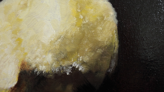
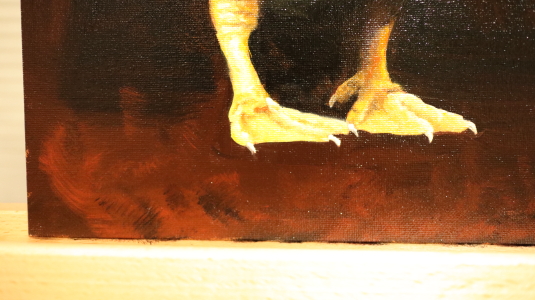
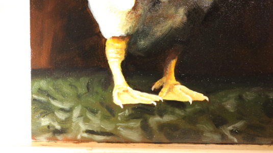
Jay Angler wrote:I've never failed to be amazed at how human eyes both "see what's not there," and "change what they see" when the focus is surrounded in a different way. I have a magic cone of cotton and a strand of it changes colour when the back-ground colour changes. I describe it as being due to "undertones", but I suspect the professionals would have other words for it.
So I'm not surprised that dark body shadows will look lighter when surrounded by darker background rather than by white. No idea how to figure that out in advance, other than by an educated guess, or a lot of practice.
Hang in there, and hopefully your gosling will shine when you're done!
I don't think I'll ever get board of learning about this. I just wish I knew some more words so I can find some books about it.
I've also been trying to learn about Newton's Rings which is something about how changing from light to dark, doesn't just change value, it also changes colour/hue. If we just take a value and darken it, it looks wrong, but if we go through some colours that don 't even belong there, it looks real somehow. I want to know why and when to do it.
I got to here, and now it's time for some breakfast.
The goal is to give myself some time away from it and come back and find out "what's the most wrong". Then I work on that part to get it part way there. Then step away, ask "what's the most wrong now", etc. Or, where can I do the most good with the least effort?
I think it's going to be the head. But first, food.
r ranson wrote: I've also been trying to learn about Newton's Rings which is something about how changing from light to dark, doesn't just change value, it also changes colour/hue. If we just take a value and darken it, it looks wrong, but if we go through some colours that don 't even belong there, it looks real somehow. I want to know why and when to do it.
I remember my art teacher being very fond of purple shadows - try it :P mixing up different colour patches to get impressionist style effects is also very freeing!
I put the eye in and made some more adjustments to the head.
It's still not right, but at least it's not a eyeless horror.
What do you think? Getting closer yet? Anywhere obviously wrong? I think maybe I can see it better once I get the beak and legs in. But that requires mixing up a new batch of colours. My palette is pretty filled with mess right now
to the right are the darks, to the left are the lights and a few in the middle that get used in both. I mix up the piles of each local colour, then I add a little bit of whatever I need with the brush as I go along.
I'm going to work a bit more on it today, maybe. The paint has about 3 days of workable time before it tacks up. Then I would have to let it dry for a few weeks before painting again. So I hope to get it done in three days. Or at least done enough.
This morning I started on the left (our right) foot... only to wipe it away again. It was too vibrant and weird.
Maybe the beak will be kinder to me. It's scary because it doesn't have the same ratio and shape as the adult beak. I haven't practiced one this young yet.
It FEELS real and yet when we look up close, it's not. It's just mess.
And yet it feels real.
Attempting that style of painting scares the shit out of me. Painting objects is much easier than painting feelings.
This gosling I'm painting is an experiment to see if I can get a little bit in that direction. Sort of 19th Century realism. Which is lovely from afar but a mess of wonky brush strokes when someone gets really close to it.
He's looking pretty special to me! Re the dark shadow on the body - tapestry weavers use purple shades for shadows - once black is used, it can't go darker. Have you seen this sort of thing?
https://colorpickerfromimage.com/ If the image can be scanned, the picker can help to ID the colour.
Viewing from a distance could be helpful. Too close an acquaintance removes the "Impressionistic" effect.
I'm hopeless with paint so you have my total admiration.
I haven't colour corrected the photos I'm sharing here. The camera has a limited dynamic range (how dark or light it can see) so I can either show the lighter colours and let the darks drop to black, or show the darks and have the rest of the goose fall to bright white (i don't really feel like doing the dynamic range bracketing thing as I would need to take five photos and blend them together.)
Basically, if it's background and looks black, it's dark maroon. If it's goose and looks black, it's green because that's the colour I found when using the viewfinder shown above during my original colour mixing.
Colour pickers are pretty cool. I just don't do digital when painting. Even use my old school camera without wifi.
Because my eyes have distortion at anything closer than arms lenth, I got the standing easel so I could walk back about four paces every time I load more paint on my brush, so every second or third brush stroke.
Having an easel that doesn't fall down if I'm not holding on to it has made a huge difference. In class, they say I'm spending more time dancing than painting.
Is a great video on dynamic range and the limits of photography.
That's one of the reasons I took up painting, the cameras limits at seeing values were chafing and the fix was too cumbersome. Also, the camera kept showing what was there and not what I saw.
Paint can almost reach the full dynamic range our eyes can see, more than printing, screen, or camera. But, what it's like in person is very difficult to share.
Like the first time I saw an Emily Carr painting in person, I was awestruck. Printed and photos show nothing. In person, her painting contains the feeling of the local forests. A feeling I've never seen another painter, photographer or other medium capture.
If I'm really stuck, I will get a snack and cuppa tea and look at it from the kitchen.
It's not the best painting studio set up (too much natural light), but it has the advantage of an open concept house so I can see the painting from the other room.
I'm at the point now where I remove the reference image and try to focus on making this a good painting. I don't need or want photorealism. But I do want a nice painting.
Anything obviously stand out to you that can still use some love?
Here is my feedback. Most people are their own worst critic. Keep in mind I have no talent for anything artistic, but like many people, "I know what I like", and in that vein, I have good taste. I think it looks fantastic.
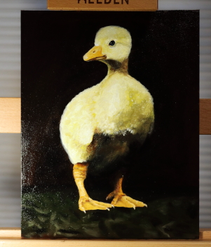
Trace Oswald wrote:Here is my feedback. Most people are their own worst critic. Keep in mind I have no talent for anything artistic, but like many people, "I know what I like", and in that vein, I have good taste. I think it looks fantastic.
awe, thanks.
I can't see if this is a good painting, a meh painting, or if it even looks like a goose/gosling/baby waterfoul, or something else.
This is what the background looks like when I come back to it this morning.
My theory is that the redness in the background is pushing the painting too warm (red/orange). (see also how bright I have to make the goose for the camera to 'see' the background)
But also, let's stop for a moment to admire how beautiful terra rosa (red earth) and black can be. It's one of my favourites.
(again, I am 'blowing' my highlights so the camera can see the darks)
I'm trying to emulate the texture of the damask fabric the goose was standing on without actually putting in the full damask pattern. As it's background, I don't want to put a lot of effort into it. (maybe that's where I'm going wrong?)
If it were mine, I wouldn't touch it :) One, it looks great. Two, I'd be afraid I would mess it up. I think the background change you made is an improvement though.
Trace Oswald wrote:If it were mine, I wouldn't touch it :) One, it looks great. Two, I'd be afraid I would mess it up. I think the background change you made is an improvement though.
Thank you so much. It helps to hear that.
I think I'm at the stage where it's going to get turned to the wall to dry (leaning it against the wall facing the wall, so dust doesn't get stuck to the paint not because I'm ashamed of it). I think I'm at the limit of what my skills can achieve and what this source photo can do.
It's officially in drying mode. I don't know how to make it better, so I will leave it to dry and maybe later, I will have skills to see what needs improvement.
Although it is tempting to paint the companion piece to this. When I took the original gosling photos, I got two really good ones.
It looks great! I've been following along since you started with this project. Today I actually reread the title. Please insert a Woohoo! cheer for each thumbs up I gave you! Remember, pollinators get two thumbs up per post, so that's double for your entries.
r ranson wrote:It's officially in drying mode. I don't know how to make it better, so I will leave it to dry and maybe later, I will have skills to see what needs improvement.
Although it is tempting to paint the companion piece to this. When I took the original gosling photos, I got two really good ones.
Here in East Central Indiana on Thursday mornings there is a TV show with a lady doing paintings with water colors that is really interesting and it seems that some of the painting techniques lap over with the oil, or other, paining. It is out of Fort Wayne, IN area on channel 39.3 at 8:00 AM if you're interested in watching that.
I thought it looked great when you were talking about “too warm” and reworked around the feet. That was BRAVE.
You paint so well in my opinion, that I can’t begin to critique.
That you are guided by your inner sense of what looks right and what doesn’t is central! You’re painting YOUR painting, so follow your instincts. That’s what all the great painters have done.
Early on in the thread there was a section questioning why one color changes how another appears. It brought to mind a weaving or dying workshop I attended 40+ years ago. We viewed two pieces of cloth. They appeared to be the same color. We each preferred the same one of the pair (secret ballot so as mot to be influenced by one another).
When we saw the two pieces up close, it was evident that the one we all preferred was a mix of many colors, not all of them were even the same range, or hue. If hue isn’t the right word, then for example they were not all greens. There were magenta flecks and teal flecks…
I concluded that even when we are unaware of them, the composite flecks are more “exciting“ to the eye than monochrome. Perhaps this is related?
Anyway, congratulations on your gosling.
Post by:autobot
I have always wanted to have a neighbor just like you - Fred Rogers. Tiny ad:
The new gardening playing cards kickstarter is now live!