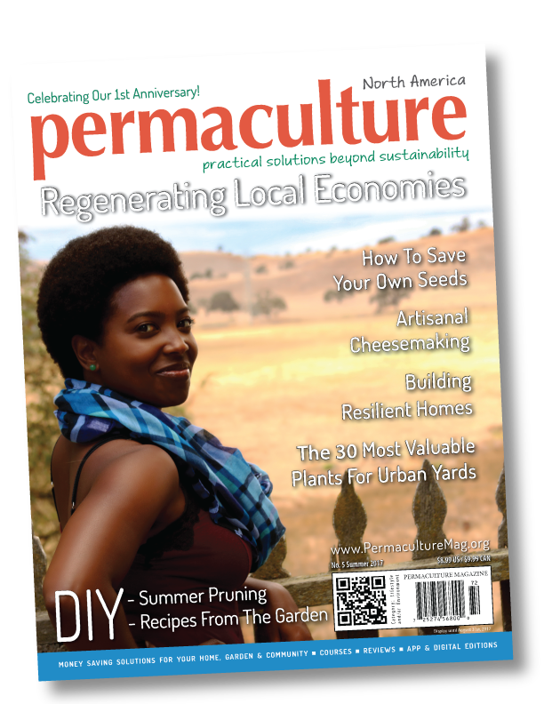


Polly Oz wrote:When I go to the purchase page, it says that issues are also available on android and in the App Store. Does the 'also' mean there is a third option? Also, in the App Store it doesn't access to the 87 back issues. Is that just a failure to mention, or does subscribing via the app not include the back issues?


Judith Browning wrote:Mine came in the mail today!!!
It's wonderful Cassie!
...beautiful job and excellent subjects...now if I can just tear it away from Steve.......


Steven Kovacs wrote:I would love to take a look and maybe subscribe, but unfortunately the font is so painful for me to read that I can't even evaluate the site's content. The all-caps titles are a problem too - all-caps is much, much harder to read than title case.


Cassie Langstraat wrote:
Steven Kovacs wrote:I would love to take a look and maybe subscribe, but unfortunately the font is so painful for me to read that I can't even evaluate the site's content. The all-caps titles are a problem too - all-caps is much, much harder to read than title case.
Hi Steven,
The fonts on which page are so hard to read?


Steven Kovacs wrote:
Cassie Langstraat wrote:
Steven Kovacs wrote:I would love to take a look and maybe subscribe, but unfortunately the font is so painful for me to read that I can't even evaluate the site's content. The all-caps titles are a problem too - all-caps is much, much harder to read than title case.
Hi Steven,
The fonts on which page are so hard to read?
The entire website. I can't tell exactly what the problem is, but for me trying to read the site at all is like translating letter by letter from an unfamiliar alphabet - and I'm someone who reads quite quickly normally. I find it very frustrating. Maybe the letters are too narrow, or packed too tightly, or are too difficult to distinguish from one another, or something? It's definitely the font that's the issue, not the overall graphic design.


Cassie Langstraat wrote:
Which website?
exacteditions.com? or permaculturemag.org?


Steven Kovacs wrote:I would love to take a look and maybe subscribe, but unfortunately the font is so painful for me to read that I can't even evaluate the site's content. The all-caps titles are a problem too - all-caps is much, much harder to read than title case.
 ....I'm on a full sized computer screen though and maybe it's a lot different for someone on a phone or ipad?
"We're all just walking each other home." -Ram Dass
"Be a lamp, or a lifeboat, or a ladder."-Rumi
"It's all one song!" -Neil Young


Judith Browning wrote:
Steven Kovacs wrote:I would love to take a look and maybe subscribe, but unfortunately the font is so painful for me to read that I can't even evaluate the site's content. The all-caps titles are a problem too - all-caps is much, much harder to read than title case.
I wonder if we are looking at the same magazine? I've been reading the one on line until my paper copy got here and I'm finding them both easy on my eyes and at the moment, because of eye surgery, I only have the use of my left one....I'm on a full sized computer screen though and maybe it's a lot different for someone on a phone or ipad?


Cassie Langstraat wrote:You still get the bonus 87 back issues from our mother magazine, but only for a limited time!
 '
'


Robbie Asay wrote:
Cassie Langstraat wrote:You still get the bonus 87 back issues from our mother magazine, but only for a limited time!
Is there a place to find out what the limited time is? I'm on a fixed income and budget a month ahead of time so that usually means I miss out on almost everything. ''


 1
1


Steven Kovacs wrote:I'm on a full-sized monitor, too, and have good vision. I don't know how to explain it other than to say that I find the font takes significant effort to read. It might just be me.


Jordon Thompson wrote:Cassie/Hannah/Staff, I got my first magazine of many in the mail yesterday and IT IS PHENOMINAL. You all did such a great job. It was super educational, easy to navigate, lots of great pictures and designs, I love it. 70 years from now when my great grand-kids are hopefully reading your magazine, I'll get to brag that I got the very first one.

 In a good way!!


Judith Browning wrote:
Steven Kovacs wrote:I would love to take a look and maybe subscribe, but unfortunately the font is so painful for me to read that I can't even evaluate the site's content. The all-caps titles are a problem too - all-caps is much, much harder to read than title case.
I wonder if we are looking at the same magazine? I've been reading the one on line until my paper copy got here and I'm finding them both easy on my eyes and at the moment, because of eye surgery, I only have the use of my left one....I'm on a full sized computer screen though and maybe it's a lot different for someone on a phone or ipad?
here's a sample snip of what I see...no caps and 'normal' looking type face...
![Filename: permaculturemag-font.png
Description: skinny letters and all caps [Thumbnail for permaculturemag-font.png]](/t/54414/a/39860/permaculturemag-font.png)


 2
2


It's time to get positive about negative thinking  -Art Donnelly
 1
1


 1
1


 2
2


Nick Watkins wrote:I have no idea how I missed this thread during the summer, but it's better to subscribe late than never. Can't wait to get my first issue!


 2
2


 3
3


 3
3


|
My pie came with a little toothpic holding up this tiny ad:
List of Rocket Mass Heater Builders
https://permies.com/wiki/122347/List-Rocket-Mass-Heater-Builders
|


