• Post Reply Bookmark Topic Watch Topic
  • New Topic
permaculture forums growies critters building homesteading energy monies kitchen purity ungarbage community wilderness fiber arts art permaculture artisans regional education skip experiences global resources cider press projects digital market permies.com pie forums private forums all forums
this forum made possible by our volunteer staff, including ...
master stewards:
  • Nancy Reading
  • Carla Burke
  • r ranson
  • John F Dean
  • paul wheaton
  • Pearl Sutton
stewards:
  • Jay Angler
  • Liv Smith
  • Leigh Tate
master gardeners:
  • Christopher Weeks
  • Timothy Norton
gardeners:
  • thomas rubino
  • Jeremy VanGelder
  • Maieshe Ljin

suggestions for the new look and feel

 
author and steward
Posts: 52410
Location: missoula, montana (zone 4)
hugelkultur trees chicken wofati bee woodworking
  • Mark post as helpful
  • send pies
    Number of slices to send:
    Optional 'thank-you' note:
  • Quote
  • Report post to moderator

The right column of current topics gets confusing with every other topic being highlighted in white with the others using the same bg as the rest of the page. It kind of makes the same color bg items seem of lesser importance.


I take it we are talking about the "forums" page - the home page for the forums that lists a summary of all the forums?


Please lose that ugly wood grain background and never find it again.


You mean you want me to lose my masterpiece? The very art I have been working on for three years?

At this time, you can log in and set your view to be the old view.


I noticed that when you do a search, the page style is still the original - it doesn't have the new look.


On the "todo" list.


I love it! I like the idea of having the best columns. And adding the pictures makes it a lot more fun to browse.


Thanks! I like these features too!

----

So this might be a good time to point out that there are several modes for changing things.

One is for non-logged in users

One is for logged in users

One is for logged in users with pie

Since pie is a new feature that will come out any day now, I think we need to start making a list of what features might possibly come with pie.

- ability to turn off wood

- - -

Devaka,

When looking at the permies.com category yesterday, there was no "best ever" column, but today there is. Did you mend something?


- - -

it appears the new format doesn't convert to mobile style.


We have plans to upgrade our current mobile view. For now, the mobile view is the same.


I was wondering if you would consider making the color of the words on the left column a bit of a different color.


Can you upload an image with what you think might be better?


I noticed right away that in the recent posts list, there is no listing of the person who made the thread, or the person to last respond with an answer, as was on the original site. Sometimes, I tend to click on something because I enjoy a specific person's take on things, and find that I learn a lot from this particular person in general. I might be more apt to connect with more posts if I knew that it was started by someone, or responded to by someone who I follow a bit. Its not that I wont click on a thread that I might be interested in, but that I know that I click on more when I am inspired by certain personalities. Does that make sense?


Good suggestions!

I would like to propose the following new features for pie users:

- preferences checkbox: show thread starter in list of threads
- preferences checkbox: show last commentor in list of threads
- ability to influence "best" algorithm with people that you favor or disfavor
- ability to configure forums page to be "best ever", "best this year", "best this month", "best this week", "best today" or "most recent"
- ability to add two thumbs up; ability for thumbs down
- ability to show time in customizable time zone rather than "2 hours ago"
- ability to turn off wood
- ability to show registration date for users under their name instead of as hover text


shadows come from all angles, making the 3D attempts look corny, since there's no realistic light source that would give those shadows


Can you mock up an improvement?


the button text color contrast is way too low; use Jonathan Snook's color contrast tools to get into a range that is readable for the larger audience.


Can you mock up an improvement?


So let me quickly summarize... By 2016 YOU CAN'T:
Make a website which is not mobile-friendly.
Make an index page with 4 sidebar on it.
Make a repetitive textural background like this woody one.
Make textural buttons with useless artworks but no Hover class.
Make buttons and calls to action with very low contrast.
Make poor advertising integration
Add useles animated Gif and artworks


Please be specific about the mobile friendly thing.

4 sidebar?

woody background is my design - I think we will give folks the ability to opt out.

"textural buttons with useless artworks but no Hover class" - example?

"buttons and calls to action with very low contrast." example?

"Make poor advertising integration" -- I think we are about to nearly eliminate advertising and go in a totally different direction.

"useles animated Gif and artworks" example?


I find the buttons very hard to read.

I hope its ok to attach a mockup.
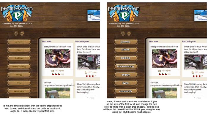


(mockups are very appreciated!)


When alexander and I worked on this look and feel, I said that what I wanted was something that was dusty, rusty and old. I wanted something that seemed like it was a wood and brass ipad a hundred years ago that is still in operation. The buttons might be a little worn, but they still work.

Some of the coderanch staff made the buttons. They are supposed to look like aged, engraved brass. It is possible that they could use some improvement. But just making them white takes a bit of the fun out.

I don't suppose you can mock them up a bit further so that they are more readable AND they help me with what I am trying to do?


I'm impartial to the wood, but what's missing is some green! Permies is about permaculture, which is about growies, and they're missing!


Do you have a mockup you could share?


My other thought is that the forum view is cluttered and very not mobile friendly (which is also bad for SEO).


mockup?


One solution that may solve both issues is to put the "best of" stuff below the left hand menu.


Other stuff is going there. Coming soon!


I didn't have any problems with the new site, just an old one that I might as well put right here. When you get to the bottom of the page, you want to go to the next page. But I can't seem to find the"Next Page" button. I have to go all the way up to the top to get to the next page.


Which page are we talking about?


Button fonts: I find these very hard to read, and I suspect they'd fail visual contrast tests.


mockup?


The alternate-colour list: the beige ones tend to disappear, perhaps need a border.


mockup?


Posts: 1947
Location: Southern New England, seaside, avg yearly rainfall 41.91 in, zone 6b
81
forest garden fungi trees books chicken bee
  • Likes 1
  • Mark post as helpful
  • send pies
    Number of slices to send:
    Optional 'thank-you' note:
  • Quote
  • Report post to moderator
I miss having the date at the top of each thread. I just read a "similar thread" and all it said was "six years ago" and a more recent thread said "twelve hours ago" The normal view has date and time.

The white letters on the buttons do ruin the old fashioned look. What if the buttons were a bit darker brass and the letters were a bright gold yellow with a black shadow. When I imagine old fashioned buttons I imagine a painted ceramic or bone look. Maybe off white buttons with black lettering in an old fashioned painted font.

I have no idea how to do a mock up.
 
out to pasture
Posts: 12484
Location: Portugal
3346
goat dog duck forest garden books wofati bee solar rocket stoves greening the desert
  • Mark post as helpful
  • send pies
    Number of slices to send:
    Optional 'thank-you' note:
  • Quote
  • Report post to moderator

Matu Collins wrote:I miss having the date at the top of each thread. I just read a "similar thread" and all it said was "six years ago" and a more recent thread said "twelve hours ago" The normal view has date and time.


On my computer, if I hover the mouse over the bit that says 'twelve hours ago' or whatever, it shows the actual time and date. Does that work for you?
 
Rocket Scientist
Posts: 4526
Location: Upstate NY, zone 5
574
5
  • Likes 1
  • Mark post as helpful
  • send pies
    Number of slices to send:
    Optional 'thank-you' note:
  • Quote
  • Report post to moderator
I have to say that the woodgrain and rounded buttons make the site look old-fashioned in a "dated" manner, more than an "antique" manner. I think if you want it to read as a hundred-year-old ipad, it needs some *more* brass/engraved decoration. The thick borders to sections look more clunky than antique. With current CSS abilities, you could make image borders which would look like a 3-d rim instead of a flat line.

The buttons are definitely hard to read, and need much more contrast as well as larger text. The contrast overall is much less than the original view, and I find it harder to read.
Giving the buttons a ":hover" class which brightens up on mouseover would help with readability as well as general user-friendliness.

Back when the beta view first came out it had the fixed top menubar, which took up a large permanent chunk of vertical real estate which is in short supply on my laptop screen, causing many pictures to be impossible to view all at once. This was removed, but the idea of having it always available is good. Something I suggested then was to use CSS to minimize it and make it expand when mousing to the top edge of the screen. This is very easy to do, taking just two statements of CSS, and with a bit more tweaking it should be possible to have it visible at the top of the page and minimize when scrolled down.
 
paul wheaton
author and steward
Posts: 52410
Location: missoula, montana (zone 4)
hugelkultur trees chicken wofati bee woodworking
  • Mark post as helpful
  • send pies
    Number of slices to send:
    Optional 'thank-you' note:
  • Quote
  • Report post to moderator
Can you put together a mockup of your suggestions?
 
Posts: 23
  • Likes 1
  • Mark post as helpful
  • send pies
    Number of slices to send:
    Optional 'thank-you' note:
  • Quote
  • Report post to moderator
I like it. I do not mind the wood to me the wood looks homey! not homely! Homey.
 
steward
Posts: 21553
Location: Pacific Northwest
12040
11
hugelkultur kids cat duck forest garden foraging fiber arts sheep wood heat homestead
  • Likes 3
  • Mark post as helpful
  • send pies
    Number of slices to send:
    Optional 'thank-you' note:
  • Quote
  • Report post to moderator
I don't know if this is a bug, or a new feature, but I just noticed that the new forum design does not show us when people joined when I'm reading through a thread. I really enjoyed seeing this information as I read, as I could see when someone was a newby and should be welcomed/given lots of help. I also liked that feature because I could use it with the amount of apples and posts a person has made to give me a glance into how knowledgeable they might be. This was especially useful when I joined the forum and knew little about permaculture.
 
Matu Collins
Posts: 1947
Location: Southern New England, seaside, avg yearly rainfall 41.91 in, zone 6b
81
forest garden fungi trees books chicken bee
  • Mark post as helpful
  • send pies
    Number of slices to send:
    Optional 'thank-you' note:
  • Quote
  • Report post to moderator
Is there a mobile equivalent to "hover"?
 
pollinator
Posts: 2142
Location: Big Island, Hawaii (2300' elevation, 60" avg. annual rainfall, temp range 55-80 degrees F)
1064
forest garden rabbit tiny house books solar woodworking
  • Likes 1
  • Mark post as helpful
  • send pies
    Number of slices to send:
    Optional 'thank-you' note:
  • Quote
  • Report post to moderator
Paul said, .....On my computer, if I hover the mouse over the bit that says 'twelve hours ago' or whatever, it shows the actual time and date. Does that work for you?....

I'm using an iPad. So I have no mouse and cannot hover. I tried hovering with my finger but that doesn't work. Like Matu, I prefer time and date. Now that I've used the new forum for 24 hours, I'm finding that the "10 hours ago" to be annoying. Looks like I'm just gonna have to visit the forum at a set time once a day just so that I can easily figure out what recent topics I haven't perused yet.

Other than this, I find the new forum quite nice. I like the woodsy look and my old eyes are having no problem reading the buttons.
 
pollinator
Posts: 1781
Location: Victoria BC
315
  • Mark post as helpful
  • send pies
    Number of slices to send:
    Optional 'thank-you' note:
  • Quote
  • Report post to moderator
I agree with Nicole that 'joined date' was nice info to have.

I also agree with Matu that an actual date is the best sort of timestamp for posts/threads.

When looking at a given forum, or the 'recent' or 'zero replies' pages, I really miss the ability to see at a glance both the original author, and the author/time/date of the last post. For example, I tend to read the updates from the various Ant logs, when the Ant posts something. I don't want to check in 5x a day when some other fan posts kudos...


When viewing from a 10" tablet as opposed to triple-screened desktop, the general cluttered feel is notably worse due to the smaller screen. Once into a thread, it's extra frustrating on a small screen to have those wasted pixels on the left showing off the wood grain. If I wanted to look at wood grain I would look at some wood! I want to read the thread, which now takes more scrolling since it is not as wide!


I do not like where this 'pie' thing is going so far; those preference checkboxes are for things that already existed and are apparently being removed... getting them back is special in the same way that NOT getting punched in the face is special!


On the plus side, I think this will be a big hit with people who live in desert environments completely devoid of trees or wood; the wood grain should be a real treat!


The option to switch to the old version is much appreciated!
 
Nicole Alderman
steward
Posts: 21553
Location: Pacific Northwest
12040
11
hugelkultur kids cat duck forest garden foraging fiber arts sheep wood heat homestead
  • Mark post as helpful
  • send pies
    Number of slices to send:
    Optional 'thank-you' note:
  • Quote
  • Report post to moderator

Su Ba wrote:Paul said, .....On my computer, if I hover the mouse over the bit that says 'twelve hours ago' or whatever, it shows the actual time and date. Does that work for you?....

I'm using an iPad. So I have no mouse and cannot hover. I tried hovering with my finger but that doesn't work. Like Matu, I prefer time and date. Now that I've used the new forum for 24 hours, I'm finding that the "10 hours ago" to be annoying. Looks like I'm just gonna have to visit the forum at a set time once a day just so that I can easily figure out what recent topics I haven't perused yet.

Other than this, I find the new forum quite nice. I like the woodsy look and my old eyes are having no problem reading the buttons.


Ah! I'd tried hovering over the post date/"twelve hours ago" thing, and it hadn't been working. I then realized I have to hover a lot longer and then it'd show up. I also see the person's join date when I hover over their name. While I like these tricks, it is a little frustrating that it's hard to find, and that anyone not reading this thread probably won't even know that this is a feature. I think that since this is a forum focused on living in nature, having the actual date/time is a lot more useful to see than "twelve hours ago." I'd much rather have the date/time known at a glance than a vague "posted 1 year ago." I think a lot of newbies/visitors would rather have this knowledge, too, especially since so many people find their way to permies by doing web searches on how to fix their garden, etc. Knowing the date the post was written (just like knowing someones location/zone) can be really useful information when learning from old posts.

But, maybe that's just me. Maybe there are people who like the "posted 1 year ago" feature? Does anyone like this feature more than the other way? Why?

As for the join date, having that information upfront and easily visible is nice, but not nearly as useful as knowing the exact date and time. I can sort of memorize how long people have been here after seeing it a few times, but I'd have to hover my mouse over every post to see when they posted!
 
D Nikolls
pollinator
Posts: 1781
Location: Victoria BC
315
  • Likes 2
  • Mark post as helpful
  • send pies
    Number of slices to send:
    Optional 'thank-you' note:
  • Quote
  • Report post to moderator
Hadn't noticed the hover for date option. Better than nothing... but doesn't help on touchscreen tablets. And even on the desktop it seems like a pointless extra step; I really can't imagine a scenario where 'one year ago' adds anything over 'Nov 21st 2014', whereas a real date might be quite useful if the post is talking about something seasonally influenced.
 
Posts: 44
Location: South Australia
forest garden urban greening the desert
  • Likes 3
  • Mark post as helpful
  • send pies
    Number of slices to send:
    Optional 'thank-you' note:
  • Quote
  • Report post to moderator
Hi Cas

Looks great. =)
I love being able to see three different paths into the content from the top.
The sub-categories on the right are good divisions of the subjects.

Below are some thoughts.
I have not used the site a lot so perhaps my questions are easy for someone with more experience here =).
Hope they are helpful. =)

Do you want to be able to go from a person's post to a list of their posts?
Linking the name on the post to a page of their stuff?
you do have that link on search results.

Perhaps the search option could be still visible when you select a side menu topic?
Would that search within that topic?
I like that you have a search page where you can choose specifics in a site which has a lot of data like this.

The post a new New Topic button is outside the pale window and I was looking for how to post within that window.
That is probably just that I have not posted much before?

Do you need the website url on the banner ads so people know they are leaving the permies site and going somewhere else?

Antialiasing on the asterisk near the banners.
Perhaps that should just be a text link to say where it is going? "All banners"?

What is the difference between most recent on the column and recent topics at the top menu?
Perhaps they are recent posts?

Best topics on the top menu is this year or all time?

The link to home goes to the old style permies home page?
Perhaps it would be useful to state Forums on the top of the page rather than just have the button?
So people can see the difference between that and the website bit.

Do you have someone to check it for accessibility?
I know accessibility means some goals re colour contrast, text size, and not sure about columns.
Perhaps you could have access to those three threads by choosing whether to view, best this year, best all time and newest as sortings?
Perhaps the mobile version is related to the accessible version as they would have similar needs re short direct paths to content and different screen real estate and contrast?
I tried this site. The first 2 didnt find anything but the Cynthia one has some response that might be useful?
http://usabilitygeek.com/10-free-web-based-web-site-accessibility-evaluation-tools/

Thanks for the opportunity to see what you're doing =)
Hope it goes smoothly and you have lots of happy permies =)


Best wishes

Janet

 
paul wheaton
author and steward
Posts: 52410
Location: missoula, montana (zone 4)
hugelkultur trees chicken wofati bee woodworking
  • Likes 1
  • Mark post as helpful
  • send pies
    Number of slices to send:
    Optional 'thank-you' note:
  • Quote
  • Report post to moderator
I updated the red stuff at the top.


What is the difference between most recent on the column and recent topics at the top menu?
Perhaps they are recent posts?

Best topics on the top menu is this year or all time?


Excellent points! Can anybody think of a reason to keep those links? I think those pages serve no value now. I suppose we should ask the same question for "flagged topics" and "Hot topics" too?


Su Ba
pollinator
Posts: 2142
Location: Big Island, Hawaii (2300' elevation, 60" avg. annual rainfall, temp range 55-80 degrees F)
1064
forest garden rabbit tiny house books solar woodworking
  • Likes 1
  • Mark post as helpful
  • send pies
    Number of slices to send:
    Optional 'thank-you' note:
  • Quote
  • Report post to moderator
Paul, whoa. Please don't remove the "recent topics" link that's at the top bar. That link will be the one that I primarily, in fact, always will be using because it takes me to a display that is useful for what I am seeking. The "most recent" column does not display the poster's name, an important fact as far as I am concerned.

Example:
Evan's posts frequently, resulting in long columns with lots of pictures. That's great and I love it, so I follow his posts. But other people also make short supportive posts. Whenever I click to read Evan's posts, my computer must re-download all his pictures, thus a slow process in my slow-slow-slow Internet. And this eats up my data. If I can anticipate seeing Evan's post, I feel that it is worth it. But I surely don't like using up time and data just to see someone saying "good job Evan".

Please keep that "recent topics" link some place on the page. Thanks.
 
paul wheaton
author and steward
Posts: 52410
Location: missoula, montana (zone 4)
hugelkultur trees chicken wofati bee woodworking
  • Mark post as helpful
  • send pies
    Number of slices to send:
    Optional 'thank-you' note:
  • Quote
  • Report post to moderator
Su,

So I think what you are saying is that if you can see the name of the most recent poster in the "recent" column, then you would be okay with the "recent topics" link going away. Is that accurate?

 
Nicole Alderman
steward
Posts: 21553
Location: Pacific Northwest
12040
11
hugelkultur kids cat duck forest garden foraging fiber arts sheep wood heat homestead
  • Likes 1
  • Mark post as helpful
  • send pies
    Number of slices to send:
    Optional 'thank-you' note:
  • Quote
  • Report post to moderator
I'm with Su Ba, please please please please please do not get rid of the "recent topic" link/page. It's really the only page I use, and the only one that makes sense to me. I had been wondering why people were complaining about not seeing the original author and most recent author in a given post, because I saw all that information. I just now realize that the only reason I was seeing that information was because I was looking at most recent posts. That information is not seen elsewhere . I find the layout of original "Recent Topics" exceedingly helpful. I love how it shows me where a topic was posted (for instance, if I know something was posted in Cascadia, I'll probably check it out, because it's my region. But I may not do so if I don't know it's in Cascadia). I do not want to have to check every subforum individually to know what's being posted in there. I also find knowing the most recent poster and original poster really valuable, too, for the same reason's everyone else has mentioned

I don't have that much time in the day, and I'd like to make efficient use of that time. I'm sure I'm not the only one! The original "Recent Topic" topic helps me be efficient. I can come, quickly scan the posts, see what's going on, and be able to help/learn from as many people as possible. While the new layout is nice, especially for quickly seeing what information there is historically on permies, it is not efficient. If I want to see what the recent topics are, I have to do a lot of scrolling because the list of posts takes up so much more vertical space. Because it takes up more vertical space and I can see less at a glance, I don't look at nearly as many threads. I think a lot less people would be helped and a lot less knowledge would be built without the "Recent Topics" page.

Edit: I realized I was calling "Recent Topics" "Most Recent" instead, which might have caused some confusion!
 
Su Ba
pollinator
Posts: 2142
Location: Big Island, Hawaii (2300' elevation, 60" avg. annual rainfall, temp range 55-80 degrees F)
1064
forest garden rabbit tiny house books solar woodworking
  • Mark post as helpful
  • send pies
    Number of slices to send:
    Optional 'thank-you' note:
  • Quote
  • Report post to moderator
Paul,

Yes, that is accurate.
 
Matu Collins
Posts: 1947
Location: Southern New England, seaside, avg yearly rainfall 41.91 in, zone 6b
81
forest garden fungi trees books chicken bee
  • Likes 3
  • Mark post as helpful
  • send pies
    Number of slices to send:
    Optional 'thank-you' note:
  • Quote
  • Report post to moderator
I go to "recent topics" at the top every time. I use that more than anything else as well. We must not be the only ones! I'm sure some moderators find it useful, best for catching spam quickly.

The "most recent" column doesn't show as many posts as the recent topic page which can show the whole day's activity sometimes.

I don't give a hoot about "hot topics" or "flagged topics". If I am feeling magnanimous I got to "zero replies"
 
Su Ba
pollinator
Posts: 2142
Location: Big Island, Hawaii (2300' elevation, 60" avg. annual rainfall, temp range 55-80 degrees F)
1064
forest garden rabbit tiny house books solar woodworking
  • Likes 4
  • Mark post as helpful
  • send pies
    Number of slices to send:
    Optional 'thank-you' note:
  • Quote
  • Report post to moderator
I'm with you, Matu.

I'm not interested in flagged topics, hot topics, and definitely not best topics. My number one go-to is most recent. I'll also go to zero replies on the days when I have extra time in my hands, and search for someone who needs help. I also use the search feature. I guess for people who are newbees or have plenty of leisure time, those other topic ideas are fine and fun. But I homestead to support myself and don't have the time to browse hours a day.

I like being able to see who started a topic, because if I see that it is Paul, Cassie, or Dale then I'm sure to read it. The new Most Recent doesn't show the originator, so I can see that I'm going to miss some of those people's topics I'm sure. I'm surely not going to open each and every most recent just to check if Paul started it. That would not only eat up my limited time, but also put an unwanted dent in my data plan.

Basically I like the new look in general. But I don't like losing some of the features that make using this site easy and friendly for me. I like seeing the name of the person who posted the message. I like seeing time and date. I like a quick and simple way to check the most recents without having to load multiple pages.
 
Matu Collins
Posts: 1947
Location: Southern New England, seaside, avg yearly rainfall 41.91 in, zone 6b
81
forest garden fungi trees books chicken bee
  • Likes 2
  • Mark post as helpful
  • send pies
    Number of slices to send:
    Optional 'thank-you' note:
  • Quote
  • Report post to moderator
Yes, the poster's name is a valuable feature.
 
Posts: 8889
Location: Ozarks zone 7 alluvial, clay/loam with few rocks 50" yearly rain
2382
4
  • Likes 3
  • Mark post as helpful
  • send pies
    Number of slices to send:
    Optional 'thank-you' note:
  • Quote
  • Report post to moderator
I also only go to 'recent topics' and browse...first the titles and then who began the thread and who was last to post. I like how the old view 'recent topics' page is easy to find that information and has a lot of topics per page.
 
Nicole Alderman
steward
Posts: 21553
Location: Pacific Northwest
12040
11
hugelkultur kids cat duck forest garden foraging fiber arts sheep wood heat homestead
  • Likes 1
  • Mark post as helpful
  • send pies
    Number of slices to send:
    Optional 'thank-you' note:
  • Quote
  • Report post to moderator
Just thought I'd mention that you can go to your profile and select to "Show user name in forum view" and you'll get to see the author and most recent poster on your "Most Recent" column. I hope that helps someone!

Having said that, I really do not care for the layout of the most-recent column. Since there's all that other cool info on the side about "Best" posts, the "Most Recent Post" information is crammed into a small space. My brain is really overwhelmed by all the surrounding data. And, the "Most Recent" column is very hard to read because all the information is in one column, rather than neatly organized into 6, easy-to-skim columns like in the "Recent Topics" page. I've tried multiple times to try to read the "Most Recent" column, and have given up and resorted to clicking on the "Recent Topics" link to look at the most recent posts. My brain simply does not want to try to process the very cluttered and hard to read information in the "Most Recent" column.
How-to-see-usernames-in-forum-view.jpg
[Thumbnail for How-to-see-usernames-in-forum-view.jpg]
Most-Recent-Column.jpg
[Thumbnail for Most-Recent-Column.jpg]
I-love-you-Recent-Topics-Page-.jpg
[Thumbnail for I-love-you-Recent-Topics-Page-.jpg]
I love you, Recent Topics Page. Please never leave me! I don't know how I could live without you!
 
Posts: 502
Location: West Midlands UK (zone 8b) Rainfall 26"
140
  • Mark post as helpful
  • send pies
    Number of slices to send:
    Optional 'thank-you' note:
  • Quote
  • Report post to moderator
I like the new look, I like the woodgrain effect though bamboo would perhaps have been more sustainable. However I'm not particularly interested in the "best ever" and "best this year" columns as permanent impingements on my view of the more current threads. Even if the brass buttons were just a bit narrower so that what to me should be the "main body" of the page is not so squished over to the right.

Well done for all that hard work!
 
Judith Browning
Posts: 8889
Location: Ozarks zone 7 alluvial, clay/loam with few rocks 50" yearly rain
2382
4
  • Mark post as helpful
  • send pies
    Number of slices to send:
    Optional 'thank-you' note:
  • Quote
  • Report post to moderator

Nicole Alderman wrote:Just thought I'd mention that you can go to your profile and select to "Show user name in forum view" and you'll get to see the author and most recent poster on your "Most Recent" column. I hope that helps someone!

Having said that, I really do not care for the layout of the most-recent column. Since there's all that other cool info on the side about "Best" posts, the "Most Recent Post" information is crammed into a small space. My brain is really overwhelmed by all the surrounding data. And, the "Most Recent" column is very hard to read because all the information is in one column, rather than neatly organized into 6, easy-to-skim columns like in the "Recent Topics" page. I've tried multiple times to try to read the "Most Recent" column, and have given up and resorted to clicking on the "Recent Topics" link to look at the most recent posts. My brain simply does not want to try to process the very cluttered and hard to read information in the "Most Recent" column.


Thanks, Nicole...I didn't know what that meant when I saw it in my profile choices...checked now

I did find that when on the page that you have pictured second, that if you then click on 'recent topics' in the heading of the page, it then goes to full screen 'recent topics' just as in the old view, as in your third picture. It just takes one more step to do it...the difference between 'most recent' and 'recent topics' wasn't immediately apparent to me. ....more caffine needed

 
paul wheaton
author and steward
Posts: 52410
Location: missoula, montana (zone 4)
hugelkultur trees chicken wofati bee woodworking
  • Mark post as helpful
  • send pies
    Number of slices to send:
    Optional 'thank-you' note:
  • Quote
  • Report post to moderator
I wanna take this moment to say that this is exactly the kind of feedback I was hoping for.


Maybe the thing to do is to offer to make your home page be "the recent topics page"?

Or, I suppose, we could just leave the recent topics page as something offered for logged in users?

----

I like the new look and feel for people that are new to permies. Especially if it is their first visit. One million people come to permies each month.

Plus, I like the picture heavy view. A lot.
 
Nicole Alderman
steward
Posts: 21553
Location: Pacific Northwest
12040
11
hugelkultur kids cat duck forest garden foraging fiber arts sheep wood heat homestead
  • Mark post as helpful
  • send pies
    Number of slices to send:
    Optional 'thank-you' note:
  • Quote
  • Report post to moderator

Hester Winterbourne wrote:I like the new look, I like the woodgrain effect though bamboo would perhaps have been more sustainable. However I'm not particularly interested in the "best ever" and "best this year" columns as permanent impingements on my view of the more current threads. Even if the brass buttons were just a bit narrower so that what to me should be the "main body" of the page is not so squished over to the right.

Well done for all that hard work!


You can actually get rid of those sidebar buttons by clicking the little "eyeball" above them.


In other news, I noticed that the link to finding the total list of forums is rather hard to find...or at least it is for me. Is there a way that we could make it more obvious? It's hard to post in a specific sub-forum, and I'm afraid that newbies might only notice the "Top Forums" and not know that there a whole lot more where that came from!


As there are so many various little hidden features, I think we're really going to need a "How to use this site" sticky thread, or at least a sticky thread of all the "How To"s that have been written, with a link to a new one detailing the features of our new forum view. I know there's a lot of how-tos, but they tend to get lost in the forums.

EDIT: Just realized my attachements didn't attach! Here's the eyeball button for those that don't know what I'm talking about, as well as the before/after.
Remove-Buttons-From-Side-copy.jpg
[Thumbnail for Remove-Buttons-From-Side-copy.jpg]
How-it-looks-wihout-sidebar-buttons-copy.jpg
[Thumbnail for How-it-looks-wihout-sidebar-buttons-copy.jpg]
 
gardener
Posts: 323
Location: AB, Canada (Zone 4a - Canadian Badlands)
60
forest garden fungi trees rabbit chicken bee
  • Mark post as helpful
  • send pies
    Number of slices to send:
    Optional 'thank-you' note:
  • Quote
  • Report post to moderator
I am echoing the love for the recent topics tab. I use it as my default link for the forums.

I want to also mention how great it would be to subscribe to a person on the forums, without having to use a reader of some sort. *grin*
There could possibly even be an optional title for people with followers that would be fun (or creepy, depending how you feel about it) - "I have (x number) of people obsessed with my comments" ...worded however you like
 
Hester Winterbourne
Posts: 502
Location: West Midlands UK (zone 8b) Rainfall 26"
140
  • Mark post as helpful
  • send pies
    Number of slices to send:
    Optional 'thank-you' note:
  • Quote
  • Report post to moderator

Nicole Alderman wrote:

You can actually get rid of those sidebar buttons by clicking the little "eyeball" above them.


I don't want to get rid of the buttons, just the "best ever" and "best this year" columns! Seems to me that if a post is the best ever, it's going to be best ever for some time yet, and I don't need to keep being offered it.
 
paul wheaton
author and steward
Posts: 52410
Location: missoula, montana (zone 4)
hugelkultur trees chicken wofati bee woodworking
  • Likes 1
  • Mark post as helpful
  • send pies
    Number of slices to send:
    Optional 'thank-you' note:
  • Quote
  • Report post to moderator
I am talking to devaka about the feature of a user being able to change (for their own view) the "best ever" and "best this year" to be "best this week" and "best today".

Folks should be able to modify the "best" columns now by rating forums.

I think that if a user shows up once a week or so, "best this week" might be of great value.

 
Su Ba
pollinator
Posts: 2142
Location: Big Island, Hawaii (2300' elevation, 60" avg. annual rainfall, temp range 55-80 degrees F)
1064
forest garden rabbit tiny house books solar woodworking
  • Likes 2
  • Mark post as helpful
  • send pies
    Number of slices to send:
    Optional 'thank-you' note:
  • Quote
  • Report post to moderator
I discovered the eyeball feature accidentally. It does make comprehending the most recent column easier for my pathetic brain. But I still go to recent topics first thing.

I wonder what other hidden tricks exist on the new site? Perhaps a topic of "how to use this site" would be good for newbees and hardheaded oldsters like myself. I'm definitely not tech oriented. Didn't grow up with it, but I'm willing to listen and learn. Being raised by the old home rule of "don't touch", I'm hesitant to click on something that I don't know what it will do.
 
Matu Collins
Posts: 1947
Location: Southern New England, seaside, avg yearly rainfall 41.91 in, zone 6b
81
forest garden fungi trees books chicken bee
  • Mark post as helpful
  • send pies
    Number of slices to send:
    Optional 'thank-you' note:
  • Quote
  • Report post to moderator
I went and bought a pie, very exciting

I tried the "turn off wood" feature and now it's just plain brown. I don't object to the wood grain pattern of the wood, just the darkness of it. It would be nice if removing wood gave a brighter look. Light colored wood would be good too.
 
Posts: 139
10
  • Likes 1
  • Mark post as helpful
  • send pies
    Number of slices to send:
    Optional 'thank-you' note:
  • Quote
  • Report post to moderator
I haven't looked around on the new site yet. I was impressed by the new look and can tell all the work that has gone into it. I just wanted to say that I appreciate this site and all the wonderful people on it. I have learned so much from everyone here and since we bought a home on 8 acres, I am able to apply the knowledge in this forum. Thanks to all!

Paul, I am reading about features on the old site that I didn't even know about. I guess I didn't dig around on it enough. I have to admit that I lurked forever before I joined, so if I didn't find all the features, that's my fault. There is one feature that I would like to request and it might even be available and I just don't know how to use it. Is there a way to "call" an individual to a post? I belong to another forum that has this feature , you enter @theirname and they are notified when they log in.

I gotta go look around and check out the new forum!

Thanks!
 
paul wheaton
author and steward
Posts: 52410
Location: missoula, montana (zone 4)
hugelkultur trees chicken wofati bee woodworking
  • Mark post as helpful
  • send pies
    Number of slices to send:
    Optional 'thank-you' note:
  • Quote
  • Report post to moderator
So a user would get a PM that would say "Dana thinks you would like to see this post: _____" ??
 
Posts: 10
Location: Essex County, Ontario, Canada -- Zone 6b
  • Likes 1
  • Mark post as helpful
  • send pies
    Number of slices to send:
    Optional 'thank-you' note:
  • Quote
  • Report post to moderator
The new look looks great! Some of the threads have so many posts that they are divided into several pages. For these threads, it would be handy if the navigation buttons (previous, 1, 2, 3, next) that appear at the top of the page were also available at the bottom of the page, since that's where the reader will be when he/she is ready to read the next page. The permaculture principle of positioning elements to maximize functionality!!!
 
Posts: 577
67
9
  • Mark post as helpful
  • send pies
    Number of slices to send:
    Optional 'thank-you' note:
  • Quote
  • Report post to moderator
Love the beta look, first time viewing, it really is more inviting. 1000 apples
 
author & steward
Posts: 7150
Location: Cache Valley, zone 4b, Irrigated, 9" rain in badlands.
3340
  • Mark post as helpful
  • send pies
    Number of slices to send:
    Optional 'thank-you' note:
  • Quote
  • Report post to moderator

Since I switched over to the new forum look, I think that I haven't been getting (or seeing) notifications for the guest authors threads.

I miss seeing those. They are one of my favorite types of threads.
 
Dana Jones
Posts: 139
10
  • Likes 1
  • Mark post as helpful
  • send pies
    Number of slices to send:
    Optional 'thank-you' note:
  • Quote
  • Report post to moderator

paul wheaton wrote:So a user would get a PM that would say "Dana thinks you would like to see this post: _____" ??


That would work. The other forum I am on, sometimes someone asks for help for their sick animal, lets say a sheep. The first people to comment on the post might not know anything about sheep, but will "call" others more proficient with sheep knowledge. @sheepwhisperer @sheepvet and then these people get notified. The way the other forum works, when I log in, I get alerts on threads that I commented on, if there is a new post. That's where the notifications show up for the "call" to a post. The alert says so-and-so mentioned you in a post, I click on it and it takes me to that post.

I am not trying to make Permies into another forum, so please don't be offended. But I think it would be a neat feature to have, the ability to call a person's attention to a thread or post. If it would be by PM, then that would work. I have read posts where a user asks a question, gets comments and another user says, that would be a question for Fred Ferklemyer, but there is no way to notify Fred that his attention is needed on that thread. Maybe Fred will find it, maybe he won't. Is there any way you could offer that option?

I get emails that there are new posts on threads that I have commented on and that really helps me find them again. I appreciate this feature!
Thanks Paul for this fantastic site.
Dana
 
Could you hold this puppy for a sec? I need to adjust this tiny ad:
rocket mass heater risers: materials and design eBook
https://permies.com/w/risers-ebook
reply
    Bookmark Topic Watch Topic
  • New Topic