• Post Reply Bookmark Topic Watch Topic
  • New Topic
permaculture forums growies critters building homesteading energy monies kitchen purity ungarbage community wilderness fiber arts art permaculture artisans regional education skip experiences global resources cider press projects digital market permies.com pie forums private forums all forums
this forum made possible by our volunteer staff, including ...
master stewards:
  • Carla Burke
  • John F Dean
  • Timothy Norton
  • Nancy Reading
  • r ranson
  • Jay Angler
  • Pearl Sutton
stewards:
  • paul wheaton
  • Tereza Okava
  • Andrés Bernal
master gardeners:
  • Christopher Weeks
gardeners:
  • Jeremy VanGelder
  • M Ljin
  • Matt McSpadden

new page for the better world book

 
author and steward
Posts: 55439
Location: missoula, montana (zone 4)
hugelkultur trees chicken wofati bee woodworking
  • Likes 2
  • Mark post as helpful
  • send pies
    Number of slices to send:
    Optional 'thank-you' note:
  • Quote
  • Report post to moderator
https://greenlivingbook.com

Any feedback?

 
pollinator
Posts: 448
Location: Poland, zone 6, CfB
178
13
forest garden fish trees books writing homestead
  • Likes 2
  • Mark post as helpful
  • send pies
    Number of slices to send:
    Optional 'thank-you' note:
  • Quote
  • Report post to moderator
I like this page very much.

Being me, I have to say a word about font consistency.
I know that ToC is a screenshot from the book and that including it as it is was easy and natural choice.
But, its look does not fit to the design as a whole.
I would either:
- rewrite it using appropriate font,
or
- put a miniature image which opens full size in a new window when clicked,
or
- put it at very end.

Or maybe convert to green and see how it fits?
 
gardener
Posts: 1343
Location: Miami, 11a, Am, apartment dweller
897
9
hugelkultur kids forest garden trees books wofati cooking bike rocket stoves
  • Likes 4
  • Mark post as helpful
  • send pies
    Number of slices to send:
    Optional 'thank-you' note:
  • Quote
  • Report post to moderator
I checked the page just now both on desktop and mobile. Overall the page looks good to me, and I can see myself sending this link to someone I want to share the book with (when I don't have a physical copy of the book to give them)

On mobile, it looks mostly good. The author profile pic circles are cut off at the bottom (which I think is intentional?), but with the white space between it and the name, it looks like the picture isn't loading fully. (Picture #1)

On desktop, at the TOC, there's a lot of white space to the right of the items (picture #2). Maybe the TOC image could be centered in the page? I feel like the contents image wants to be the focus in that part of the page, and not compete with another thing.
Screenshot_20250604_103800_Chrome.jpg
mobile, showing gap between author profile pic and author name, suggesting incomplete loading
Screenshot-2025-06-04-104052.png
desktop, showing whitespace to right of TOC
 
gardener
Posts: 620
Location: New England
274
cat monies home care books cooking writing seed wood heat ungarbage
  • Likes 2
  • Mark post as helpful
  • send pies
    Number of slices to send:
    Optional 'thank-you' note:
  • Quote
  • Report post to moderator
No more wanting to turn it into a question -- hurrah! Thanks.

I don't mind the fonts.

You might want to increase the size of "discover" to draw people in, and make the book's title the same size as the rest of the text in that block? Because you've got the book's front cover right next to the text block, you don't really need to emphasis the title again.

At least, that's what I'd do. My .02!
 
steward & author
Posts: 42189
Location: Left Coast Canada
15447
9
art trees books chicken cooking fiber arts
  • Likes 4
  • Mark post as helpful
  • send pies
    Number of slices to send:
    Optional 'thank-you' note:
  • Quote
  • Report post to moderator
First image looks a bit off with the book spine and the book bottom touching the bottom of the image.  

No kissing is the thing it's called in art class, basically don't let things just touch the edges of other things.  Overlap or fall off the edge a bit instead.  

The spine in the image makes it look like a spiral bound book, or a very thick leatherbound.  If that's not the book format, it would save customer service time later to change it now to represent the actual book.  Maybe instead, use an image template that shows the book on a slight angle to show the pages.

There are 12 countries that use the dollar sign for their currency. Although the site mentions us shipping, a tiny bit of text at the bottom saying  the prices are in USD would increase buyers confidence.
 
r ranson
steward & author
Posts: 42189
Location: Left Coast Canada
15447
9
art trees books chicken cooking fiber arts
  • Likes 5
  • Mark post as helpful
  • send pies
    Number of slices to send:
    Optional 'thank-you' note:
  • Quote
  • Report post to moderator
Love that it includes the table of contents.
 
Posts: 762
Location: Morocco
109
cat forest garden trees solar wood heat woodworking
  • Likes 3
  • Mark post as helpful
  • send pies
    Number of slices to send:
    Optional 'thank-you' note:
  • Quote
  • Report post to moderator
The headings have a CSS "text-transform:capitalize" , which makes them appear as
"Building a Better World" -> "Building A Better World"
"instead of being angry at bad guys" -> "Instead Of Being Angry At Bad Guys".

I would also convert the TOC to text. Loads faster, easier to read and matches the page better.
 
steward
Posts: 15825
Location: Northern WI (zone 4)
5011
8
hunting trees books food preservation solar woodworking
  • Likes 3
  • Mark post as helpful
  • send pies
    Number of slices to send:
    Optional 'thank-you' note:
  • Quote
  • Report post to moderator
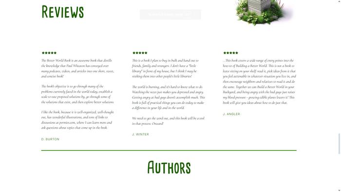
On my desktop screen, the image of the BWB book on the right (see image below) and in the lady's hands have a checkerboard shadow on them so it looks a bit messed up.  Maybe it's just me...

The green line drawings are great but they're pixelated a bit for me as well (lady with books, two people fondling a book, stack of books)
Screenshot-2025-06-04-at-11-44-46-Green-Living-Book-Green-Living-Book.png
[Thumbnail for Screenshot-2025-06-04-at-11-44-46-Green-Living-Book-Green-Living-Book.png]
 
steward
Posts: 6153
Location: Colombia - Tropical dry forest
2366
5
forest garden fish fungi trees tiny house earthworks bee solar woodworking greening the desert homestead
  • Likes 1
  • Mark post as helpful
  • send pies
    Number of slices to send:
    Optional 'thank-you' note:
  • Quote
  • Report post to moderator
Thanks so much everybody for all the great feedback! Going through it.
 
pollinator
Posts: 1195
Location: Boston, Massachusetts
525
6
urban books building solar rocket stoves ungarbage
  • Likes 3
  • Mark post as helpful
  • send pies
    Number of slices to send:
    Optional 'thank-you' note:
  • Quote
  • Report post to moderator
Some things that I noticed:
The author section appears to have the bios and photos/names laid out by the same "formula" rather than tweaking the layout to look pleasing. The stand-out issue to me is that the photos and names are not aligned horizontally. Paul's bio is two lines shorter than Shawn's in addition to Shawn's bio appearing to be in a smaller type size to balance the size difference, the space between text and images appears equal. Possible remedies: just move the photos into alignment on same baseline. align both entire bios/photos to align on same baseline. add (two?) more lines to Paul's bio to embiggen it. reverse the photos/bios texts to have photos/names aligned at the top with the text below and ending as it may.

The big image of front cover of the book does appear to have a spine, which the actual book does not, seems like a misrepresentation of the actual physical product for sale. Maybe a better, larger photo of the actual book, and a back cover view, down near the point-of-purchase.
The big image at the top could be BIGGER, ditch the arrow, and go top to bottom.

The next "image" of the book on the right-hand side, could be 200% that size. I get some sort of weird checkering/moire-pattern on my screen where the green of the book is. (Maybe the same as Mike Hassl sees?) I wonder if larger scale would reduce/eliminate this effect in the graphic? or replace with a photo? This could serve as the product image, if nowhere else.

The other green images could be larger.

The TOC is cut-and-pasted out of the book, I get that, but it is jolting to go from a "tabloid" with multiple columns, to left justified with those empty right margins, and back again. Maybe center the text and enlarge it (means a longer distance to scroll) or create two columns?
Or TOC text similar to the book, but move the B&W illustrations into the "right-hand column" and enlarge them (better eye candy).

 
gardener
Posts: 2271
Location: Gulgong, NSW, Australia (Cold Zone 9B, Hot Zone 6) UTC +10
1108
7
hugelkultur fungi chicken earthworks wofati food preservation cooking bee building solar rocket stoves
  • Likes 5
  • Mark post as helpful
  • send pies
    Number of slices to send:
    Optional 'thank-you' note:
  • Quote
  • Report post to moderator
I think the new page is bright and inviting.  I did not look at it critically.  It is tracking well on LinkedIn. It has a boost so is being advertised as well.
Great addition Andres
 
steward
Posts: 22231
Location: Pacific Northwest
12835
12
homeschooling hugelkultur kids art duck forest garden foraging fiber arts sheep wood heat homestead
  • Likes 2
  • Mark post as helpful
  • send pies
    Number of slices to send:
    Optional 'thank-you' note:
  • Quote
  • Report post to moderator
I have slow internet, so it took a while for the title font to load. Because of that, I noticed that the V and the N in "Green Living" were capitalized. Before the font loaded, it looked like "Green LiViNg"...which looked intentional enough that I tried to find meaning in the VIN. I'm pretty sure there's no meaning--only a typo--there.
image_2025-06-04_203159383.png
[Thumbnail for image_2025-06-04_203159383.png]
 
Nicole Alderman
steward
Posts: 22231
Location: Pacific Northwest
12835
12
homeschooling hugelkultur kids art duck forest garden foraging fiber arts sheep wood heat homestead
  • Likes 2
  • Mark post as helpful
  • send pies
    Number of slices to send:
    Optional 'thank-you' note:
  • Quote
  • Report post to moderator
You might want a different font for the quotes. I found this one difficult to read due to it's thin slanting letters. I can read it if I really try, but my brain really didn't want to look at it long enough to sort it out.  I like how it's a more handwriting font to look like people wrote it by hand. That's a nice touch. But, this particular font felt really hard to look at.
image_2025-06-04_203648920.png
So think and slanty! My brain doesn't want to put in the work to read anything in this font.
 
Nicole Alderman
steward
Posts: 22231
Location: Pacific Northwest
12835
12
homeschooling hugelkultur kids art duck forest garden foraging fiber arts sheep wood heat homestead
  • Likes 2
  • Mark post as helpful
  • send pies
    Number of slices to send:
    Optional 'thank-you' note:
  • Quote
  • Report post to moderator
Down in the sales section, I noticed the slanted Amatic font was really hard to read. It might be easier to read--and more consistent--if it was whatever font that the bullet points are using.
image_2025-06-04_204354720.png
Maybe use the Ariel-type font here, rather than the slanted Amatic?
 
Nicole Alderman
steward
Posts: 22231
Location: Pacific Northwest
12835
12
homeschooling hugelkultur kids art duck forest garden foraging fiber arts sheep wood heat homestead
  • Likes 2
  • Mark post as helpful
  • send pies
    Number of slices to send:
    Optional 'thank-you' note:
  • Quote
  • Report post to moderator
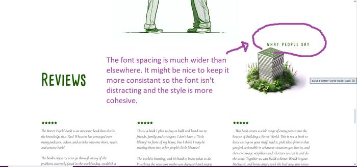
I really love the cohesive color scheme, as it's eye-catching and cohesive. It might be nice to have the font be a bit more consistent. I like how Amatic matches the the book's font, and keeps the permies branding consistent. Sometimes, though, Amatic has wide letter spacing, and sometimes it's italic. I found these things a little distracting stylistically, and they might not be necessarily.
image_2025-06-04_205030881.png
I also noticed that the lady's shoe in the background is much larger than the front shoe. Made me think it might be made by AI, and might be off putting to some.
 
Nicole Alderman
steward
Posts: 22231
Location: Pacific Northwest
12835
12
homeschooling hugelkultur kids art duck forest garden foraging fiber arts sheep wood heat homestead
  • Likes 2
  • Mark post as helpful
  • send pies
    Number of slices to send:
    Optional 'thank-you' note:
  • Quote
  • Report post to moderator

Mike Haasl wrote:On my desktop screen, the image of the BWB book on the right (see image below) and in the lady's hands have a checkerboard shadow on them so it looks a bit messed up.  Maybe it's just me...

The green line drawings are great but they're pixelated a bit for me as well (lady with books, two people fondling a book, stack of books)


I'm wondering if it's because those books were taken from a different image maybe changed to a different format (maybe a vector?) and it messed with the image quality? I wonder if =https://permies.com/u/209153/Tracy-WandlingTracy Wandling still has the original, high quality vector images of the books? I could ask her if you'd like.
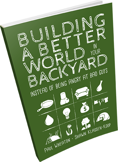
bwb-book-mockup-tiny.png
They look like they're based off of this image. I don't think I have a higher quality version than this one...which I think I took from kickstarter
 
Nicole Alderman
steward
Posts: 22231
Location: Pacific Northwest
12835
12
homeschooling hugelkultur kids art duck forest garden foraging fiber arts sheep wood heat homestead
  • Likes 3
  • Mark post as helpful
  • send pies
    Number of slices to send:
    Optional 'thank-you' note:
  • Quote
  • Report post to moderator

r ranson wrote:Love that it includes the table of contents.


Me too! The art in the table of contents (and the art in the rest of the book) is one of the things I really like about the book. I like that there was an attempt to match the promotional images to the book's illustrations.

The table of contents image also builds confidence for me--I can see this is a real book and this is what it covers. I wonder if there could be a "link to sample chapter" included under the table of contents? I am far more likely to buy a book if I can read a bit of it and see that it is awesome.
 
Andrés Bernal
steward
Posts: 6153
Location: Colombia - Tropical dry forest
2366
5
forest garden fish fungi trees tiny house earthworks bee solar woodworking greening the desert homestead
  • Likes 2
  • Mark post as helpful
  • send pies
    Number of slices to send:
    Optional 'thank-you' note:
  • Quote
  • Report post to moderator
Feedback implemented, thanks so much everyone!
 
Nicole Alderman
steward
Posts: 22231
Location: Pacific Northwest
12835
12
homeschooling hugelkultur kids art duck forest garden foraging fiber arts sheep wood heat homestead
 
Posts: 24
Location: USA N.FL
6
4
  • Mark post as helpful
  • send pies
    Number of slices to send:
    Optional 'thank-you' note:
  • Quote
  • Report post to moderator
In 1986, my PC had 20 Megabytes of memory.  The word processing programs did not use serifs on the fonts because it required more bytes.  Similarly, single spacing was used to start a new sentence to save bytes.  Now my laptop has a Terabyte of memory and the use of serifs as in the ToC are not a problem nor is facilitating the signal of the start of a new sentence.  As my eyesight deteriorates with age, I sincerely appreciate the serifs and double spaces.  I even have to get out a magnifying glass to read some comic strips in the news paper because they use the skeletonized font.  
Not to mention that using a font that does not distinguish between a lower case "L", a capital "i" and a number "one" is foolishness in my book but then I am becoming more of a curmudgeon every day.  
And yes I know that this message is written in the skeleton font but I also tolerate some foolishness to express my opinion.
Otherwise I think all of the other comments I would have made already have been made by others.    
 
 
Paul Fookes
gardener
Posts: 2271
Location: Gulgong, NSW, Australia (Cold Zone 9B, Hot Zone 6) UTC +10
1108
7
hugelkultur fungi chicken earthworks wofati food preservation cooking bee building solar rocket stoves
  • Likes 1
  • Mark post as helpful
  • send pies
    Number of slices to send:
    Optional 'thank-you' note:
  • Quote
  • Report post to moderator
LinkedIn is getting some likes.  Please boost the LinkedIn Love by adding a like and a comment: https://www.linkedin.com/feed/update/urn:li:activity:7335806506241568768/?actorCompanyId=91139143

If you have not looked at the Wheaton Lab site. Take a look, comment and repost.
 
Let me tell ya a story about a man named Jed. Poor mountain man with a tiny ad:
Learn Permaculture through a little hard work
https://wheaton-labs.com/bootcamp
reply
    Bookmark Topic Watch Topic
  • New Topic