• Post Reply Bookmark Topic Watch Topic
  • New Topic
permaculture forums growies critters building homesteading energy monies kitchen purity ungarbage community wilderness fiber arts art permaculture artisans regional education skip experiences global resources cider press projects digital market permies.com pie forums private forums all forums
this forum made possible by our volunteer staff, including ...
master stewards:
  • Carla Burke
  • Nancy Reading
  • John F Dean
  • r ranson
  • Jay Angler
  • paul wheaton
stewards:
  • Pearl Sutton
  • Leigh Tate
  • Devaka Cooray
master gardeners:
  • Christopher Weeks
  • Timothy Norton
gardeners:
  • thomas rubino
  • Matt McSpadden
  • Jeremy VanGelder

Coloured text makes it hard to read your words

 
steward & author
Posts: 38513
Location: Left Coast Canada
13742
8
books chicken cooking fiber arts sheep writing
  • Likes 9
  • Mark post as helpful
  • send pies
    Number of slices to send:
    Optional 'thank-you' note:
  • Quote
  • Report post to moderator

If we ask you to change the colour of your font back to standard, we aren't trying to squash your personality.  We are doing so because we value what you have to say and want to be able to read it.


Every few months, we get a new user who looks to be wonderful in so many ways.  Except, they like changing the colour of their entire post to something not-black.  They usually choose green, or yellow , or orange, or lovely pink.  To them, it is an expression of themselves.  They are different and unique and want to share this glimmer of their personality with the world.  

The problem is, a huge chunk of the world are now unable to read their writing.  Which rather defeats the purpose of showing off their special-ness.


As an adult, I learned the reason I have so much trouble with language is that my brain is wired differently.  I responded to this dyslexia diagnosis the way I do anything - I researched.  I read (albeit slowly) scientific papers and talked with researchers in the field from around the globe.  It's fascinating stuff.  For example, not every language has the same ratio of dyslexia in the population, and it even varied depending on sex and country.  It is estimated that a lot of people are like me and slip through the cracks and the statistics represent less than half of actual dyslexics.  The estimated global adverage of people diagnosed with dyslexia in a English as a First Language population is about 20%.  That's 20% of the population who struggle to read and write because they weren't born with a brain that is good with language.  Thankfully there are many tools available to help people like me read and write like an average person.  Grammarly is pretty decent at understanding dyslexia and is an excellent free tool to help with writing.  Without it, I would not be legible to you.  Likewise, dark text on an offwhite background (without pictures or clutter behind the text) is a compassionate way to set up your website (like the forums at permies).  If you could use a serif font, even better.

Then there is acquired dyslexia.  This happens due to disease or damage to the brain.  I have a family member with this, and it is terrible to watch the progression of the disease.  A man once so confident reading could only read under certain conditions and most online forums that were his world are now lost to him.

Some people are colourblind.  We have quite a few colour blind people who participate in these forums.  There are all sorts of different kinds of colourblindness, and it's something I hope to learn more about in the future.  But from what I understand, having words at a different colour value (black-whiteness) is the key to make life easier for them.

Learning a second, third, or fifth language also causes a stumbling block.  Some people are amazing at languages, others' not so much.  They struggle to read in a foreign text, but they want to participate.  Because these wonderful people have a different view of the world, it makes sense to make things as easy to read as possible.  

The developers of permies chose the text and background colour carefully to make it readable to the largest audience.  There isn't a perfect colour combination for everyone, but this is pretty close.  


If we ask you to change the colour of your font back to standard, we aren't trying to squash your personality.  We are doing so because we value what you have to say and want to be able to read it.  
 
Posts: 9002
Location: Victoria British Columbia-Canada
707
  • Likes 1
  • Mark post as helpful
  • send pies
    Number of slices to send:
    Optional 'thank-you' note:
  • Quote
  • Report post to moderator
Sometimes we get a brain surgeon who decides to go with all capitals because what they have to say, is more important than anything else. I always skip over those ones and read the next post.
 
r ranson
steward & author
Posts: 38513
Location: Left Coast Canada
13742
8
books chicken cooking fiber arts sheep writing
  • Likes 3
  • Mark post as helpful
  • send pies
    Number of slices to send:
    Optional 'thank-you' note:
  • Quote
  • Report post to moderator
Oh!  CAPITAL LETTERS!

that's a great point.  

Capital letters, especially in computer fonts, are all about the same size and shape.  There's no up and down flow to the words like with lowercase letters.

Here's an attempt to show what the phrase looks like to my brain.  I learn to read by seeing the flow of the sentence
up-and-down.JPG
what reading is like with dyslexia - a poor example
 
steward
Posts: 4837
Location: West Tennessee
2438
cattle cat purity fungi trees books chicken food preservation cooking building homestead
  • Likes 5
  • Mark post as helpful
  • send pies
    Number of slices to send:
    Optional 'thank-you' note:
  • Quote
  • Report post to moderator

r ranson wrote:Oh!  CAPITAL LETTERS!


Man, I find all capital letters painful. I learned back in my dial-up bbs days in the early 90's that writing in all caps means SHOUTING! So, ever since then when I read something, not just here on permies but anything anywhere typed using all caps I think to myself "why are they shouting?" For me, italics are a great way to put emphasis on a particular word, or even bold letters works good too, and reading those is more pleasant to my mind and doesn't denote shouting.
 
out to pasture
Posts: 12498
Location: Portugal
3375
goat dog duck forest garden books wofati bee solar rocket stoves greening the desert
  • Likes 3
  • Mark post as helpful
  • send pies
    Number of slices to send:
    Optional 'thank-you' note:
  • Quote
  • Report post to moderator
I think a LOT of people would grimmace a bit trying to read green on red...

 
James Freyr
steward
Posts: 4837
Location: West Tennessee
2438
cattle cat purity fungi trees books chicken food preservation cooking building homestead
  • Likes 4
  • Mark post as helpful
  • send pies
    Number of slices to send:
    Optional 'thank-you' note:
  • Quote
  • Report post to moderator

Burra Maluca wrote:I think a LOT of people would grimmace a bit trying to read green on red...


Indeed! This is a phenomena called color vibration. It can vary in intensity from person to person and some color combinations can be worse than others. Here is a quote about web design from https://webdesign.tutsplus.com/articles/why-you-should-avoid-vibrating-color-combinations--cms-25621

One of the primary phenomena that emerges out of bold and highly saturated color schemes is a seemingly “vibrating” color, an occurrence wherein the edges of two directly adjacent colors appear to merge, blur and glow, giving the illusion of motion.  


Here is an example from the same website, and for me, the red on green does it, and the hot pink/green combination is the worst for my eyes, and those letters really appear to be buzzing to me.


Here is an example of how the same image may appear to people who are color blind:


In addition to the often annoying vibrating and blurry colors for those who see in full color, given colors of equal luminance, those with color blindness may end up not seeing anything at all. While there are varying levels of color blindness, it’s best to play it safe when it comes to accessibility.


Saturated colors can really play tricks on some peoples eyes, and black letters seem to be the easiest to read for highest percentage of the global population.
 
master steward
Posts: 12490
Location: Pacific Wet Coast
7044
duck books chicken cooking food preservation ungarbage
  • Likes 2
  • Mark post as helpful
  • send pies
    Number of slices to send:
    Optional 'thank-you' note:
  • Quote
  • Report post to moderator
@James Freyer - I will politely thank you for your example above, and then scream quietly - that hurt my head!

Here's a link to the program that r ransom mentions above. https://www.grammarly.com/  
Has anyone who's ESL (English as a Second Language) tried using it? There are a few members who I suspect are using translation programs to help them, and I'm wondering if running their translation through grammarly would help catch the "miss-translated" bits?

I have a son who's a card-carrying dyslexic - he is incredibly bright and creative despite areas which are a struggle. I totally support doing what we can to keep all people contributing to permies in ways that grow and support the community as a whole. That may mean we have to work a little harder on an individual basis - typing out words or acronyms as I did above, for example - but if it helps spread permaculture to every country and every back-yard, I believe that's the best gift we can give the planet!
 
author & steward
Posts: 5316
Location: Southeastern U.S. - Zone 7b
3097
5
goat cat forest garden foraging food preservation fiber arts medical herbs writing solar wood heat homestead
  • Likes 2
  • Mark post as helpful
  • send pies
    Number of slices to send:
    Optional 'thank-you' note:
  • Quote
  • Report post to moderator
Tiny grey font on a light background seems to be popular on some websites.  Very difficult to read.
 
r ranson
steward & author
Posts: 38513
Location: Left Coast Canada
13742
8
books chicken cooking fiber arts sheep writing
  • Mark post as helpful
  • send pies
    Number of slices to send:
    Optional 'thank-you' note:
  • Quote
  • Report post to moderator

Jay Angler wrote: and then scream quietly - that hurt my head!


Welcome to my world.

Here's a link to the program that r ransom mentions above. https://www.grammarly.com/  
Has anyone who's ESL (English as a Second Language) tried using it?  


I recommend it to all my ESL friends.  It helps them tremendously in two main ways.  
One: their writing is easier to read by other people.  Quite often, people are surprised when they meet my friend that English isn't their first language.  
Two: for those who want to learn, they learn how and why English works.  

I have a son who's a card-carrying dyslexic - he is incredibly bright and creative despite areas which are a struggle. I totally support doing what we can to keep all people contributing to permies in ways that grow and support the community as a whole. That may mean we have to work a little harder on an individual basis - typing out words or acronyms as I did above, for example - but if it helps spread permaculture to every country and every back-yard, I believe that's the best gift we can give the planet!


There are a lot of coping strategies I've developed over the years.  Copy-paste text into a programme I can read.  There used to be a feature in most word processors where I can transform the case of the text.  So if someone writes in all caps, I plug the text in there and say "change to sentence case" and it was great.  I haven't found that for a while.  Same with colour.  But this takes a lot of time and I need to know in advance that this is worth the effort.

If the font on a text is bad, I might use a plugin like https://www.dyslexiefont.com/en/

The wall of text is the hardest.  I haven't found a coping strategy for that yet, that doesn't involve printing stuff on paper and a pair of scissors.  
 
gardener
Posts: 3545
Location: Central Oklahoma (zone 7a)
1259
forest garden trees woodworking
  • Likes 10
  • Mark post as helpful
  • send pies
    Number of slices to send:
    Optional 'thank-you' note:
  • Quote
  • Report post to moderator

r ranson wrote:
Some people are colourblind.  We have quite a few colour blind people who participate in these forums.  There are all sorts of different kinds of colourblindness, and it's something I hope to learn more about in the future.  But from what I understand, having words at a different colour value (black-whiteness) is the key to make life easier for them.


There's actually a lot of us -- I've seen estimates of 10-14 percent of males in the USA.  (The genes are sex-linked; women with color vision deficiencies exist, but there are many fewer.)  

Leaving aside the complexities of all the different kinds of color vision deficiency, the way mine works is that I have a functional insufficiency of the rods or cones or whatever that perceive certain colors in my eye.  I'm not at zero, and the insufficiency varies across a spectrum of a few colors.  It's not easy to pin down because one consequence is that I don't share a common color vocabulary with the rest of the world.  I also don't tend to "think in color" -- where somebody else might sort a jar of buttons by color, I'd sort by shape or material.  Ask me "how many yellow buttons?" were in the jar and I couldn't begin to estimate, even though yellow is a color I see just fine -- because color categorization is not how I think about the world.  And one reason is that I still could not give you an answer, because lime green is just another shade of yellow to me.  Color is unreliable so I don't use it.

But when it comes to reading text on a screen, it's very simple.  Contrast, contrast, contrast.  

The highest contrast is black text on a white screen.  Or white on black.  

Permies doesn't have a black or a white background.  Our default background is, for reasons I couldn't begin to articulate, some sort of desert/sand/khaki camouflage color.  Black text on desert camo is not ideal from a contrast perspective, but it works well enough.  But did you see that color vibration post above?  If you post colored text, you're going to create color vibration against the Permies default background color for somebody.  Your text will buzz and flash.  I don't have enough color words in common with the people talking about that post to take part in their conversation, but it's clear to me that I am getting color vibration from different color combinations than the people commenting in this thread.  And it hurts.  Nobody is going to read texts that hurt.

Any time you use a text color that's not black or white on the opposite background, you run up against the fact that whatever color you use, it's gonna be one of the colors that somebody lacks enough rods and cones for.  If we are entirely without those rods and cones (very rare) your text is invisible.  Most likely, we just don't have enough (or they don't work robustly).  So your "color" is dim.  Your text is dim. Your text is faint.  It's low-contrast.  It's hard (or if dim/faint enough) impossible to read.

Contrast, contrast, contrast.  For a person with color vision deficiency, that means black or white text.  Anything else is going to be on a spectrum from "dim to invisible" for someone.

Hope this helps!
 
steward
Posts: 1898
Location: Coastal Salish Sea area, British Columbia
1058
2
books chicken food preservation pig bike solar wood heat rocket stoves homestead ungarbage
  • Likes 2
  • Mark post as helpful
  • send pies
    Number of slices to send:
    Optional 'thank-you' note:
  • Quote
  • Report post to moderator
I have not read thru every response on this topic, so please excuse my response if it has already been said.

So why not remove the option for picking the colours which are hard to see on this forum? The yellow in your original post r ranson is really hard to see.
Would this take away the need to ask people to not do this?

just my opinion.
 
pollinator
Posts: 2339
Location: Denmark 57N
598
fungi foraging trees cooking food preservation
  • Mark post as helpful
  • send pies
    Number of slices to send:
    Optional 'thank-you' note:
  • Quote
  • Report post to moderator
A very simple fix for colours you struggle with is to select the text  I use that for websites with poor contrast or where someone has used green on white.
 
r ranson
steward & author
Posts: 38513
Location: Left Coast Canada
13742
8
books chicken cooking fiber arts sheep writing
  • Likes 2
  • Mark post as helpful
  • send pies
    Number of slices to send:
    Optional 'thank-you' note:
  • Quote
  • Report post to moderator
That's neat to know about the contrast.  Thanks for sharing.


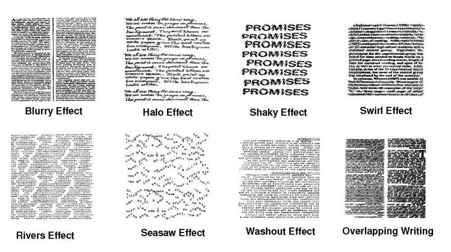
Contrast is important in dyslexia.  Not enough, and the words blend into the background, but too much creates rivers.  The white background becomes stronger and the text becomes the background.  

Here are some examples of what strong white background can do to text.

 
r ranson
steward & author
Posts: 38513
Location: Left Coast Canada
13742
8
books chicken cooking fiber arts sheep writing
  • Mark post as helpful
  • send pies
    Number of slices to send:
    Optional 'thank-you' note:
  • Quote
  • Report post to moderator

jordan barton wrote:

So why not remove the option for picking the colours which are hard to see on this forum? The yellow in your original post r ranson is really hard to see.
Would this take away the need to ask people to not do this?

just my opinion.


It would make my life easier if there wasn't the option, but I think a lot of people like having the option to print their text.

- advertizers use it to draw attention to certain places.
- People have fun with it
- probably other things I haven't thought of.

The idea is that it's used as a decoration to the text, instead of for the body of the text.  


I suspect that like the 20% of people with language disabilities, there's about 20% of people who have a brain that is perfectly matched to the written word.  These are of the people who are almost physically hurt when they come across a misplaced apostro'phy and are wonderful at spelling.  They naturally fall into jobs like editing, web design, advertising... I think it's easy for both ends of the spectrum to forget that people struggle at the other end.

People with language disabilities feel hurt and betrayed when advertizers put words on top of busy pictures.
People who are good with words, feel hurt and angry when others don't make the effort to communicate clearly.

I think it's really important to remember that both ends of the spectrum exist and to make the effort to do better.  As a dyslexic, I know my language-results and word-choosing are odd to someone who is a good brain-match for language.  In some ways, this is to my advantage because I don't fall into the pattern and cliche that exist.  In other ways, I understand that it makes it harder to be understood so I practice writing on forums like this.  I use technology to do better with my words.  It's my responsibility to do the best I can.

But sometimes I feel that it's also my responsibility to share the struggle.  When you're so good at something that it's more natural than breathing, it's easy to forget that others struggle.   They take time and effort to make something beautiful, and that something is illegable to 20-50% of the population.  But there are tricks they can learn to make their words more accesable.  Like the high contrast mentioned above.  
 
Dan Boone
gardener
Posts: 3545
Location: Central Oklahoma (zone 7a)
1259
forest garden trees woodworking
  • Likes 2
  • Mark post as helpful
  • send pies
    Number of slices to send:
    Optional 'thank-you' note:
  • Quote
  • Report post to moderator

jordan barton wrote:
So why not remove the option for picking the colours which are hard to see on this forum?

...

Would this take away the need to ask people to not do this?


This is an interesting question.  I don't have an answer for it, just a very personal impression coming from highly non-technical volunteer who has been interacting with software development from the frustrated-user perspective for almost forty years now.  

Here at Permies, we the staff are working with forum software that we don't write or maintain.  We have access to the people who do, but AFAIK we can't just select an option, check a box, and have the color options vanish from the posting window.  We would have to initiate a process of, essentially, persuading the people who make the software to remove a function/feature from "their" software.

If you have ever dealt with programmer types, they have a culture that isn't intensely focused on design, user-interface, ease-of-use, and visual user comfort.  It is not uncommon to find individual programmers who are oblivious to or even contemptuous of such concerns. "What, your users have a problem with the software? You need to get better users!"  But even when you've got a good team with a user focus, programmers use "features" as a metric of success.  It's built into their thinking.  They are no more inclined to "take out a feature" than a gardener is inclined to rip out a healthy plant.  There might be a good reason, but if it's not their idea, the conversation that results in their being persuaded to do it is going to be a hard slog, a long and difficult climb.  

And one part of that conversation is going to involve the programmer wanting to get into details about other "use cases" for the feature.  "I don't want the colors" we might say.  "We never need them and we have to explain to a certain percentage of new users why they shouldn't put their whole post in color, because the feature is there."  And that's when the programmer -- who feels negative things about removing perfectly functional features -- will start probing into why the color feature is there and whether it's ever necessary.  "Actually you do use it" he might say.  "Remember that time you all had the silly holiday thread and were posting Santa limericks in seven different colors?"  Or "sometimes when your people are doing garden plans, all the terrestrial plants get listed in green and the aquatic plants get listed in blue."  Usually these conversations result in the discovery that, yeah, there's some minor use case for the feature.  Then it becomes a judgment call: Is it better to write off the minor use case and give up the feature?  Or is it better to accept the cost of educating a few new users that "the feature is not for putting your entire post in lime green so people will know itsa you, the special lime green lady."  Generally at permies, where we approach everything with a "build a better community by investing the volunteer resources into community management" approach, we would come down on the side of "keep the feature, do the education."

Or that's how it looks to me.  Ask another staff member, you might get a different answer.  (In fact, I'd bet on it!)
 
pollinator
Posts: 287
Location: Wichita, Kansas, United States
82
2
  • Likes 3
  • Mark post as helpful
  • send pies
    Number of slices to send:
    Optional 'thank-you' note:
  • Quote
  • Report post to moderator
I totally agree with the original post.
My wife and I were at Cracker Barrel yesterday.
Their menus are brown printing on light brown paper.
When some guy closed the curtains and killed half the light, I couldn't read the menu.
I suppose it's meant to look rustic.
I find it to be a pain.
 
Posts: 727
Location: Morocco
99
cat forest garden trees solar wood heat woodworking
  • Mark post as helpful
  • send pies
    Number of slices to send:
    Optional 'thank-you' note:
  • Quote
  • Report post to moderator

Dan Boone wrote:
Here at Permies, we the staff are working with forum software that we don't write or maintain.  We have access to the people who do, but AFAIK we can't just select an option, check a box, and have the color options vanish from the posting window.  We would have to initiate a process of, essentially, persuading the people who make the software to remove a function/feature from "their" software.

If you have ever dealt with programmer types, they have a culture that isn't intensely focused on design, user-interface, ease-of-use, and visual user comfort.  It is not uncommon to find individual programmers who are oblivious to or even contemptuous of such concerns. "What, your users have a problem with the software? You need to get better users!"  But even when you've got a good team with a user focus, programmers use "features" as a metric of success.  It's built into their thinking.  They are no more inclined to "take out a feature" than a gardener is inclined to rip out a healthy plant.  There might be a good reason, but if it's not their idea, the conversation that results in their being persuaded to do it is going to be a hard slog, a long and difficult climb.  


As a programmer who cares about typography, style and visual aesthetics, I can relate… Rarely do others care about such things.
What I would suggest, is to provide a setting for members to disable custom color / font / size.

jordan barton wrote: So why not remove the option for picking the colours which are hard to see on this forum? The yellow in your original post r ranson is really hard to see.


One problem is that it varies which colors are hard to see between people. The second problem is to define a mathematical function that tells you how hard to see a color is (after all, a program needs to decide if it is hard to see or not).
 
Posts: 1
Location: Minnesota/Indiana, US
1
forest garden homestead
  • Likes 4
  • Mark post as helpful
  • send pies
    Number of slices to send:
    Optional 'thank-you' note:
  • Quote
  • Report post to moderator
Using a contrast checking tool is an easy way for people to use color feature options in a way that still ensures their customization is accessible to folks.

In my professional day-job (user experience), I like to recommend WebAIMs contrast checker tool, and shoot for at least AA compliance.

Lots to say about the culture of feature factories in software development, as Dan elaborated on. Least to say is he's right. It's still, unfortunately, an accurate picture of too many orgs that create software.
 
steward
Posts: 21564
Location: Pacific Northwest
12053
11
hugelkultur kids cat duck forest garden foraging fiber arts sheep wood heat homestead
  • Likes 3
  • Mark post as helpful
  • send pies
    Number of slices to send:
    Optional 'thank-you' note:
  • Quote
  • Report post to moderator
This thread reminded me of the one we have about color acuity. There's some really spiffy tests that allow you to not only see how well you see color, but to see if you have minor--or major--forms of colorblindness.

https://permies.com/t/35925/Color-Acuity-Test

My grandfather was very colorblind, being unable to differenciate between greens and reds. He couldn't tell the difference between stoplights or ripe/unripe strawberries. One of my cousins is also red-green colorblind to a lesser degree, but didn't find out until he kept mixing paint wrong in an auto paint shop.

And, my husband's father and sister are both blue-green colorblind, but had not known until they took the test. It's handy to know if you or loved ones are colorblind. When I taught preschool, I actually was the one that identified one of the three-year olds as colorblind. I was always watching to see if the kids could tell their colors apart, and this little boy kept thinking pink was green. I told his parents (they'd assumed he just wasn't old enough to tell colors apart) and got him tested, and--sure enough--he was colorblind.

There's a large segment of society that is colorblind, and it's so important for the rest of us to be aware of that!
 
Nicole Alderman
steward
Posts: 21564
Location: Pacific Northwest
12053
11
hugelkultur kids cat duck forest garden foraging fiber arts sheep wood heat homestead
  • Likes 2
  • Mark post as helpful
  • send pies
    Number of slices to send:
    Optional 'thank-you' note:
  • Quote
  • Report post to moderator
Knowing about colorblindness is also good for making gifts for those who are colorblind. Something that might look good to you, might be really bland or brown..or vibrate terribly to someone with different types of colorblindness. And, it doesn't always work out the way you think, either.

My Mother-in-Law likes teal and bight pink and red. These colors vibrate to me, but she likes them.

I made her an elephant. It's teal with neon pink tusks. But, when you plug this picture into a colorblindness simulator, it shows up as a lovely bright blue that shines amidst the brown surroundings for someone with red-green colorblindness (deuteranomaly and protanomaly). Unless you're blue-green colorblind (tritanomaly), and then it vibrates even MORE horribly.


This is the colorblindness simulator I used:  https://www.color-blindness.com/coblis-color-blindness-simulator/


Fascinatingly enough, when I plugged in the teal and bright red dragon and fairy I made her, the slight difference in hue makes this one look much blander to someone red-green colorblind, while it still vibrates a bit to someone with blue-green colorblindness. The red and the pink are both too bright to blue-green colorblind people.

So, while you might think you know someone's favorite color--they might say it's blue (which is a color that shows up most vividly for most people with colorblindness), if it's the wrong blue/teal, it will look entirely different to them, but not to you!
DSCF0665.JPG
Normal dragon and fairy
Protanopia.jpg
Red-Green Colorblind
Tritanopia.jpg
Blue-Green Colorblind
 
gardener
Posts: 4008
Location: South of Capricorn
2130
dog rabbit urban cooking writing homestead ungarbage
  • Likes 1
  • Mark post as helpful
  • send pies
    Number of slices to send:
    Optional 'thank-you' note:
  • Quote
  • Report post to moderator
Another hello from the colorblind contingent!!
When the colors are invisible for me (yellow.... pink.... orange), I generally highlight the text, which sometimes throws it into a more readable contrast. If it is still not readable, I'm skipping that post, unfortunately.
 
Sebastian Köln
Posts: 727
Location: Morocco
99
cat forest garden trees solar wood heat woodworking
  • Likes 3
  • Mark post as helpful
  • send pies
    Number of slices to send:
    Optional 'thank-you' note:
  • Quote
  • Report post to moderator
What you can do to turn all text black (or some other color is) to install the Stylus addon for Firefox, create a style for permies.com and add


EDIT: I managed to make a public style you can just install: https://userstyles.org/styles/178893/permies-black-text
 
If you try to please everybody, your progress is limited by the noisiest fool. And this tiny ad:
2024 Permaculture Adventure Bundle
https://permies.com/w/bundle
reply
    Bookmark Topic Watch Topic
  • New Topic