
|

|

|

|

|

|
|
|
|
|
|
|
|

|

|

|

|

|
 10
10


 70
19
24
2
7
70
19
24
2
7
My PEP Badge Tracker - An easier way to track your PEP Badge Progress. | Wait, wait, wait; What is PEP? | How Permies.com works.


 28
28
 11
3
7
11
3
7
Gert in the making
10
paul wheaton wrote:thumb if you likey this image
Vic Johanson
"I must Create a System, or be enslaved by another Man's"--William Blake
8
Lif Strand
New Mexico USA
13
You are welcome to check out my blog at http://www.theartisthomestead.com or my artwork at http://www.davidhuang.org


 6
9
6
9
Sourdough Without Fail Natural Small Batch Cheesemaking A Year in an Off-Grid Kitchen Backyard Dairy Goats My blog


 7
7
"Our ability to change the face of the earth increases at a faster rate than our ability to foresee the consequences of that change"
- L.Charles Birch
My Herbal Tea Store (CA)
paul wheaton wrote:click on the thumbs up for this post if you like the new page best
Music makes life better


 4
4


 3
3
Aspirations: She seeks wool and flax, considers a field and buys it, girds herself with strength, opens her mouth with wisdom, and does him good all the days of her life. (pieces of Proverbs 31, NKJV)


 1
1
Being weird is easy. Making it mainstream is hard. Be brave! https://www.youtube.com/@healthygreenbrave


 1
1
"Good tea. Nice house." -- Lt. Worf, TNG
10
Victor Johanson wrote:I don't like the negativity the first panel associates with masculinity.
Invasive plants are Earth's way of insisting we notice her medicines. Stephen Herrod Buhner
Everyone learns what works by learning what doesn't work. Stephen Herrod Buhner
paul wheaton wrote:
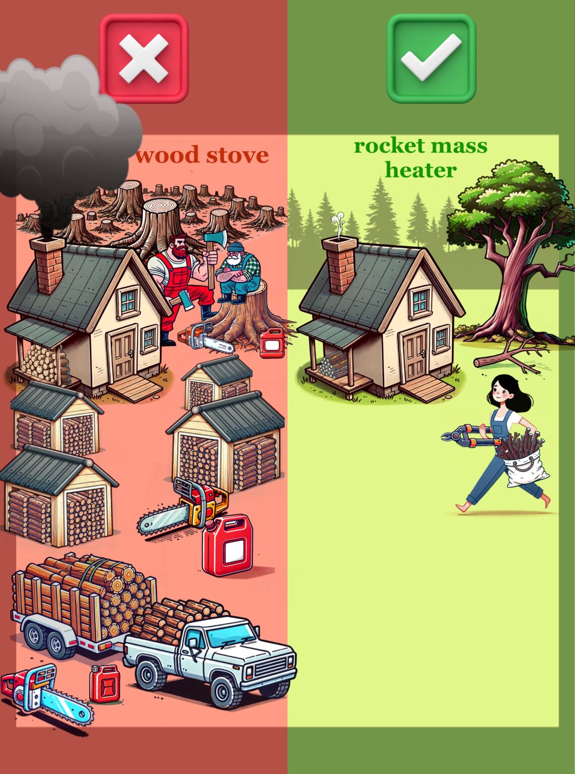
Andres and experts made a new page. The idea is that this new page is better. Better for our world domination goals. We will try it out and see. It does look really nice. If it is better, I guess I will miss the logger dudes and the barefoot gal.
Destruction precedes creation
2
Jarret Hynd wrote:The new page is a great improvement over the original in regards to world domination. Good work to everyone who put it together.
Mass AI use the last few years has made images, similar to the original cartoon, one that many will just glance over because everyone and their dog are spamming AI images everywhere. People want real life images - I've seen this trend in various industries the last year. (reference the research article "Customer reactions to generative AI vs. real images in high-involvement and hedonic services")
Ideally, you'd want a video playing in the hero section instead of just the image of the RMH bench: say a 15 second loop of 4-5 clips.
6
Lif Strand
New Mexico USA
1
Ryan Simon wrote:IIf you could find a way, I'd merge the two designs. The quirkiness of the old kept me on the page longer than the new page.
Invasive plants are Earth's way of insisting we notice her medicines. Stephen Herrod Buhner
Everyone learns what works by learning what doesn't work. Stephen Herrod Buhner
2
The Japanese concept of finding beauty in imperfections is known as Wabi-sabi (侘び寂び). It is a worldview and aesthetic philosophy centered on the acceptance of transience and imperfection, often described as appreciating beauty that is "imperfect, impermanent, and incomplete."
Wabi-sabi evolved from Zen Buddhist influences and traditional tea ceremony aesthetics. It acknowledges three simple realities: nothing lasts, nothing is finished, and nothing is perfect. The concept encourages valuing roughness, simplicity, modesty, and the marks of age or repair over flawless symmetry.
4
Anne Miller wrote:
Victor Johanson wrote:I don't like the negativity the first panel associates with masculinity.
I don't see any masculinity when I look at that page, maybe it is a feminine prospective?
All I see is that it takes tons and tons of wood to fire up a wood stove and only twigs to fire up a RMH.
Vic Johanson
"I must Create a System, or be enslaved by another Man's"--William Blake


Praying my way through the day
8
Victor Johanson wrote:Nothing is more masculine than a couple bearded burly loggers, and the implication is that they are responsible for destroying the environment, while the next panel implies the virtues of femininity, and the paradise that will ensue once all the nasty men are gone. Your filters are far different than a man's; we have to deal with constant innuendo of this kind, and it's not cool. If anything, women should understand what it's like to be stereotyped and marginalized, and show some empathy when it shifts to another demographic.
How permies.com works
What is a Mother Tree ?

 2
2
Burra Maluca wrote:
Victor Johanson wrote:Nothing is more masculine than a couple bearded burly loggers, and the implication is that they are responsible for destroying the environment, while the next panel implies the virtues of femininity, and the paradise that will ensue once all the nasty men are gone. Your filters are far different than a man's; we have to deal with constant innuendo of this kind, and it's not cool. If anything, women should understand what it's like to be stereotyped and marginalized, and show some empathy when it shifts to another demographic.
It breaks my heart to read this.
I guess I'm guilty as charged because I see that hunky great red-bearded fella doing a ton of work to keep his community warm, and then feel all glowy inside because my own hunky great red-bearded fella already built me a rocket mass heater (ok I know he built it for us, not just me, but I'd made it very, very clear that I wanted one!) and this year virtually all the firewood we have has been hauled from the tree to the wood stack by yours truly, and as most of it is lopper-sized I've also been the one responsible for cutting most of it to size.
To me, that image is inspiring because it means I can do the work that previously my man had to do because it was too much for me but now we have a way to keep warm on a smaller amount of sticks, then I can contribute a bit more fairly to the work load.
But not everyone sees things the way I do...
Vic Johanson
"I must Create a System, or be enslaved by another Man's"--William Blake
4
M Pearson wrote:
On a cultural note; independent of the content or arguments for/against any heating method, think of this: imagine you show a gruff logger dude a graphic showing him with a chainsaw and a big pickup truck hacking down tons of trees, vs a barefoot vegan looking hippie girl running a RMH and lacking both a chainsaw and a pickup.
Which method do you think he's gonna pick?
And now think: what is the distribution of your "potential customers" between these groups? I.e. who is in need of heating in a relatively cold climate where building a RMH is pretty easy and they don't just live in an apartment with central/gas/electric heat?
If I had to take a guess, I'd say it's 80% gruff logger dudes.
Burra Maluca wrote:
To me, that image is inspiring because it means I can do the work that previously my man had to do because it was too much for me but now we have a way to keep warm on a smaller amount of sticks, then I can contribute a bit more fairly to the work load.

M Pearson wrote:... a barefoot vegan looking hippie girl running a RMH and lacking both a chainsaw and a pickup.
... Skinny barefoot vegan chicks tend to live in apartments on University Ave in Berkeley.
So maybe you want to not frame it as "big tough chainsaw pickup logger dudes vs skinny barefoot vegan girls" but "big tough chainsaw pickup logger dudes being cool & creative vs. wasteful and bad stewards of their land" or something.
2
2
paul wheaton wrote:thumb if you likey this image

|
It's exactly the same and completely different as this tiny ad:
Heat your home with the twigs that naturally fall of the trees in your yard
http://woodheat.net
|