Bookmark Topic Watch Topic
  • New Topic
permaculture forums growies critters building homesteading energy monies kitchen purity ungarbage community wilderness fiber arts art permaculture artisans regional education skip experiences global resources cider press projects digital market permies.com pie forums private forums all forums
this forum made possible by our volunteer staff, including ...
master stewards:
  • Nancy Reading
  • Carla Burke
  • r ranson
  • John F Dean
  • paul wheaton
  • Pearl Sutton
stewards:
  • Jay Angler
  • Liv Smith
  • Leigh Tate
master gardeners:
  • Christopher Weeks
  • Timothy Norton
gardeners:
  • thomas rubino
  • Jeremy VanGelder
  • Maieshe Ljin
 
Posts: 70
6
  • Likes 1
  • Mark post as helpful
  • send pies
    Number of slices to send:
    Optional 'thank-you' note:
  • Report post to moderator
.... overall it looks pretty awesome! - Great job!!  

..... just put some shadow under the loader bucket amd it will appear raised.      
 
Posts: 3
  • Likes 2
  • Mark post as helpful
  • send pies
    Number of slices to send:
    Optional 'thank-you' note:
  • Report post to moderator
I'm really, really new here. But, my husband also just published a book.
Different topic though.

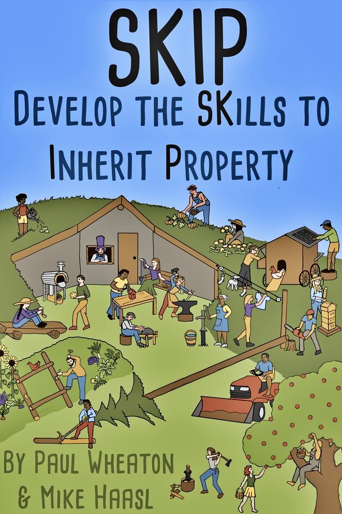
Your cover, while it does have awesome stuff, looks really busy. It's hard to focus on any one thing and it doesn't really present a powerful idea. I got really lost in all of the depictions. So instead of being curious about what SKIP really means I became disinterested because there was so much going on.

Is your audience for people already doing this, or is it for new people, or both?
 
gardener
Posts: 653
Location: Poland
332
forest garden tiny house books cooking fiber arts ungarbage
  • Mark post as helpful
  • send pies
    Number of slices to send:
    Optional 'thank-you' note:
  • Report post to moderator
To add some inspiration - Taschen has some of the best designed book covers: https://www.taschen.com/

Regarding drawing skills - learning to draw takes really, really a lot of practice; and drawing humans is especially hard. I like A Case for Pencils, for some drawing tips and inspiration: https://www.instagram.com/acaseforpencils/

and Li Ching for watercolour tutorials: https://www.instagram.com/lichingheng/
 
Posts: 1
  • Likes 1
  • Mark post as helpful
  • send pies
    Number of slices to send:
    Optional 'thank-you' note:
  • Report post to moderator
I don't know much about what each person is doing but it showed me immediately that the book would be comprehensive in covering skills.

I like the cover overall. It reminds me of the cover for the book Smart Moves. Some people mentioned font. This book cover may give you ideas for other fonts that work with this type of drawing. Please don't use the word "by" on the cover. That indicates beginner/self-published.


master pollinator
Posts: 1022
Location: East of England/ Northeast Bulgaria
384
5
cat forest garden trees tiny house books writing
  • Likes 2
  • Mark post as helpful
  • send pies
    Number of slices to send:
    Optional 'thank-you' note:
  • Report post to moderator
Cute! I see you there in your purple, Nicole! The "Where's Wally" idea works well. A lot of the critiques are about things not being just as they'd look in real life. I don't think it needs to be exactly correct - that's not what the cover is for! The cover is not a how-to manual in itself, just something appealing enough to give a prospective reader a taste of what the book includes and entice them to pick it up/ click "Look Inside".

What Bihai said about bleed. This works great for the ebook, but for the paperback they will want an additional 6mm/ 1/4" or so all around to allow for some inaccuracy in trimming the books. So you may find you need to do a second larger version making sure there's nothing essential close to the edges. The printer or POD company will have a template showing how much they need.

The one thing that bothers me a little is that there's nothing in this cover that links me to the earlier book. Daron mentioned this a while back in the discussion. Author branding - basically just making sure that a reader who has Paul's last book will recognise this as also being by Paul. It's not essential, but it does help. Especially as IMO SKiP is the advanced super-powered version of the Building a Better World stuff. The cover concept is completely different, but maybe using the same font would tie the two books together a little more. I would also suggest using the same trim size as the other paperback, so side by side on the bookcase or a book table at a conference, they clearly go together.

 
Posts: 15
  • Mark post as helpful
  • send pies
    Number of slices to send:
    Optional 'thank-you' note:
  • Report post to moderator
"Green Rocks"  does it suggest growing lichens on a rock or that "green" kicks butt.  Perhaps rocks surrounding the garden patch or an apple tree espaliered against a south facing rock wall.  

To me, visual images on a book cover create a single mental picture which might corrupt the reader's interpretation of the text/illustrations.  But then, I am 76 and have only been avidly reading for about 66 years and it is a very rare book that is purchased or even read based on cover art.  Now, magazine covers can be mentally corrupting.  Yeah old Norman Rockwell's art; or Hefner's.  

I do note that my hard bound books have no art on the covers, but often have various images on a separate book cover.

just a couple of thoughts
Jim Johnson
Greenfield Mo


pollinator
Posts: 314
Location: New Mexico USA zone 6
66
2
  • Likes 2
  • Mark post as helpful
  • send pies
    Number of slices to send:
    Optional 'thank-you' note:
  • Report post to moderator

Sipan Celiker wrote:Hello there, I am quite new into the group. I read the thread and had an idea for a sketch. So here you are!
Please let me know if you like it as a book cover.


What a great idea and nicely executed!  However I'd put the developed land on top and the raw land on the bottom, since the developed (through permaculture of course!) is based on the raw land.
 
Posts: 3
Location: Winnipeg, Canada
1
  • Likes 1
  • Mark post as helpful
  • send pies
    Number of slices to send:
    Optional 'thank-you' note:
  • Report post to moderator
My question is more about the name of the book/intent. If you have varying coloured skin bodies on the cover, are you hoping to speak directly to land ownership in the context of privilege and who gets the land in America? Because that is a heated topic and one that deserves its own book. Having the word "inherit" is a loaded word. Also, the acronym is confusing. SK is part of one word rather than two. Also, when I read, "SKIP" I think "Skip the dishes". Is that just a Canadian thing? Are you referring to skip the purchase of land?
I guess I'm new here.
 
pollinator
Posts: 153
Location: Oregon zone 8b
54
kids forest garden books cooking fiber arts homestead
  • Likes 1
  • Mark post as helpful
  • send pies
    Number of slices to send:
    Optional 'thank-you' note:
  • Report post to moderator

Maria Epp wrote:My question is more about the name of the book/intent. If you have varying coloured skin bodies on the cover, are you hoping to speak directly to land ownership in the context of privilege and who gets the land in America? Because that is a heated topic and one that deserves its own book. Having the word "inherit" is a loaded word. Also, the acronym is confusing. SK is part of one word rather than two. Also, when I read, "SKIP" I think "Skip the dishes". Is that just a Canadian thing? Are you referring to skip the purchase of land?
I guess I'm new here.


These are good questions. I think the various activities help explain what to expect to find in the book, but maybe a different title would help. Most people will probably want to learn these skills for the sake of their livelihood, and the origins of the SKIP program can be explained leisurely inside the purchased book. The script does a good job explaining too.

How about:
"Learn Practical Permaculture Skills (instead of being mad at bad guys)
A SKIP Guidebook"
Maybe the "bad guys " part isn't needed. But hopefully folks would read the cover, wonder what is SKIP and ooh, can I learn to do that?
 
Posts: 6
Location: Otter Lake, Quebec, Canada
forest garden food preservation solar
  • Mark post as helpful
  • send pies
    Number of slices to send:
    Optional 'thank-you' note:
  • Report post to moderator
I like this cover a lot. Even more than the green.
 
pollinator
Posts: 174
Location: northern lower peninsula of Michigan
57
5
homeschooling forest garden foraging chicken wood heat homestead
  • Mark post as helpful
  • send pies
    Number of slices to send:
    Optional 'thank-you' note:
  • Report post to moderator
I'd edit the title down to "Gain Skills to Inherit Property " and put Gain in a different font. And also yes you need to leave a margin all the way around the page instead of characters and words right up to the edge. That leaves the traditional room for damage without obliterating the important stuff. Good job, though, of coming up with a design!! Looks like a fitting group of images.
 
Posts: 30
11
  • Likes 2
  • Mark post as helpful
  • send pies
    Number of slices to send:
    Optional 'thank-you' note:
  • Report post to moderator
I have not followed this progression and am a new set of eyes on this project. I hope you find my comments helpful.
The cover makes or breaks a book. Who is your audience? If this is written organically for your existing fan base, a few tweaks already mentioned, will be all that is needed. Your fan base will instantly judge your cover in a knowing and forgiving fashion. If you’re hoping to sell to strangers outside your existing fan base, the cover needs more work and maybe a new direction.
There are many home grown permie books being published with high quality drawings, photos, graphics, long term studies and professional looking covers, layout and writing. Homesteading Skills as well. This is the competition. Why would this group want to volunteer the cumulative thousands of hours work to produce a book that will basically be skipped over by most all but your insular fan base? I am assuming you are hoping to sell to a broad base.
As an outsider, my impression of the cover is that it is disjointed and in many instances, makes no sense and or is confusing.  The artwork reminds me of a Richard Scary children’s book, which is great, but many of the skills need re-orienting and or grounded in space that makes sense. The cover confusion leads me to believe that disjointed, stand alone skills will be presented by some people who aren’t very good at what they do, in a confusing jumble inside.

I suggest taking a look at a Richard Scary book. They are all about skills for children. A child brushes their teeth in the bathroom. A mother strolls on a sidewalk. A police officer directs cars on a road. There is a lot going on on every page and it all makes sense. Each person’s activity is taking place surrounded by a scene that makes sense.

What I see on this cover,  among other things, is an underground house with a happy guy in the window looking out over a blacksmith with no fire (how is it hot?), an open cooking device with no attendant (bad housekeeping) a guy taking a ball to a girl who sits on a wood sled (is she disabled?), a meager garden (must not be able to grow much food) with poles over it?,  a guy stripping bark (for what?) who narrowly missed being struck by a tree an idiot unsafely chopped down into the middle of several active people, one of only two trees (bad forestry), a beek looking rather lost, a chicken (who keeps one chicken?) with no legs, or is perched on the ramp in the middle of the day (must be sick), the largest apple tree I’ve ever seen still in production (not a skilled orchardist) with the oddest spacing of apples and a dude perched in the crotch while a girl picks (women do the work while guy has fun), while a bull dozer operator sits waiting, with dirt in the bucket, for what? Where’d he get it? Where’s he taking it? Around all those people! Unsafe.  All of this info and judgement happens in a split second at first glance of a picture.

It is extremely difficult to draw all of these activities into one small picture, as I’m sure you already know. Having them grounded and make sense makes even more demands on the artist. You have taken on an extremely complicated task that takes years of work to hone into a publishable piece.

I see from the title, this book is about skills. The acronym is forced and shouldn’t be emphasized. The picture shows me several permaculture fails. Why would I want to learn skills from poor examples? Gardening, I want to see a full, robust, thriving garden. Blacksmithing, I want to see the fire pit, with the anvil. Bark stripping, I want to see stacks of stripped logs in a place that makes sense. Orchard trees, I want to see healthy, realistic examples.  
What about drawing icons for these many skills and placing them in a grid? An icon doesn’t demand grounding. They speak simply on their own. Or drawing the subjects as if they are organized and posed for a photo? Posed for a photo, they don’t need to be grounded.
I know there is a tremendous amount of knowledge going into this book. This cover won’t help much to get that knowledge disseminated to new permaculture enthusiasts, if that is the goal.
If your audience is pre-existing fans and future converts, the cover needs to be worked over.  As it is, I don’t think it will help to convert many people because it will be skipped over for more professional looking permie and homesteading skills books.

 
Posts: 50
13
  • Likes 1
  • Mark post as helpful
  • send pies
    Number of slices to send:
    Optional 'thank-you' note:
  • Report post to moderator

Elanor Pog wrote:
Who is the man with the top hat?? Is it Paul or Mike, if yes, do you have a top hat, if yes, please post a photo wearing it!

Is "skills to inherit property" a subtitle? If yes should it be a smaller font? I think the font type is ok, but the sizing of the title/s is a bit wonky

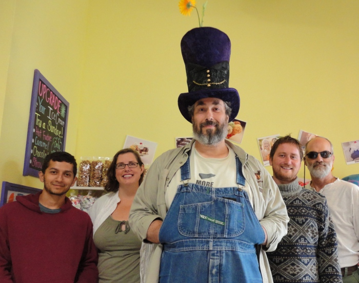

I think it's Paul! I went digging in Paul Wheaton Bio thread, and found a bunch of pictures:


Posts: 35
Location: Galapagar, Madrid, Spain
38
kids forest garden foraging trees bee writing
  • Mark post as helpful
  • send pies
    Number of slices to send:
    Optional 'thank-you' note:
  • Report post to moderator

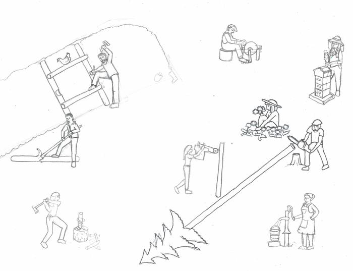
I'm thinking this might be the basic idea? (It's extreeeeeeemly rough. It takes time to draw little figures, and this was one sheet of paper, so the level of detail is totally lacking. And it's hard to draw tiny figures at that scale. And I didn't spend much time on it because I'm not even sure if it's what you're going for.)


I'm sure you spent a while digitizing it and adding color but the truth is I love the sketchy pencil and paper look of your original sketch! It sings to me. It feels more DIY. I don't know why but the color version reminds me of the Simpsons. Pencil and paper, back to basics somehow feels more SKIP.
 
Posts: 56
5
  • Mark post as helpful
  • send pies
    Number of slices to send:
    Optional 'thank-you' note:
  • Report post to moderator

Nicole Alderman wrote:So many power outages! I ended up having to do the part of hugel plants and the apple tree twice, because the power went out before I could save. That happened twice!

I now have everything sketched out better (if you click on the image, you can see it in higher resolution). I'd love if for ideas on what can be fixed, what looks funny, what would look better moved around a bit, etc. Give me all your constructive criticism, because I've been starting at all the details so long that I can't "see the forest for the trees" any more!


Maybe remove the girl, on top left hand corner, watering the one cabbage and put a group of flowers growing there with or without a water element (brook, small pond) instead,  then put one or more birds in right hand top corner under “y” of property.
This might add a cohesive element of nature and create a balanced image. Even without the changes, it looks really cool. Awesome job!
 
Posts: 11
3
  • Mark post as helpful
  • send pies
    Number of slices to send:
    Optional 'thank-you' note:
  • Report post to moderator
Wood chopper holding the axe the wrong way
Maybe a hint of a stem and leaf for the apples
Apples too evenly spaced out
ladder for apple picker in the tree
tractor guy needs boots, barefoot machinery operation  is tsk tsk tsk
beekeeper looks like she is not wear netting, I think it is okay cover her face a little bit
the chicken needs some chicks
bird house builder, switch to a smaller hammer, a few more tools and supplies on the table would be nice.. hey maybe even this book (he is using as a reference, right?)
pizza needs to be foreshortened a bit, right now it looks like a giant chocolate chip cookie

a bit of smoke coming from the pizza oven?
Watering gal needs a few more veggies or flowers.  right now it looks a bit like a failed crop with one head of lettuce
There are smudges and left over pixels from copy and pasting (I am guessing)  throughout the title ...

add someone reading a book.. this book or any of the others Paul wrote ...
framing and door need a bit more character
chicken coup could use a bit more detail (show boards?)


as per usual.. YMMV!  Thanks for asking us though!  
 
Posts: 17
3
9
  • Likes 1
  • Mark post as helpful
  • send pies
    Number of slices to send:
    Optional 'thank-you' note:
  • Report post to moderator
Has anyone thought of incorporating the badges in some way? Maybe as a border or watermark in the sky area?
 
Posts: 450
Location: Indiana
58
5
  • Mark post as helpful
  • send pies
    Number of slices to send:
    Optional 'thank-you' note:
  • Report post to moderator
Just some general info.
Most applications/programs have the ability to "auto-save" at the time period you set.
I just made it a habit to hit CTRL+S to save manually whenever I thought I had done enough that I didn't want to lose the info.

For printing: IF you're publishing a book with photos make sure the photos are a MINIMUM of 300 dpi otherwise they will look grainy.
This true whether you're using a Publishing program or Saving your document as a PDF file.

You should have run a SKIP challenge to find mistakes/corrections. After all, reading the "fine print" should be a requirement on all of the legal documents associated with transfer of properties.

Luck to you on the book!
 
Posts: 33
Location: South Eastern Virginia
34
4
cat trees chicken
  • Likes 1
  • Mark post as helpful
  • send pies
    Number of slices to send:
    Optional 'thank-you' note:
  • Report post to moderator
I’m going to leave the pictures on the cover alone for a bit.

The second book should be cohesive with the first book. Please make both books the same height. Similar fonts for the title. BWB is green. Either go with green or pick a nice saturated color that looks good next to green.

I would think book #2 would mention that the authors wrote the informative and entertaining book “(full title of Building a Better World)”.  This should at least appear prominently on the back cover!

OK, back to the pictures that are being discussed. Any of these that are not chosen for the cover can be used inside the book. White space is nice, but we don’t want too much of a good thing. I would encourage submission of everything from doodles to real pictures.

That’s my insight for today. I have been the editor for several groups within the SCA. (www.sca.org) Coming up with something informative and different on a monthly basis is both fun and terrifying!
 
pollinator
Posts: 216
Location: Wisconsin, Zone 4b
56
8
kids books homestead
  • Mark post as helpful
  • send pies
    Number of slices to send:
    Optional 'thank-you' note:
  • Report post to moderator
My thoughts...

That's kind of busy. Not necessarily a bad thing though as it's eye-catching too.

To free up a small amount of visual space, I suggest making the title a little bit smaller. In addition to giving a visual breather, it should help draw the eye to the title. Also suggest using two different fonts for SKIP and the subtitle that explains it.

The apple tree looks like it has the spots from Put Me in the Zoo. I think adding stems and/or putting them in clusters would help.

The downed tree reminds me of a Christmas tree on one very long stilt. It kind of creates a visual traffic jam with our log peeler. Maybe if the tree were shorter that would help.

The author names aren't really standing out to me, though if that's intentional then it's great.

Entirely unnecessary, but something I thought of: what if the wood chopper were turned the other direction and moved to the bottom left, thus putting the author names in the center?

Overall I like it. I just get picky about details.


gardener
Posts: 802
Location: 4200 ft elevation, zone 8a desert, high of 118F, lows in teens
532
7
dog duck forest garden fish fungi chicken cooking bee greening the desert
  • Likes 4
  • Mark post as helpful
  • send pies
    Number of slices to send:
    Optional 'thank-you' note:
  • Report post to moderator
I like the cover, not sure if what I've done is going to show the way I want, but I'm going to try it.  Here is your cover:

And here it is with some simple color tweaks.  I used Photoscape X (free version), under Edit, I did the HDR option, which is a cheater way of doing HDR.  I did Amount: 80; Radius: 90; HDR: 67.  Let's see if it shows the difference when I post this below.... okay, it does mostly.  So you can see it's an easy way to make the colors look less "flat".  If you have Photoscape X you can play around with it more quite easily.  I'm not sure if there is a similarly easy way to do this on gimp or photoshop.  
skip-cover4-copy.jpg
cover with HDR trick tweaks
 
pollinator
Posts: 3090
Location: Meppel (Drenthe, the Netherlands)
1018
dog forest garden urban cooking bike fiber arts
  • Likes 2
  • Mark post as helpful
  • send pies
    Number of slices to send:
    Optional 'thank-you' note:
  • Report post to moderator
[quote=April Virginia....
What about drawing icons for these many skills and placing them in a grid? An icon doesn’t demand grounding. They speak simply on their own. ...

I am for icons too, like on the cover of Paul's other book. And I know there are already icons (as I said before) for all PEP-badges. Why not use those?
 
Posts: 2
Location: Southern UK.
1
forest garden wood heat woodworking
  • Likes 3
  • Mark post as helpful
  • send pies
    Number of slices to send:
    Optional 'thank-you' note:
  • Report post to moderator
You wanted critism, sadly I'm about to fail on that, others comments all have validity, however I judge a book cover on 1 criteria; does it make me want to buy and read. The cover is fun, lively, bright and absolutely makes me want to read the book...please don't change it too much!
Good job.
 
steward
Posts: 21559
Location: Pacific Northwest
12046
11
hugelkultur kids cat duck forest garden foraging fiber arts sheep wood heat homestead
  • Likes 5
  • Mark post as helpful
  • send pies
    Number of slices to send:
    Optional 'thank-you' note:
  • Report post to moderator
Okay, here's a bunch more modifications/mock-ups/tests:

  • I cut up the tree and turned it into logs. I also tried scooching the chainsaw man, which made me have to scooch the tractor
  • Solar coop man has stepstool
  • Pizza man has better pizza and has moved closer to the rocket oven. Rocket oven got a bit bigger to match him
  • More plants up by the lady watering on top of the wofati (I don't think you want to have streams or ponds on top of the wofati)
  • Apple tree hopefully has more realistic apples. I'm still not pretty happy with how they look. If anyone has a standard-size apple tree full of apples to share a picture of, I'd love to see it for inspiration. And, yes, Paul likes nice, big, healthy natural trees grown from seed https://paulwheaton12.wordpress.com/2014/05/06/apple-trees-from-seed/
  • I changed the font to match the Building a Better World book cover (It's "Cabin Sketch Regular"--big thanks to Tracy for helping me identify it!)
  • I'm still not sure what to do about the wood chopper. I purposefully have her using the ax backwards as a mallet, so that those that don't know about kindling crackers wouldn't wonder why she's using an ax. But maybe enough people are familiar with kindling crackers that the mallet would make more sense
  • I shifted the blacksmith up and to the right a bit, which then led to shifting the well lady a bit.
  • I cleaned up the sky of specks (there's probably still specks elsewhere in the picture, as I'd have to go layer by layer to find them all....I have something like 30 layers in opperation, with almost every person being it's own layer)


  • this has the chainsaw guy moved. I still have to clean up all the lines
    Here's with the chainsaw guy in his old spot, cutting up the logs


    Here's some with just the lines. One with sepia lines, and the other with white lines on green (I don't really like this one, but I figured I'd share it since I mocked it up)

    I had to rebuild some of the sketchiness that I'd deleted in the color version
    same green as the Build a Better World book


    Here's a very quick mock up with just the icons. I tried a different title layout, more like the Building a Better World book. Not sure if I like it. The icons would all need to be basically redrawn, since the original ones are TINY files. They are, literally, the same resolution as you see them in my signature. I'm thinking we could go one of two ways with this (1) Make all the badge icon backgrounds be white (and the fonts white), or (2) Remove the badge backgrounds and turn the badge icon's white.


    One problem with using the icons is that there's 22 of them....not a really useful number for trying to put into a grid.


    For those curious as to my process, I basically draw everything on paper in pencil. Then  Trace over it with pen. Then scan it into the computer, clean up the lines. Each of the drawings has it's own layer, and the colors for the cover are all one one layer that is "multiply" to add the color on top of all the sketches. So when I move a figure, I have to recolor them. It's kind of a pain, but I haven't figured out a better way. Here's a scanned sheet of some of the sketches. It's one 8.5x11 paper with all those sketches! I still haven't mastered drawing with a mouse, and I really do love drawing by hand, so everything is sketched in pencil first.

    sketch of SKIP badge activities

     
    steward
    Posts: 12465
    Location: Pacific Wet Coast
    7021
    duck books chicken cooking food preservation ungarbage
    • Likes 3
    • Mark post as helpful
    • send pies
      Number of slices to send:
      Optional 'thank-you' note:
    • Report post to moderator
    I definitely like it with chain-saw guy moved forward and the tractor moved back (*and* I noticed you fixed its load of dirt nicely!)
    The pizza guy definitely looks like they're taking something to the open stove, so I like that much better also.
    I personally would much prefer the kindling cracker to have a sledge or club hammer. The idea of using an ax backward is an accident waiting to happen - she could slip and fall on the sharp edge for example.
    The apples look better and the lady with the watering can looks better with more plants - they look like they're more "for real" now.
    I definitely prefer the "coloured in" version to the line drawings below.
    Personally, I prefer the drawing you've done, to just the badges. To me the badges are a "tracking device", but the drawing shows people doing real and useful skills. I have no idea how many people will actually inherit property due to SKIP, but I *do* know that these skills will help people live richer lives with a smaller footprint and hopefully pride in "doing", so to me it's the skills that should be show-cased rather than the badges.
    With a project like this, there will always be picky details, and I know that you can't please everyone. I tend to agree with Sam Knight - if it makes people want to pick up and read the book, you've succeeded!
     
    Posts: 12
    3
    4
    • Likes 4
    • Mark post as helpful
    • send pies
      Number of slices to send:
      Optional 'thank-you' note:
    • Report post to moderator
    I was thinking it should be a little more busy and have more background stuff. I like the tree being cut up.
    PXL_20210216_235600429.jpg
    [Thumbnail for PXL_20210216_235600429.jpg]
     
    gardener
    Posts: 1746
    Location: N. California
    812
    2
    hugelkultur kids cat dog fungi trees books chicken cooking medical herbs ungarbage
    • Mark post as helpful
    • send pies
      Number of slices to send:
      Optional 'thank-you' note:
    • Report post to moderator
    Hi Nicole. I love the direction you are going in.  I think you are doing an amazing job.  I would agree with some of others about the guy felling the tree amongst the crowd of people.  I get you are trying to show lots of skip tasks, but something about the placement bothered me too. Although they are right about how apples grow, no one looking at the cover is not going to know what kind of tree that is.  It's a common cartoonish way to draw an apple tree, and it just depends on what you like.  When I first looked at the lady chopping wood I thought why is she holding the ax backwards? then I recognized the log splitter thing I have seen as a skip. and it made sense.  But if the potential book purchaser hasn't seen it being built on permies, or somewhere, they might have the same thought.  I was thinking with the pizza guy maybe if the pizza was on a pizza paddle it would be a bit easier to recognize.  I wish my daughter was up I would have her draw what I mean, then the person would look like a real person, and the hand would look real ect.  I am not the artist my daughter is so the sketch I will add is crap, but hopefully you will see what I'm talking about.  Maybe it will give you an idea.  Anyway I think it looks super and even if you don't change a thing it will still draw people in to take a closer look, which is what you want a book cover to do.  Thanks for all your hours of hard work.
    IMG_20210216_222222607.jpg
    [Thumbnail for IMG_20210216_222222607.jpg]
     
    Nicole Alderman
    steward
    Posts: 21559
    Location: Pacific Northwest
    12046
    11
    hugelkultur kids cat duck forest garden foraging fiber arts sheep wood heat homestead
    • Mark post as helpful
    • send pies
      Number of slices to send:
      Optional 'thank-you' note:
    • Report post to moderator
    I was chatting with my brother (who happens to make a living as a graphic artist, with the 4 year degree to go along with it), and he was thinking that the main room for improvement with my design is that I used too small of drawing, making it look a little rougher/blotchy than it should. The picture, to him, looks good at a distance, but is more questionable at closer look. There's two paths I could go with it:

    (1) Turn it into a vector--basically go around each shape and color and turn them into ones that can scale up and down. This would give it clean, smooth lines, and a more cartoon-like feel. This would be art more like Olof's really cool Wheaton Eco Scale or the permies home page or Tracy's design for the Wofati Greenhouse

    or:

    (2) Redraw everything larger in pencil, preserving pencil line and texture, to give it more of the Where's Waldo./Richard Scarry look. The fastest way to do this would be to print out each figure that I've already drawn at a larger scale, and then stick the copy on a light desk with another paper on top, and trace/redraw it with shading and nice pencil lines.

    I'm not sure which direction to take. I'm thinking either direction would take at least 10 hours to do. Is it worth it?

    Which direction do you think would be better: More sketchy, or more smooth? Which do you think would draw a larger audience?

    And, here's the current state of the cover (I added shading on the wofati, door definition--I really liked the style used above!--more shading on the chicken coop, redrew the spoon carver, and gave a mallet to the wood chopper)

    current cover
    different title arrangement


    pollinator
    Posts: 580
    Location: Central Texas (Georgetown)
    322
    7
    monies tiny house wofati
    • Likes 1
    • Mark post as helpful
    • send pies
      Number of slices to send:
      Optional 'thank-you' note:
    • Report post to moderator
    Maybe...
    - make all people figures into Paul figures.
    - include tons of forest trees.
    - include wildlife to fill holes.
    - use a where's waldo sky line, or a 10am sun angle.
    - double the size of your canvas in preparation for the back cover.
    - set a goal of depth layers (a huge amount), but the figures never shrink in perspective from depth.
    - use the brown and cream theme, but add a lot of shading.
    - pat yourself on the back
    - use three or more hills; it would broaden the landscape, and free-up some visual connection opportunities.
     
    Posts: 2
    2
    • Likes 3
    • Mark post as helpful
    • send pies
      Number of slices to send:
      Optional 'thank-you' note:
    • Report post to moderator

    Regarding the actual cover proposition currently being considered,...
    As an Advertising & Graphic Design instructor, this is what I would suggest to one of my students in preliminary Critique session.

     *    Use of colors more interesting, earthy but still lively, and images/illustrations organized yet separate enough to be clear.
     *    However, comes off as more a probable kids' book rather than something which would appeal to adults looking to further their education and experience levels.
     *   Wonky ALL CAPS type font looks random and does not give ability to fine tune or highlight key concepts (So, for example, I would advise a graphic design student to consider either leaving out the throw-away connectors (the, to, by) or making them lower case.
     *   Then look at your text arrangement --- clusters and breaks --- and think about how your brain processes things.  So, putting your key concepts together on single lines is likely to be clearer and stronger:
        *                 SKIP
        *          Develop your
        *   SKills to Inherit Property
        *
        *        by Paul Wheaton
        *          & Mike Haasl
     *   Illustration, layout, etc. may fly as is otherwise, but would at least consider adding a little more perspective, not quite so flat/boxy/ primitive, a few more organic details, randomize & cluster some of the tree fruits --- and maybe make the tractor "face" a little less grumpy/menacing 🚜 😎

    More than 2 cents here, but FWIW, and take what you like...
     
    pollinator
    Posts: 102
    Location: Willamette Valley, OR
    36
    4
    • Likes 1
    • Mark post as helpful
    • send pies
      Number of slices to send:
      Optional 'thank-you' note:
    • Report post to moderator
    I love the look of the cover. It’s fun. It’s inviting.

    If I were empress of the world I would make two suggestions. I’m not, but I guess I’ll make them anyway.

    Why these two? Only because they are what jumped out to me (and I know, perhaps only me) it the first 5 seconds of looking at the photo.

    1] please don’t have a higher percentage of women with bare legs compared to men. (Ok, I know that statement is going to irritate some people. Please note that I refer to percentage as a quick way to think about patterns. I am not advocating quotas or suggesting nefarious attitudes held by the artist. And If this suggestion is blown off I will not die of it and I will still buy the book and I will not go on a crusade and I won’t even respond with snarky replies to those who dislike my suggestion.)

    2) I love that you have a spinner on the cover.  But have you thought about putting her in dirty overalls instead of a long skirt? That would not only bust stereotypes a little bit, but might also invite a slightly longer gaze at that part of the picture and hence be a little plug for spinning.

    Thank you for inviting feedback and considering by little ideas. Both mean a lot to me.

    Laura
     
    master pollinator
    Posts: 4988
    Location: Due to winter mortality, I stubbornly state, zone 7a Tennessee
    2132
    6
    forest garden foraging books food preservation cooking fiber arts bee medical herbs
    • Likes 3
    • Mark post as helpful
    • send pies
      Number of slices to send:
      Optional 'thank-you' note:
    • Report post to moderator
    Several of the people depicted on the cover are real people. Two of the girls I recognize, prefer to wear skirts. Perhaps there are more, who are real people, who prefer to wear skirts, or shorts.

    Paul, of course is depicted in his overalls.
     
    Nicole Alderman
    steward
    Posts: 21559
    Location: Pacific Northwest
    12046
    11
    hugelkultur kids cat duck forest garden foraging fiber arts sheep wood heat homestead
    • Likes 2
    • Mark post as helpful
    • send pies
      Number of slices to send:
      Optional 'thank-you' note:
    • Report post to moderator
    I honestly hadn't realized there were no women in overalls. I actually had intended to have a few--but somehow we just ended up with a woman with overall/jumper. Drawing this was fun, because--other than Mike and Paul--I wasn't really intending to have all these people be representative of actual people. I just sort of started drawing them and then realized so-and-so would fit and they morphed into that person.

    As for legs visible, it looks like there's two guys in shorts (one installing the chicken coop solar panel--I'm still amazed no one has said "Wouldn't the chicken hop up there and destroy that panel?") and the other driving the lawn mower. There's three girls with legs visible: the one watering the plants, the one drawing water from the well (jumper), and the one picking apples (skirt). I tried to have a diversity of clothing styles. I personally HATE shorts, short skirts, and tanktops. But I know others like them. So I drew people in each!

    I actually spent a long time trying to make sure there was good diversity and that people weren't stuck doing gender-specific rolls. A woman is blacksmithing, a man is baking pizza, a woman is carving a spoon, a man is harvesting food, a woman is chopping food, etc.

    For fun, and those curious, here's the Where's Waldo of those I've drawn:

    Paul Wheaton (obviously!)

    Mike Haasl--he wanted to be roundwood woodworking--and so he is!

    Me! This wasn't actually intended to me, but as I was touching up the image, I decided to give her curly hair, a headband, and my favorite color shirt and a skirt (even though I rarely wear them, I do LOVE long skirts, and that's how I'd want to be depicted :D)

    R Ranson! I actually based this off of actual pictures of what she wears, and that's her little lamb, and her Crowing Hen.

    I drew this one, and then realized it looked a lot like Dave Burton! And Dave has totally done a lot for PEP and SKIP, so it makes sense for him to be here. And, he was always cooking up really yummy things in his Bootcamp thread!

    This one I based off of an actual picture of Jacqueline Freeman. And, no, she wasn't originally wearing a net, but I figured people would think I didn't know what I was doing if she didn't at least have a bee net, ha!

    I don't know the name of this awesome lady, but she was at Wheaton Labs for...I think?...the 2019 PTJ. And I just think the picture was so epic that I had to draw her in!

    Looking at these zoomed in, I'm really tempted to redraw everyone at a larger scale to give them more details and higher definition, especially Dave, who was one of the first people I drew. But, I'm not sure what Paul wants, so I'm not really working any more on this until he tells me. Chances are, the people doing the videography will use my drawing as inspiration to make a better one.

    Oh! And for fun, I played around with the colors to see what it would look like with a more vibrant hue that matches the Building a Better World book better.
    skip-cover8-bright.jpg
    I think the blue sky is waaay too bright.
    I think the blue sky is waaay too bright.
     
    steward
    Posts: 15511
    Location: Northern WI (zone 4)
    4847
    7
    hunting trees books food preservation solar woodworking
    • Likes 1
    • Mark post as helpful
    • send pies
      Number of slices to send:
      Optional 'thank-you' note:
    • Report post to moderator

    Nicole Alderman wrote: I don't know the name of this awesome lady, but she was at Wheaton Labs for...I think?...the 2019 PTJ. And I just think the picture was so epic that I had to draw her in!

    That's Bailey!
     
    Nicole Alderman
    steward
    Posts: 21559
    Location: Pacific Northwest
    12046
    11
    hugelkultur kids cat duck forest garden foraging fiber arts sheep wood heat homestead
     
    L Anderson
    pollinator
    Posts: 102
    Location: Willamette Valley, OR
    36
    4
    • Mark post as helpful
    • send pies
      Number of slices to send:
      Optional 'thank-you' note:
    • Report post to moderator

    Joylynn Hardesty wrote:Several of the people depicted on the cover are real people. Two of the girls I recognize, prefer to wear skirts. Perhaps there are more, who are real people, who prefer to wear skirts, or shorts.

    Paul, of course is depicted in his overalls.


    I don’t mind the skirts. I like skirts too. Especially when it’s hot out.  There are many benefits to skirts that go beyond fashion preferences  Skirts are much cooler than shorts when it’s hot outside. They’re more forgiving of imperfect or changing figures. In the 1970s my teenage friends teased me for wearing skirts in summer.  (Of course in the1980s we were all wearing skirts again. Even pleated plaid ones. I still love plaid). It’s easier to pee outside in a skirt than in shorts (not sure if this benefit extends to men.  If I meet a kilt wearer I will ask).  Skirts are easier to make and depending on the style take less fabric. They definitely take less time, less hardware, and less skill, especially when compared to zipper-and-button shorts.  (Pull on/elastic waist shorts are kind of in the middle). So, skirts  are easier on the earth.  They should be a lot cheaper to buy than shorts, no? But they definitely are not. Plus, they are fun to wear.

    When I referred to bare legs, I really just meant bare legs. It should be no surprise that we are used to looking at more bare female skin than bare male skin. Yes, that is true in real life. And I have no problem with that. But the pattern tends to be amplified in the media.  Often this is and unconscious. Often it is fully conscious.  Really, I bet sometimes many men wish they could they could wear a skirt in hot weather without having accompanying commentary. (Besides, am I the only one who was sorely disappointed when NBA players stopped wearing those little basketball shorts and switched to knee length ones?)

    Now regarding spinning in the skirt: I’m a spinner and I belong to a pretty good sized guild. There are quite a few male members as well.  It is very common to overhear comments about how spinners are generally portrayed by non-spinners. Female. Mostly middle aged or older. “Traditional” dress: no wild hair, usually a skirt, usually understated. Again, I don’t think those who design the images are being mean or are disrespecting women or spinners. I don’t think it’s something that would occur to non-spinners to think about at all. Ditto for knitters or crocheters. For weavers, not so much. Not sure why.

    Anyway, I try to mention things now and then. I like it when I learn new things about other people’s experiences and thoughts. Saves me all that mind reading and makes my fellow humans more interesting to be around.

    Laura
     
    L Anderson
    pollinator
    Posts: 102
    Location: Willamette Valley, OR
    36
    4
    • Likes 1
    • Mark post as helpful
    • send pies
      Number of slices to send:
      Optional 'thank-you' note:
    • Report post to moderator
    Shoot, Nicole! What a nerd I am! I didn’t think you were just tossing the drawing into the fray! I thought it was the actual draft cover and it was just time to tweak. I guess I thought that because I liked it so very much. And just so you know, I don’t think the sky is too bright. My opinion.

    Laura
    PS I did notice the care you took to include a diversity of people.
    PPS Full disclosure: I am a retired sociologist. It’s pretty impossible to turn that off.  I do try. Success is highly variable.
    gift
     
    Unofficial Companion Guide to the Rocket Oven DVD
    will be released to subscribers in: soon!
      Bookmark Topic Watch Topic
    • New Topic